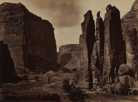
Timothy H. O’Sullivan, Cañon de Chelle, 1871-1873Lee Friedlander, Yosemite, 2004Robert Adams, Arvada, Colorado, 1984-1987Stephen Shore, Fifth Street and Broadway, Eureka, California, September 2, 1974Michael Jang, TV news outside Milk-Moscone murder scene, 1978Pirkle Jones, Black Panther demonstration in front of the Alameda County Court House, Oakland, California, during Huey Newton’s trial, July 30, 1968Jim Goldberg, Edgar G. and Regina Goldstine, 1981Edward Weston, Whale Vertebra, 1934Dorothea Lange, The Road West, U.S. 54 in Southern New Mexico, 1938Larry Sultan, Hamilton Field, 2009Klea McKenna, Rainstorms & Rain Studies, 2013 – 2016
The main photography show at the new SFMOMA is on California and the West and how they have had an integral role in the development of the art form. It’s good but is more of a primer, introducing the different photographic “schools” that have developed here. In other words, it’s a bit thin and I wish it had gone deeper.
The main issue is that it sort of waffles between being organized thematically versus being ordered chronologically. The wall text suggests that things are chronological but the actual photos for a supposed time period end up covering over a century. This is most obvious in the Early Landscapes room. It feels like it’s about the 19th century Watkins, Russell, Muybridge, and O’Sullivan school of mammoth plates, albumen prints, pristine spectacular western landscapes, and our early attempts at taming them. But it goes into Ansel Adams work from ~50 years later and even includes a Friedlander photo from 2004.
In many ways the exhibition would’ve been better off just making the rooms purely thematic—similar to Oakland’s Inspiration Points show a couple years ago. This is pretty much how I chose to approach the show after the first couple of rooms. By focusing on the themes and ignoring the chronology cues, I found myself thinking about how each theme could cover ~150 years of photography in the West.
Early Landscapes was intended to set up a transition to the New West.* These photographs are very much my thing. I love Baltz and Robert Adams. Henry Wessel’s photo of the Richmond garage tree is fantastic.** It’s always nice to see Shore prints.
*I’m tempted to start calling the pristine landscapes either “Old West” or “Old Topographics” a retronyms to either The New West or The New Topographics.
**And I’m completely unable to find it online anywhere.
The comparison between these views of The West is one which I feel deeply in my own photography. I very much love going out into nature and hiking with my camera. I also love going out into the suburban sprawl and taking photos of—and criticizing—the cityscape that has resulted. They’re more than just a core part of my visual literacy, they’re home.
I also like the older landscape photography because of how its message differs from landscape photography today. Modern landscape photography is often environmental-minded, relying on the glory of unspoiled nature to remind the viewer that nature needs to be preserved. 150 years ago, the message was almost the opposite. The glory of unspoiled nature was all potential and something we could, and should, tame.
While the Old West is distinct from the New West, the New West is visible in many of the Old West photos. “Photographing the incursion of technology into nature” is one of photography’s original subjects. Watkins and Robert Adams may have had different goals with their photography, but we can see as many similarities in their work as we can see between Watkins and Ansel Adams.
I found it interesting that the conflict and chaos theme—really more about demographic change—only started with photos from the 1960s. Muybridge photographed the Modoc War 100 years prior.* Dorothea Lange has photographs from the Great Depression in the adjoining room. The history of California is a history of conflict and demographic change, it’s not something which started in the 60s.
I do however enjoy seeing how photographers address the social issues of their time. Where political comment is often absent from the rest of the modern art canon,* photography has always been on the front lines. As much as there’s disagreement about what the democratic camera means, it’s pretty clear that as an art form, photography is somewhat unique in how it’s accessible to many more people and has always had an element of not just witnessing, but being part of any conflicts.
*In the rest of the museum, it’s only visible in the Anselm Keifer and Gerhard Richter rooms. But for the rest of the art from the 1960s and 1970s? If there were politics in it it’s long been scrubbed from the wall texts.
It’s not just conflicts either. A lot of the changes are long-term gradual things which may not even depict changes but rather illustrate existing inequality. These images though, by Jim Goldberg or Carrie Mae Weems, get short shrift in this exhibition. Goldberg’s Rich and Poor is hung on both sides of a hallway—which makes no sense for a series which encourages both close inspection and zig-zagging between images. Weems’s From Here I Saw What Happened and I Criedmeanwhile is one of those photo series which needs to be seen in its entirety yet only two of the images are on display.
That economic and racial inequality are the two big issues for this year’s election, I can’t help but sort of side-eye the way both of them are minimized here.
Speaking of Lange and social justice, while I approve of featuring the “founders/ƒ.64” as being an important theme of western photography, keeping so much of their work outside of the themes in the rest of the rooms felt strange. The group wasn’t about content but rather technique. Their photos fit with all the other themes in the exhibition. There are pristine landscapes, technological changes, and demographic conflicts on display here, but the exercise in tying them into the other rooms is left to the viewer.
As an ƒ.64 room though I liked that they stayed away from most of the super-iconic photos. There’s Lange’s road. And a few of the Weston images are very familiar. But this room could have been full of just photographs I’ve seen over and over again.* I enjoy just absorbing more of their other work.
*Note, there should probably be such a room at SFMOMA because many of those ƒ.64 photos are extremely important to both photography and the idea that photography is art and all of them are inherently part of the Bay Area’s role in art history.
The last theme involves photographers playing with the medium itself. I’ve been on record saying that I consider Weston to be part of this group but most of these photos are much more recent. As such, many of them don’t quite do it for me.* The ones that do though I really like. In particular, Larry Sultan using day laborers as models and the weird ethical questions they create in the resulting photos. Did they know what they were getting in to? What does it mean to stage photos of gente day laborers using those day laborers as models? I don’t have good answers here either but I enjoy thinking about the questions.
*Contemporary Art is still being sorted by Sturgeon’s Law.
I also loved Klea McKenna’s photograms. And it’s always nice to see Trevor Paglen on display although putting him in the playing-with-the-medium room risks reducing a lot of his work to being about technique rather than interrogating the inherent nature of photography as being surveillance.
Looking at the recent photos though provides a clear example of how art photography has embraced the “make it fucking large” ethos of the collector-driven market. So many of the prints are not just huge, but possibly too big to the point that they feel like they’re only trying to be appreciated for their size rather than as images to be looked at. I understand why this is the case* but I don’t have to like the results.
So yeah. I like many of the individual photos but was kind of unsold on the larger theme of the exhibition. As with the opening shows in the rest of the museum, this felt very much like a for-the-masses sketch of possibilities for future shows while staking a claim on a lot of territory.
While Ai Weiwei wasn’t on my list of things to see at all, Pier 24 was at the top. I’ve been jonesing to go for years and just never managed to get my plans in order to get there. The current show features appropriated photos which, while something I’ve enjoyed intellectually in small doses, I was not sure I was ready for a full-on overload of.
I shouldn’t have worried. The space itself is awesome and the collection is more of a “physical version of a huge website”* in that is seems to have any photo series or print which you’d want to see from the canon.** It’s especially focused on photo series. Many of the rooms have at least one complete series of images. Since I’m used to seeing only one or two prints from each series in a museum, I loved being able to see the complete groups for a change. I can really get into what a specific photographer is doing, both from a sequence and a grouping point of view. It also assuaged a lot of my concerns as a context guy since Pier 24 is also known for its absence of context.
*A description someone much smarter than me came up with but which really captures the scope of the place.
**Comments about the demographics of the canon are best left for a different post.
Pier 24 doesn’t have wall text so you have to open up the exhibition guide to figure out what you’re actually looking at. The guide meanwhile only has super basic information—artist identification and a single project statement. As a result, a lot of people hold up Pier 24 to demonstrate how “only the image matters” or “context is irrelevant.” Inside Pier 24, I can see how that argument holds water. But that’s only because the space provides the context. Displaying the full series all together eliminates a lot of the descriptions that have to accompany a single image displayed by itself. Similarly, the way the different series on display interact with each other provides additional context.
Much of the appeal photography holds for me is in how it’s basically an exercise in recontextualization. As soon as you take a photo, you’ve taken it out of context by choosing what’s in, and out, of the frame. The way you choose to display or share the image after taking it is a new context.* There can be no true absence of context—although I would completely agree that context can be meaningless or unhelpful. In the case of this exhibition, since it’s about appropriated photos and recontextualization, the initial decontextualization serves the general theme.
The most interesting room in Pier 24 for this is the series of rooms of the Archive of Modern Conflict. These rooms are pretty dense with salon-style hangings of all kinds of photographs. Vernacular photos are mixed with art photos are mixed with functional photos resulting in all kind of new connections between images despite there being no context about the origins of each specific image.
At the same time, something about these rooms doesn’t hold up for me. Without any information, I found myself looking at the images with the half-awake, short-attention-span mindset I look at things on the web. If it doesn’t grab me right now, why bother looking? I wasn’t just missing the original context of the images, I wasn’t finding much compelling in the new context.
Which gets at the dangerous thing about buying into the no-context-needed mindset. Poorly-thought-out context invites short-attention-span consumption. This is easy enough to default to without any additional encouragement and, while a legitimate way of approaching a lot of media, is not something I like museums and other places that typically intend to encourage more thoughtful looking (or, at least, that’s why I go to them) to engage in.
Reappropriating vs Mining
Hank Willis Thomas
Pier 24’s Secondhand was an interesting double bill with San José’s Postdate. Both shows used repurposed photos but where San José involved reclaiming images from a colonial past—demonstrating a very activist way of appropriating—Pier 24 is almost all within the same sort of western tradition and feels more concerned with the surface of images rather than what’s underneath them.
A lot of the work,* focuses on mining archives and extracting keepers—whether sequences, groups, or individual images—that look interesting to us today. It’s tempting to call this kind of thing “curation” only there’s no illumination provided.** They’re generally not about what the photo means and are instead going for the “oh this looks interesting” reaction. Other work*** involves doing clever things to photos to create new, interesting things to look at but which don’t didn’t make me rethink the actual photos themselves.
*Such as with The Archive of Modern Conflict and Erik Kessels (more on him later).
**One of my pet peeves is the way “curation” has become used on the web as a way of describing collections which, while often very tastefully selected, provide no information or educational information about what the point is.
In both cases, the results can look pretty fun without really saying much. This isn’t a knock on what was on display, just that after having seen another exhibit which really investigated how powerful appropriation could be—especially in the context of colonialism and the representation of the powerless—I found myself wanting to see more work which explicitly examines the cultural context of the images, presents other meanings, and brings the appropriated images from the past into the present.
The only artist on the show who really did this was Hank Willis Thomas. His work in Pier 24—as well as his recent Unbranded work—looks at more than just how the photos look and instead focuses on the content of the photos and how our understanding of that content has changed over time. His work in the show was also particularly relevant given how Black Lives Matter has been constant over the past couple years. Viewing a lot of the older, recognizable but still-charged images through the flag frames suggests how these are commemorated and remembered as accomplishments rather than as part of an ongoing fight.
Erik Kessels & Vernacular Archives
Erik Kessels. Album Beauty.Erik Kessels. In Almost Every Picture.
Erik Kessels deserves specific comment since, not only does he appear to be the main attraction in the exhibition, much of his work critiques our concepts of vernacular photography and makes us think about how we use images.
One of the things that bugs me about a lot of current photography writing is its tendency to state that people did a good job organizing their photos in the past. From what I’ve seen looking at my friends’s and family’s photos is that staying on top of the photo albums was as rare and difficult to do then as keeping digital images organized now is. Even most people who did do a good job making albums have boxes of decades-old images that they haven’t gone through yet.
Managing and mining this archive—whether digital or physical—is a daunting task. What I like about Kessels is how he suggests other ways of using images than the pure documentary mindset that governs most archives of vernacular photos. In Almost Every Picture has a number of series that pull a common theme—a spouse, a pet, fingers covering the lens, carnival prizes—out of a larger cache of images. The archive doesn’t have to tell a story chronologically, it can have a completely different theme and the chronology will still be accessible. People age, fashions change, we can sense the passage of time despite the focus being something else.
As someone who’s still working through doing something with my photos, seeing alternative ways to approach my own archive is great to see.
Album Beauty meanwhile made me start thinking more about vernacular photos as common memory. While extracting specific series or groups of interest out of a vernacular archive is a nice skill to create fun sequences which tell small quirky stories, much of the appeal of vernacular photos is in their entire corpus and how they show us images that remind us of moments in our own lives.
This is something that Colors of Confinement touched on as well. Because so many Japanese internees have a gap in their family photos from the internment years, the photos that do exist from the camps work to remind them of their own experiences. It’s easy to say how photos erode memories by replacing them with whatever’s in the photograph, looking at other albums demonstrates how photos trigger memories as well.
Vernacular photographs,* describe a sense of place and time in a way that allows for our own memories of that period to be part of the experience. We flip through the contents of an album and pause when we see something that reminds us of our own experiences—a location we also visited, clothing or hairstyles that made us look awful, toys we played with or coveted. Ideally we’re looking through the album with someone else so the pause can become conversation as we share stories. But even if we’re on our own, the pause and remembering and slight smile in recognition will occur before we go back to looking.
And it doesn’t have to be an album. It could be a shoebox of prints or a carousel full of slides. Those are just as much fun to look through and, in some ways are a better shared experiences than an album is since it’s easier to pass individual prints or slides around.
Which brings me to 24 hours of Flickr. This room gets mentioned in every writeup I’ve seen on this show. It didn’t do much for me. It kind of feels like a physical statement about how awful the current deluge of photos is compared to how great the nicely-organized albums of the past were. Yes, people upload way more photos than they’d have printed in the past. And yes, 90% of those photos are crap. But there’s nothing gained by seeing how many 4″×6″ prints a days worth of uploads translates to.
What I took away from that room was how respectfully I treat photographic prints. In a room full of prints, all of which were treated as basically disposable trash, I still found myself trying not to step on any of them—even the brick-wall test shots half-covered in a low-resolution watermark.
Photographs as Byproduct
Larry Sultan and Mike Mandel. Evidence.
The rooms I liked best though contained photographs which were, essentially, byproducts of other ventures. Rather than being vernacular photos that people took to document their lives, these are things produced by government, big business, or a media company as part of an offered product or service. Some are intended as communication and illustration to accompany other information; some are merely an intermediate step of a production process; and others are artifacts that happen to feature photography but aren’t photos themselves.
The highlight is Larry Sultan and Mike Mandel’s Evidence. It’s one of the granddaddies of the field of appropriated photography and it’s awesome. Is it a bit superficial? Absolutely. But it’s funny and bizarre and simply a very well-selected sequence. I find it hard to believe it’s as old as it is since it still sets the bar for this kind of thing as an example for how decontextualization and recontextualization can work.
The photos in Evidence come from all sorts of governmental and industry archives. By themselves, in their original context, they would have been pretty boring, of interest to a small, specific audience—quite possibly boring to even that audience. Out of context and grouped together though makes these technically-competent photos anything but boring. Rather than wanting to know what’s going on, I found myself making up my own narratives and noticing things in the images that weren’t originally the main point—like the interactions between people in a group shot or the way a headless person is holding the intended subject of the image.
I also really liked Viktoria Binschtok’s work investigating the locations of Google Street View (GSV)photos. There have been a lot of GSV projects but I really like the idea of not just rephotographing the street view image but going inside and making the automated, corporate image into a real place. GSV in many ways demonstrates everything that makes for bad photography. It’s automated and distant and unedited and presents an unnatural point of view. But these are also what make it so compelling to play with. There is no existing editorial voice to contend with and you can sit down, dig though as much of the archive as you can handle, and do whatever you want with the results.
Most of the projects though have been either commentaries of GSV itself or attempted to find street view images that looked like “real”* photographs. Binschtok though uses GSV as just the jumping off point to play with the concept of intent. Her photographs paired with the GSV imagery produce a result that makes both much more interesting. It reminds me a little of rephotographing Stephen Shore with GSV but rather than starting with the interesting, fully-intended image and showing how bland the location looks on Google, these start with the bland GSV images and force us to see how they can be transformed by looking with intent instead.
*Read, images that look like the accepted canon of “good” photography. This is also an idea that deserves a post all of its own.
The collections of photos that have been prepared for halftoning and printing are fascinating.* These are byproducts of the printing process. They’re not the original negatives nor are they the final halftoned prints. Instead they’re photographs which have been painted and marked up to improve the contrast and eliminated unwanted details so that they will reproduce well after offset printing.
*Especially given my background in printing. I’ve worked as a prepress operator at an offset printing shop as well as an OEM support lead for digital printing and so have lived the “how to go from paste-up (or digital file) to printed page” life for over a decade.
This is the kind of thing that would be called cheating today so it’s instructive to see how much manipulation was required in order to get a usable final image. None of these photos are lying even though they’re all faked. It’s also a reminder of how much image processing is always needed behind the scenes in order to make a decent photographic print.
Outside of being a reminder of how photographs end up on paper, these objects are also wonderful commentaries on photography as an exercise in recontextualization. They’re not just extracting what’s in the photo from what’s outside it, they’re also painting out details and reframing what’s in the photo as well—in-game action photos become posed studio images, group photos become headshots. And then they’re put on the wall of a museum where we no longer know who the players are you see what an editor selected decades ago as the most-important part of these images.
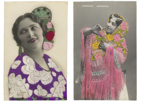
Finally, there are photos which are used as the substrate for other products. The embroidered postcards are beautiful objects and the ID badges are great fun to look at. In neither case am I really looking at the photos though. I’m seeing them as objects and remnants of a specific period of time. I appreciate seeing multiple specimens—Pier 24’s scale does most of the heavy lifting here—as I can get a better sense of the craft and usage of the pieces.
It’s no surprise that my favorite pieces at Pier 24 were these byproduct photos. They were useful objects which we can relate to—even after their previous functions are no longer needed or remembered, we recognize enough about how they were used. Recontextualizing them into a museum allows us to relate to them as useful objects and appreciate the new context along with the original craft. Looking at photography—or really anything else in a museum—needs to be more than just an academic surface-level exercise for me. I need to see what the photos are doing, how they’re being used, or what statement they’re making.
I’ve been seeing a lot of photography projects which involve erasing the subjects of other photos. Michael Somoroff’s take on August Sander is the latest entry to generate discussion here. As with the colorization thing, an awful lot of the reactions are the same sort of outrage about “respecting the original photographer” or “desecrating works of art.” Both of which tend to amuse me, especially when people get especially worked up about it.
I’m not a fan of Somoroff’s project—only the photo of the cook really works for me—but I’m not against this sort of erasure in general. Tweaking art and changing its context is something I love and wish more museums would show—for example, Princeton’s Itinerant Languages of Photography and Re-Framing History at Galerie Lelong. These shows treated photos and images as functional items which live and change as society changes rather than confining them as specimens to be collected and kept in mint condition.
Bence Hajdu
Fra Angelico
Bence Hajdu
Sandro Botticelli
Do most people notice the river, castle, and bridge on the background? Or that there’s an empty room behind Mary? Probably not. But those are all there on purpose. The details have been chose for a reason and it’s a lot of fun to think about. When the background include city details, you can also start to see depictions and documentation of architecture and technology which most people just miss.
The first thing I thought of when seeing the Sander discussion was Bence Hajdu’s Abandoned Old Master Paintings. I really like these and I mentioned them in a few discussions. A number of people agreed with me and found them a lot more interesting too. Where erasing the Sander subjects was troublesome, erasing the old master subjects not only didn’t bother them at all. I’d expect the anti-desecration people to be similarly upset but now I’m wondering if that argument is just an easy choice for a generic “I don’t like this” reaction.
For my part, I don’t like Somoroff’s project because I don’t think Sander’s work in particular lends itself to the erasure game. It’s not a portraiture thing but rather the few-props, simple backgrounds, and somewhat shallow depth of field means that there’s not much to look at besides the subject. Sander’s done his job well and left only the relevant details in the frame. The photo of the cook works for me because there’s enough extra detail for it to work here. In general though, the details are a bit too minimal.
Jan van Eyck
Larry Sultan
I’d be curious to see the same approach taken to portraiture where the entire frame is full of background detail. Unfortunately, most iconic photo portraits don’t have the kind of detail I’m picturing. There are plenty of old master portraits are like this—for example, the Arnolfini Portrait is exactly what I’m thinking of. It’s very clearly about the people in the room but there is also lots of other detail to look at and take in if you bother to look. It’s also not the way you’d take a formal photo now with random shoes in the foreground and everything in deep focus.
The language of photo portraiture, even environmental portraiture, is different and it took me a while to think of iconic photo portraits which have the right mix of subject with background information. Arnold Newman is too formal with his backgrounds being too-closely tied to the subjects. Rania Matar (not iconic but internet famous) emphasizes the backgrounds too much. I finally remembered Larry Sultan. Envisioning either Pictures From Home or The Valley (NSFW) with the subjects erased feels more interesting to me and suggests a way this kind of erasure could work with photo portraiture.
Josh Azzarella
Pavel Maria Smejkal
Robert Capa
Josh Azzarella
Pavel Maria Smejkal
Charlie Cole
Josh Azzarella
Pavel Maria Smejkal
Joe Rosenthal
The other interesting tactic on the erasure front involves modifying iconic photojournalism and news media images. Two examples here are Josh Azzarella’s and Pavel Maria Smejkal’s work, which, while not exactly the same, happens to overlap a lot. When I look through their projects, I’m struck by how recognizable some images are once I’ve put on the “do I recognize this landscape” hat. It amazes me that Mount Suribachi or wherever Capa got that soldier killed are so recognizable despite being such a small portion of the image.
These iconic photos do suggest that we’ve absorbed enough of the other details, even without there being anything specific, just through repeated exposure and references to the original images. Whether it’s the Olympic Village in Munich, a road near Trang Bang, the Valley of the Shadow of Death, or Kent State, they’re the very definition or photos which we know culturally and are continuously reminded of as they get remixed and referenced over the years.
This is another way that the old master paintings work with the erasures. They’re part of our visual canon so we just recognize them better. It may just be that, for me, August Sander isn’t part of the same shared visual culture. Or perhaps only a few of his photos, such as the cook, are.
Mishka Henner
Robert Frank
Which brings us to Mishka Henner. His approach to Robert Frank takes one of the most-famous photo projects and remixes it through erasure. But it’s about more than just erasing the subjects to reveal the backgrounds. Henner is getting into the remix thing and reveals new compositions within Frank’s originals. Henner’s work feels a bit gimmicky to me but that’s more of a taste-based reaction. I’m good with the remix concept. I’m also good with riffing on a classic of the medium. I’m just not liking these specific results. It’s okay, liking isn’t the only thing.
Thinking about erasure as only part of the remix culture though opens up a lot of other projects which are worth considering for comparison—in particular, all the rephotography projects.
Pavel Maria Smejkal
Annie Leibovitz
Alexander Gardner
That Gardner’s* Confederate “Sharpshooter” photo has been subjected to both the erasure treatment as well as rephotography makes this connection easy. We recognize the image without the subject. And we recognize the place over 150 years later. Of all the photos in Annie Leibovitz’s Pilgrimage, her photo of Devil’s Den** is probably her best example of explicitly revisiting both national myth and photographic myth. The location still resonates and seeing what it’s like now changes my understanding of the original. It’s no longer just something from my history books. It still exists and I can see the history in it.
**Which I’m unable to find a good version of anywhere.
Christopher Rauschenberg
Eugene Atget
Rephotography is something else that could seem like a gimmick but, in the right hands, ends up being something much more powerful. This works especially well when the subjects being rephotographed have such a strong sense of place already. Christopher Rauschenberg’s Paris Changing where he rephotographs Atget is a great example here. It takes the past into the present, showing how much has changed, and how much hasn’t.
The pairs are really interesting to look at because they also give you an additional appreciation for what Atget was doing. Atget isn’t a photographer who most new photographers get into. It usually takes a while to start to get him but once you do you’re seeing everything much much differently—at almost a different time scale. It’s no surprise that Rauschenberg found himself shooting Atget-like photos at the same time he was rephotographing Atget.
This same impulse is what makes looking up Stephen Shore’s locations in Google Street View to be so interesting. In this case it’s not the exact replication but being able to explore the area and see what made the frame’s Shore chose to be so uncommon. Really seeing why Shore chose certain views and thinking exactly about what makes them work can only happen if you play around in the area.
Hebe Robinson
If Google Street View isn’t available, the rephotographing which includes the original as part of a wider view of the scene does a similar job at showing context. Unlike the tightly-composed Atget or Shore photos, this approach often seems to be used to take vernacular photos and place them in a larger setting as a way of telling stories about the past and giving them something to anchor to in the present. Our stories and memories need these anchors so we can remember them and pass them on.
Mark Klett and Byron Wolfe
Rephotographing can also be used to remix content in order to reveal previously-unseen connections. Mark Klett and Byron Wolfe in particular are the experts in this area. Rather than just going wide, their work incorporates original photos into new panoramic images which, in addition to just showing the wider view of the area, either show how one photographer worked a scene or how two photographers happened to take photos from about the same spot.
Similarly, Klett writes in the Timothy H. O’Sullivan book about discovering how some of O’Sullivan’s photos were taken from the same mountain top, only looking in opposite directions, and how this discovery could only be noticed from the mountain top and wasn’t apparent in the images themselves. He also writes about discovering how O’Sullivan would cant his camera for certain scenes and how the act of being in the field helps him learn about what O’Sullivan was doing.
Mark Klett and Byron Wolfe
Klett and Wolfe proceed to remix the old photos to show the combined results of a photo session as an unintentional panorama. The resulting new compositions are fascinating to look at since they both help me see how O’Sullivan or Ansel Adams or whoever worked and suggest David Hockney “Joiners”* in that they pick out how the eye wanders and gets interested in specific details while surveying a scene.
*Only these joiners are using 8×10 negatives.
In all these cases, Klett and Wolfe take the old photos and show us something new through their remixing. None of it is a gimmick, we see and notice new things as the context changes around the images. At its best, this is what remixing does, it adds, transforms, and makes us think about everything in a new light. This isn’t desecration of art, it’s allowing it to live.


.")


