Tag Archives: Carrie Mae Weems

sfmoma_cawest2

California and the West

This originally posted on NJWV.

Timothy H. O’Sullivan, Cañon de Chelle, 1871-1873
Lee Friedlander, Yosemite, 2004
Robert Adams, Arvada, Colorado, 1984-1987
Stephen Shore, Fifth Street and Broadway, Eureka, California, September 2, 1974
Michael Jang, TV news outside Milk-Moscone murder scene, 1978
Pirkle Jones, Black Panther demonstration in front of the Alameda County Court House, Oakland, California, during Huey Newton’s trial, July 30, 1968
Jim Goldberg, Edgar G. and Regina Goldstine, 1981
Edward Weston, Whale Vertebra, 1934
Dorothea Lange, The Road West, U.S. 54 in Southern New Mexico, 1938
Larry Sultan, Hamilton Field, 2009
Klea McKenna, Rainstorms & Rain Studies, 2013 – 2016

The main photography show at the new SFMOMA is on California and the West and how they have had an integral role in the development of the art form. It’s good but is more of a primer, introducing the different photographic “schools” that have developed here. In other words, it’s a bit thin and I wish it had gone deeper.

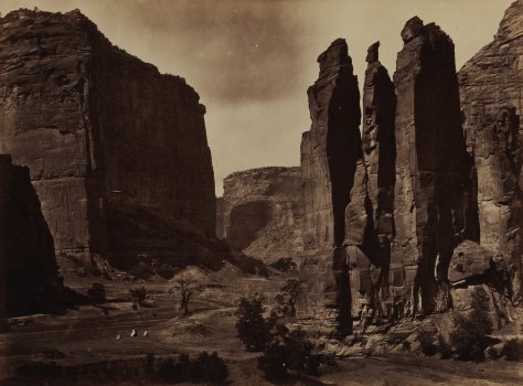
The main issue is that it sort of waffles between being organized thematically versus being ordered chronologically. The wall text suggests that things are chronological but the actual photos for a supposed time period end up covering over a century. This is most obvious in the Early Landscapes room. It feels like it’s about the 19th century Watkins, Russell, Muybridge, and O’Sullivan school of mammoth plates, albumen prints, pristine spectacular western landscapes, and our early attempts at taming them. But it goes into Ansel Adams work from ~50 years later and even includes a Friedlander photo from 2004.

In many ways the exhibition would’ve been better off just making the rooms purely thematic—similar to Oakland’s Inspiration Points show a couple years ago. This is pretty much how I chose to approach the show after the first couple of rooms. By focusing on the themes and ignoring the chronology cues, I found myself thinking about how each theme could cover ~150 years of photography in the West.

Early Landscapes was intended to set up a transition to the New West.* These photographs are very much my thing. I love Baltz and Robert Adams. Henry Wessel’s photo of the  Richmond garage tree is fantastic.** It’s always nice to see Shore prints.

*I’m tempted to start calling the pristine landscapes either “Old West” or “Old Topographics” a retronyms to either The New West or The New Topographics.

**And I’m completely unable to find it online anywhere.

The comparison between these views of The West is one which I feel deeply in my own photography. I very much love going out into nature and hiking with my camera. I also love going out into the suburban sprawl and taking photos of—and criticizing—the cityscape that has resulted. They’re more than just a core part of my visual literacy, they’re home. 

I also like the older landscape photography because of how its message differs from landscape photography today. Modern landscape photography is often environmental-minded, relying on the glory of unspoiled nature to remind the viewer that nature needs to be preserved. 150 years ago, the message was almost the opposite. The glory of unspoiled nature was all potential and something we could, and should, tame.

Carleton Watkins: The Stanford Albums

While the Old West is distinct from the New West, the New West is visible in many of the Old West photos. “Photographing the incursion of technology into nature” is one of photography’s original subjects. Watkins and Robert Adams may have had different goals with their photography, but we can see as many similarities in their work as we can see between Watkins and Ansel Adams.

I found it interesting that the conflict and chaos theme—really more about demographic change—only started with photos from the 1960s. Muybridge photographed the Modoc War 100 years prior.* Dorothea Lange has photographs from the Great Depression in the adjoining room. The history of California is a history of conflict and demographic change, it’s not something which started in the 60s.

*Also an exhibition at the California Historical Society which I need to see this summer.

I do however enjoy seeing how photographers address the social issues of their time. Where political comment is often absent from the rest of the modern art canon,* photography has always been on the front lines. As much as there’s disagreement about what the democratic camera means, it’s pretty clear that as an art form, photography is somewhat unique in how it’s accessible to many more people and has always had an element of not just witnessing, but being part of any conflicts.

*In the rest of the museum, it’s only visible in the Anselm Keifer and Gerhard Richter rooms. But for the rest of the art from the 1960s and 1970s? If there were politics in it it’s long been scrubbed from the wall texts. 

It’s not just conflicts either. A lot of the changes are long-term gradual things which may not even depict changes but rather illustrate existing inequality. These images though, by Jim Goldberg or Carrie Mae Weems, get short shrift in this exhibition. Goldberg’s Rich and Poor is hung on both sides of a hallway—which makes no sense for a series which encourages both close inspection and zig-zagging between images. Weems’s From Here I Saw What Happened and I Cried meanwhile is one of those photo series which needs to be seen in its entirety yet only two of the images are on display.

That economic and racial inequality are the two big issues for this year’s election, I can’t help but sort of side-eye the way both of them are minimized here.

Speaking of Lange and social justice, while I approve of featuring the “founders/ƒ.64” as being an important theme of western photography, keeping so much of their work outside of the themes in the rest of the rooms felt strange. The group wasn’t about content but rather technique. Their photos fit with all the other themes in the exhibition. There are pristine landscapes, technological changes, and demographic conflicts on display here, but the exercise in tying them into the other rooms is left to the viewer.

As an ƒ.64 room though I liked that they stayed away from most of the super-iconic photos. There’s Lange’s road. And a few of the Weston images are very familiar. But this room could have been full of just photographs I’ve seen over and over again.* I enjoy just absorbing more of their other work.

*Note, there should probably be such a room at SFMOMA because many of those ƒ.64 photos are extremely important to both photography and the idea that photography is art and all of them are inherently part of the Bay Area’s role in art history.

The last theme involves photographers playing with the medium itself. I’ve been on record saying that I consider Weston to be part of this group but most of these photos are much more recent. As such, many of them don’t quite do it for me.* The ones that do though I really like. In particular, Larry Sultan using day laborers as models and the weird ethical questions they create in the resulting photos. Did they know what they were getting in to? What does it mean to stage photos of gente day laborers using those day laborers as models? I don’t have good answers here either but I enjoy thinking about the questions.

*Contemporary Art is still being sorted by Sturgeon’s Law.

I also loved Klea McKenna’s photograms. And it’s always nice to see Trevor Paglen on display although putting him in the playing-with-the-medium room risks reducing a lot of his work to being about technique rather than interrogating the inherent nature of photography as being surveillance.

Looking at the recent photos though provides a clear example of how art photography has embraced the “make it fucking large” ethos of the collector-driven market. So many of the prints are not just huge, but possibly too big to the point that they feel like they’re only trying to be appreciated for their size rather than as images to be looked at. I understand why this is the case* but I don’t have to like the results.

*They have to compete with paintings and other media in a “bigger is better” arms race in the art-collector world rather than focusing on just photography collectors.

So yeah. I like many of the individual photos but was kind of unsold on the larger theme of the exhibition. As with the opening shows in the rest of the museum, this felt very much like a for-the-masses sketch of possibilities for future shows while staking a claim on a lot of territory.

Consuelo Kanaga. Annie Mae Meriwether, 1935

Portraits and Other Likenesses

This originally posted in a slightly different form on NJWV.


I made it up to San Francisco last week to see SFMOMA’s Portraits and Other Likenesses show at the Museum of the African Diaspora. I always love seeing shows which include photos, paintings and sculpture all in conversation together. As a photo-leaning person it’s especially nice to see photography taken out of its own little bubble. This show mixes all media together under the umbrella of portraiture—in this case taken broadly as any artwork that represents a person or people. I’ve seen a few SFMOMA on the go shows now that have done this and I hope it bodes well for the approach the new and improved museum will take when it opens next year.

I am increasingly interested in issues involving portraiture and representation and how frequently-stereotyped communities choose to represent themselvesNavigating the tropes of how they’ve been represented and othered is both difficult and fertile territory. The individual pieces on display aren’t always directly about representation but the entire show, by consisting of representations of blackness by black artists, is.

This is difficult territory. There are so many representations on display— costumespersonalstereotypes, etc. And there are multiple levels of thought behind all of them. This show invites me to look and stare without flinching. As a non-black person of color I ended up both confronting a lot of my socialization as to what my instincts are when viewing black people while simultaneously sympathizing with the amount of effort it takes to present yourself to the white world.

Stereotypes suck. Especially in how they make you second guess and overthink everything in your self-presentation.* Do you avoid the stereotypes even if you happen to enjoy some of them? Do you have to dress extra nice whenever you go out? Is your presentation of beauty based on white beauty standards?

*Man do I wish SFMOMA had a copy of Carrie Mae Weems’s Ain’t Jokin in addition to Boneyard. Also, I wish there was more by Fred Wilson than Me and It. Sadly, SFMOMA appears to be thin on both of their work.

Consuelo Kanaga. Annie Mae Meriwether, 1935

And at a certain level almost everything on display is intended for white consumption. Who else buys art? So while there may be important statements in a piece, the way the art market chooses to frame it ends up being out of the control of the artist—no matter how intelligently-considered the representation is, at the end of things it’s still warped by being put in a museum. I wish I could remember the full details of Annie Mae Meriweather’s* story but the story of Consuelo Kanaga’s portrait of her being reduced to just its beauty demonstrates how cruel the market is.

*Google does turn up a Woody Guthrie story related to her but nothing about the photo.

I have similar feelings of guilt by how much I love Seydou Keïta’s work. I’m reacting to the image because of its almost-effortless grace and beauty* while at the same time not knowing, or even really caring, about the subject—who he is, why he might be having his portrait taken, what was going on in Mali at the time.  Yes, there may be perfectly legitimate reasons for the erasure of much of the contextual information, but at the same time I’m still consuming his image** in a way that embodies a lot of the things I dislike about photography. I don’t like erasing the humanity of the subject and while I try not to do it here, I find myself slipping each time I view it and swoon at its beauty.

*There are days when this is my favorite photograph ever taken.

**I’ve seen this image described on occasion as a self-portrait. I’ve never seen this description though in an actual museum. And I’m not sure if his official website is treating it as a headshot or just the best example of his work. If it is indeed a self-portrait I’ll feel a lot better about liking it.

This is potentially bad behavior with many subjects but with black subjects it’s especially awful. The spectre of Black Lives Matter and all the police violence in the news over the past few years is unavoidable. Pieces here touch on issues of presenting and demonstrating and claiming humanity in the white world—actions that shouldn’t be necessary but frustratingly are. And despite all that it’s still frightening easy to erase their humanity and see just surfaces and tropes. This is deadly and violent behavior.

Which is why Glenn Ligon’s Narratives is my favorite piece in the show. They don’t just reference slave narratives and how humanity gets mediated by whiteness. They also, through their size, suggest fugitive slave posters and the erasure of humanity by whiteness. Yet they’re written fully by Ligon so it’s clear that he’s in control and crafting his own story—explicitly bringing together many different threads of the performative aspects of race, americana, assimilation, and authenticity.

The entire content of the pieces are details about Ligon’s humanity—details you’re invited and encouraged to look closely and really observe. It’s a presentation, and representation, that is difficult to erase. That it’s often wickedly funny is the icing on the cake.

Lynette Yiadom-Boakye. Sapphires Under Cotton, 2013

Caille Millner

I timed my visit to correspond to Caille Millner’s short talk on the exhibition. I’ve been following her on Twitter and Tumblr for a few years now and I was interested in her observations. I was not disappointed. She discussed two of my favorite pieces (Keïta and Ligon) and I especially loved her comments on Keïta where she placed the image as exemplifying, for her, Mali’s belle epoque and the brief joyous period when independence from France was coming but the the realities of being an independent country and undergoing a military coup hadn’t blotted the horizon.* Comparing Keïta and James Van Der Zee by contrasting the societal context and internal migrations going on when each photograph was taken is a great way to think about them

*It helped that I was standing in front of a case of 1960s Malick Sidibé photos while she was making these comments.

Millner also had some nice comments on Lynette Yiadom-Boakye and the idea of portraits of non-existent people. Yiadom-Boakye’s work is also complicated—in a very good way. I share Millner’s concern about how making people up as a way to address a lack of representation may not be the best way to address an erasure. At the same time, there is something to appropriating classic western/white techniques and making them your own. I also thought of Medieval People of Color’s ongoing work in highlighting the black servants in these classic paintings and how those servants are often crushed into unrecognizable shadows in photo reproductions of those works. There’s an aspect of this piece that I see as being the painting equivalent of fighting against Shirley and learning to depict black skin.

The audience discussion about Yiadom-Boakye and Van Der Zee though had me shaking my head and thinking about white comfort. Van Der Zee is a name. When The Met digitized all of its photography holdings, a number of us started counting and confirmed that he was the exception to all their non-white photographers. He’s someone you’re supposed to know and boy did the white audience know him. Lots of comments, most of which seemed intended to demonstrate that they’d heard of him and accepted him as a master. Similarly, Yiadom-Boakye seemed to relax those people because it looked familiar and like other things they’d learned to think of as good.* It was safe and comfortable to appreciate it.

*Reminding me a bit of watching Death and the King’s Horseman at Ashland and how the audience was super-uncomfortable for most of it until the white characters came on stage.

Which frustrates me because this was a museum of black artists. As a visitor, you’d expect and want to be introduced to people you’ve never heard of in the general museum circuit and to gravitate toward the names and styles you recognize misses the point.