Tag Archives: Pier 24

Henry Wessel

The Grain of the Present

Note: This originally posted on NJWV.

LaToya Ruby Frazier
LaToya Ruby Frazier
Robert Adams
Robert Adams
Robert Adams
Robert Adams
Lee Friedlander
Lee Friedlander
Henry Wessel
Henry Wessel
Vanessa Winship
Vanessa Winship

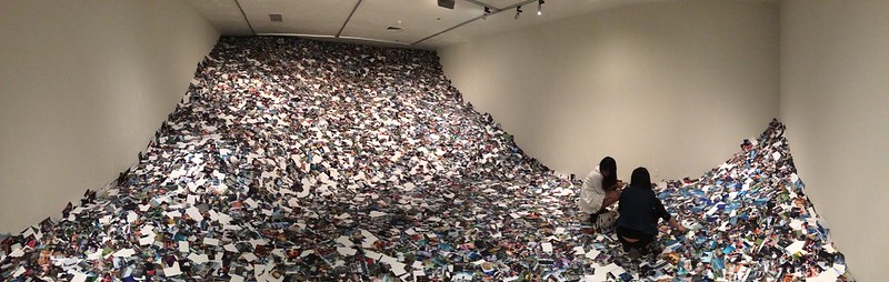
Took my second trip to Pier 24, this time to see their Grain of the Present exhibition. Pier 24’s shows are so expansive and generous with the amount of material from each artist that I find it difficult to write about the show in general. Too many directions to go and things to think about.

That said, most of the photographs on display do reflect a sublime sense of photography as a reactive, perceptive medium. Rather than being previsualized images, we see the products of the photographer recognizing something they liked and finding a way to get the shot before the moment passed. At their best, the resulting photos both show each photographer’s unique point of view and help us learn more perceptive ways of seeing the world around us.

The highlights especially deserve to get mentioned individually. I’m just going to go in alphabetical order.

For Robert Adams they had a selection of his Prairie shots up. Adams is in this show because of his involvement in New Topographics but instead of looking at any New West of suburbs and development, we got to see effectively pre-suburban living. Same eye but a very different feel. Time’s stopped. Hope remains. There’s something elegiac because we can sense the decline coming.

Lewis Baltz meanwhile continues being arguably my favorite photographer. I’ve never seen all of Candlestick Point before and I’ve very glad I got a chance to do so here. Being able to explore the photos in a grid is a wonderful way to explore the work and feel my way around both the location and the images. There’s so much sublime subtle stuff going on with the light and the shadows and reflections.

LaToya Ruby Frazier is probably the highlight of the show. I love the mix of scales and subject matter. Her family photos are small and intimate and feel incredibly personal. Yet at the same time I’m reminded of watching my grandparents age. Her cityscapes are completely different. Large, detailed, inquisitive, showing aging buildings and disappearing industries. And they work perfectly with the family images. The big photos need to be big. The small ones need to be small. But in all cases the images are keenly seen and personal.

Lee Friedlander’s Little Screens are hilarious. They’re very much of their time in terms of the hardware, furniture, and tv shows shown. But they’re also entirely suggestive of our screen addictions today. It’s one of those simple ideas which could come off as either a trite gimmick or heavy-handed snark but instead Friedlander’s treatment reveals the humor of how we just shove the TV wherever it fits in a room yet it still becomes the focal point.

I enjoyed Ed Panar’s work and how he keeps returning to the same subjects. While many of the galleries emphasize the idea of being receptive to images when you’re out and about, much of Panar’s work can be seen as recognizing that something as imminently familiar as the view from your front porch or your daily walk is also always changing and will occasionally present itself as a photo worth taking.

Henry Wessel is also always great and I was very excited to see his photo of Richmond again. It was one of my favorite things in the new SFMOMA yet I couldn’t find an image of it anywhere online. I’m glad I got a second chance. Wessel, probably more than any other photographer in this show, fits the description of someone who’s out there just finding photographs with his camera. I know there’s more to it than that but there’s a certain casual grace in his shots that I both admire and envy.

He’s neither super-precise nor is he consciously rough. The light and tones are always this perfect combination of having a slight low-contrast glow while still popping crisply off the page. And his sense California reminds me of home—especially now that I live in New Jersey.

And Vanessa Winship. I like her very much. Her work, especially her portraits, also has a certain grace about it. It’s much more precise than Wessel but there’s a gentleness in the images where I don’t feel like I’m being prompted to gawk at anyone.

I didn’t include Diane Arbus or Stephen Shore in the highlights because, as great as their work is to see in-person, I’m already very familiar with it. While all the older photographers in the show were selected because of their association with New Topographics or New Documents, only Arbus’s and Shore’s work has a massive overlap with the images displayed in those two exhibitions.

That said, Arbus is a nice example of how being receptive to a photograph doesn’t mean grabbing a snapshot and moving on. Arbus’s portraits are keenly seen in terms of how she chooses her subject. That the resulting images are part of an impromptu portrait session doesn’t diminish their spontaneity.

What didn’t fit the Theme

Bernd and Hilla Becher

Each photographer draws inspiration from the ordinary moments of life, often seeing what others overlook—and showing us if you look closely, you can find beauty in the smallest aspects of your surroundings.

Some of the photos on display though just didn’t fit the concept of the show for me. Some may ask us to look closely and see what other people may not see. But they’re not really ordinary moments. Others are indeed ordinary moments but do not show us anything novel. Note, this doesn’t mean that I think these photos are bad, just that, within the context of this show, I wasn’t feeling it.

First, Bernd and Hilla Becher. I love them and their typologies and can sit in a room full of those photo grids for hours. But there’s no sense of moment at all in the photos.

Nicholas Nixon’s Brown Sisters is sort of similar. It’s a project I adore and am already steeling myself for when it devastates me—it’s guaranteed to eventually devastate me. And it does capture an ordinary moment. We all take family photos and can relate to the truths within this project. But this particular project has always been clearly much more than a mere family photo in both the repetition and the collaboration between all five people involved in its production that it feels out of place among the rest of the projects on display.

I feel a bit bad putting Awoiska van der Molen’s work here but I just never got the sense of moment at all from it. Her photos are nice enough and, in a different space with a different context,* may have moved me. But in this space, they felt like a more academic exercise amidst photographers who were working on a much more intuitive level.

*The Pier 24 no context thing may also have served her work particularly badly since her titles and descriptions are just as vague.

And Garry Winogrand’s Women are Beautiful was the exact wrong photo series to choose. Yeesh. I’ve tried to rationalize my feelings about it in the past but I also don’t think I’ve ever been subjected to the entire set. Caille Millner is right. It’s creepy and intrusive as all hell. Yes the ice cream woman is a great photo. As is the LaGuardia bar photo. As are a few others. But the rest? Good lord. For most of those photos there are literally only two reasons why he triggered the shutter. And they’re usually braless.

To include those in an exhibition of “see what others overlook” is either hilariously tone deaf or an ironic joke doomed to fail due to Pier 24’s lack of context. Winogrand deserves better than that. I would’ve been filled with joy had it been The Animals which got selected.

On Print Sizes

Eamonn Doyle
Eamonn Doyle

The first room of this exhibition included a sample from every photographer in the show. It was immediately apparent who the new photographers were compared to the old ones. If it’s printed huge? New photographer. If it’s a nice small size? Old photographer. New photography is hug both because new art is huge and because digital technology allows for photography to be printed huge.

I don’t like this tendency and feel like it frequently gets in the way of the photos. It’s probably no surprise that the two new photographers whose work I really liked had a mix of small and larger prints which gave me the impression that they’d really considered the optimal size for each image.

Alec Soth’s Niagara is a series I’m familiar with but which I’ve never seen in person. I like it better as a book. The giant wall-size photos of the falls and the hotels work ok. Still too large but the geometry of the hotel architecture gets abstracted nicely at that scale. The portraits though are kind of monstrous. I find myself wondering if the sitters realized their nudes would be larger than life and if Soth intended for us to gawk at them. It’s not an empathetic scale.

Eamonn Doyle’s i suffers similarly in that it feels both intrusive and, rather than inviting us to look closely, enlarges everything to the point where subtlety gets lost. I was dubious as it was about whether his cleverness was enough to sustain a book. It definitely doesn’t scale to giant-size images. Sometimes a clever idea only works at a small scale. I can see these working fine arranged as small prints on a single wall the way that Winogrand, Friedlander, and Baltz were displayed.

And holy moly Women Are Beautiful would be an order of magnitude creepier if it were printed at modern sizes.

Other Comments

A few random comments and observations which don’t fit with the rest of this post—many of which refer to specific things I’ve not seen before.

While the lack of context information at Pier 24 doesn’t bother me too much, I do find myself being dismayed by the absence of any process information too. I think it’s important to know what kinds of prints we’re looking at as the distinct photographic printing processes all result in different kinds of objects.

Henry Wessel
Henry Wessel

The grid of color Wessel photos! Not something I every imagined and definitely not my mental conception of his work. I was amazed that they kind of amazingly had the same light and contrast as his black and white photos do. How does he do that?

Bernd and Hilla Becher

I have never seen non-typology wide Becher photos before either. I like that they still include typologies in the frame. Also, looking at their grid of spherical tanks makes me want to shoot a typology of soccer balls for all the different patch tiling.

Diane Arbus
Diane Arbus

San Francisco is full of “Summer of Love” celebrations right now. That Arbus’s Boy with Straw Hat is ALSO from 1967 is a bit of a coincidence but also felt like a wry joke at how it feels like the summer of 1967 has become a myth about peace love and happiness reigning unencumbered by war or racial inequality.

And back to Baltz’s Candlestick Point. As much as I enjoyed the entire set I also couldn’t help shaking the feeling that I must’ve parked in a few of these locations. Candlestick’s overflow lots were dirt and occupied a lot of the land that Baltz was photographing. Many of the images felt familiar to me as places which I walked through before and after Giants games with that oddly hot and direct mid-day sun or the brutal cold wind which whipped up in the afternoon.

Pier 24 / Erik Kessels

Pier 24: (Sloppy) Second(s)hand

Purely coincidentally, I also recently went to see Secondhand at Pier 24. My thoughts about it are fewer and less interesting than @vossbrink’s, so I’ll try to express them with some brevity.

Pier 24

Pier 24 is weird. I’m not big on museums and galleries generally, and this was perhaps my least favorite experience in one, because it is one of the least accessible contexts I’ve encountered for viewing art.

To start with, it is only open during weekday working hours, and by appointment. It’s free, which is nice, but it is essentially never accessible to someone with a regular work week. That speaks volumes to who it (isn’t) for, and is one of the major reasons why I hadn’t visited previously.

The “no text on the walls” gimmick is ::shrug:: for me. I’m sure there’s an argument to be made for letting work speak for itself, but I’m not the one to make it. (And if you make it to me, it’ll probably sound like the voices of the adults in Charlie Brown.) Public-facing displays of art should include as much useful context as is feasible. This is my stance regardless of whether the work in question is something I happen to know a decent bit about or not.1

That said, the information in the book is adequate. I don’t think I gained anything from reading it in a book rather than looking at it on the wall. Mainly it just induced unnecessary cognitive dissonance to navigate a relatively non-linear space while flipping through an extremely linear book.

Kessels

Erik Kessels seemed to be What It Was About, with other artists rounding things out a bit, and in some cases (the Richard Prince cowboy) seeming actually a bit out of place and gratuitous.

The Kessels stuff seemed to be largely about playing with scale. Expanding and exploding. Or reducing and inundating. The result is very clever.2 I was repeatedly put in mind of those Stephen Biesty cross-section books, not because Kessel’s explosions are illustrative, but because they look like something that has been chopped up into pieces.

That being said, I did think the big Photo Cubes were pretty funny.

Pier 24: Secondhand

The Big Fucking Roomful of 4×6 Prints3 was also entertaining, mostly just because it was fun to watch people get down into the piles and investigate them under the supervision of a bored-looking docent. I also found myself for the first time actually appreciating watermarks on photos, because they provided a layer of information about the image’s source that was otherwise missing.4

Pier 24: Secondhand

I wasn’t taken with Kessels’s provided explanation of the room’s purpose:

I visualize the feeling of drowning in representations of other peoples’ experiences.

Not to rehash The 1978 Test, but what is the mindset of the artist for whom an image glut is a problem or source of fear and anxiety? Why does or should an abundance of imagery induce a feeling of drowning?

A whole world full of other people and their experiences was always there before. And unless artists are all thoroughgoing solipsists, they must know that. So why is the representation of those experiences perceived as overwhelming? Why does the artist (and why is the viewer expected to) “drown” in it? Why can I not escape the feeling that the so-called vernacular image can only manifest to artists and curators as a problem to be solved or an opportunity to exploited? Is the place of an artist in the world dependent on the anonymity and invisibility of everyone else in it?

I sometimes think that at heart, the “serious” photographer has never really evolved past the original form of the camera operator: a person whose vocation is defined primarily by access to a novel technology which for their audience is still unavailable or mysterious. The photographer as gadgeteer has generally been scorned by those who pursued the medium as an art, but maybe that was always just a case of Protesting Too Much. And maybe, deep down, this secret shame has been driving art photography all along.

Or maybe not. But it’s one way to account for the persistent down-the-decades anxiety of the photographic artist confronted with a world of vernacular images.

Archive of Modern Conflict

Pier 24: Secondhand

Some of my favorite photographs were from the Archive of Modern Conflict—but as a series, it was not so great. Although I cannot find the tweet at the moment, I think @vossbrink put it as the whole being less than the sum of its parts. This, and a few of the other rooms as well, put me in mind of Szarkowski’s statement that

It is important to remember that an anonymous photographer is simply a photographer whose name we have lost, perhaps temporarily. When we recover it, and find out the name of his town and his wife (or her husband), we can begin writing dissertations about him or her, but the work has not changed.

This is, I suppose, a rather old-fashioned way to look at vernacular photographs. But more often than not, what I feel when I am looking at some photograph that has been appropriated into a sequence or other larger work is that really, I would rather know more about the person who made the photograph and less about the what the appropriating artist has decided it should now come to mean.

Hank Willis Thomas

Pier 24: Secondhand

One part of the whole experience that I really, really liked were Hank Willis Thomas’s flag presentation case…I’m not sure how to describe them except as photo tangrams, really. I don’t have anything illuminating to say about them, but they’re great.

And no, I didn’t just like them because I have a thing for flags. Although man, did I kick myself for not bringing my IR camera that day.

Appropriating Down

Something that @vossbrink and I have been talking about lately has been the difference between “appropriating up” and “appropriating down,” in the sense of “punching up” versus “punching down” in comedy.

This useful distinction has seen a lot of action over the last few years in discussions of comedy, and specifically who is or should be fair game as the butt of a joke. Basically, “punching up” means comedy that cuts at someone with more power than you, and “punching down” means comedy that cuts at someone with less power than you. Most non-assholes would agree that it makes more sense to look at edgy comedy this way than according to the rubric that everybody is fair game or that a comedian can be an “equal opportunity offender,” because of course the world is not a fair or equal one. Punching down is the comedic equivalent of bullying.5

Recently, and particularly in the context of discussion of Prince’s Instagram stuff, where—ethics & legality of re-use/copyright stuff notwithstanding—we’ve been thinking about appropriation in those “punch up”/”punch down” terms.

There’s a pretty big difference between the kind and quality of commentary and criticism we find in Prince’s use of Marlboro ad images and what we find in his use of images from Instagram. And thus a difference in the worth of those bodies of work.

I mentioned above that Prince’s cowboy is out of place in Secondhand; it’s because the majority of the show consists of work that appropriates down. I think there is no question that it is exploitive of photography produced by regular human beings—the most charitable question I can think to pose is whether it is merely exploitive in the sense of the exploitation of a natural resource. Conversely, many of the best works in Secondhand are the exceptions to this rule, the images that appropriate up by drawing on iconic historical images or imagery produced by governments or institutions.


  1. Granted, outside of the particular areas of photography that I’m very into, usually that’s “or not.” 
  2. As you may already know, I generally use “clever” in a derogatory sense; this is not an exception. 
  3. Not the actual title. 
  4. “A work of art so bad it made me reconsider my feelings about watermarks on digital photos” is a very mean sentence that I decided to put in a footnote instead of the body of the post. 
  5. Note: The meaning of the word “bullying” has been muddled somewhat recently, especially as regards online debates, especially by being used as a slur against legitimate criticism from women of color. I mean actual bullying as such, in which someone uses their size/power/money/etc. to go after someone with less size/power/money/etc. 
Larry Sultan and Mike Mandel. Evidence.

Pier 24: Secondhand

Note: This originally posted on NJWV.

On Context

Archive of Modern Conflict

While Ai Weiwei wasn’t on my list of things to see at all, Pier 24 was at the top. I’ve been jonesing to go for years and just never managed to get my plans in order to get there. The current show features appropriated photos which, while something I’ve enjoyed intellectually in small doses, I was not sure I was ready for a full-on overload of.

I shouldn’t have worried. The space itself is awesome and the collection is more of a “physical version of a huge website”* in that is seems to have any photo series or print which you’d want to see from the canon.** It’s especially focused on photo series. Many of the rooms have at least one complete series of images. Since I’m used to seeing only one or two prints from each series in a museum, I loved being able to see the complete groups for a change. I can really get into what a specific photographer is doing, both from a sequence and a grouping point of view. It also assuaged a lot of my concerns as a context guy since Pier 24 is also known for its absence of context.

*A description someone much smarter than me came up with but which really captures the scope of the place.

**Comments about the demographics of the canon are best left for a different post.

Pier 24 doesn’t have wall text so you have to open up the exhibition guide to figure out what you’re actually looking at. The guide meanwhile only has super basic information—artist identification and a single project statement. As a result, a lot of people hold up Pier 24 to demonstrate how “only the image matters” or “context is irrelevant.” Inside Pier 24, I can see how that argument holds water. But that’s only because the space provides the context. Displaying the full series all together eliminates a lot of the descriptions that have to accompany a single image displayed by itself. Similarly, the way the different series on display interact with each other provides additional context.

Much of the appeal photography holds for me is in how it’s basically an exercise in recontextualization. As soon as you take a photo, you’ve taken it out of context by choosing what’s in, and out, of the frame. The way you choose to display or share the image after taking it is a new context.* There can be no true absence of context—although I would completely agree that context can be meaningless or unhelpful. In the case of this exhibition, since it’s about appropriated photos and recontextualization, the initial decontextualization serves the general theme.

*As can be the way the world changes after you’ve displayed the images.

The most interesting room in Pier 24 for this is the series of rooms of the Archive of Modern Conflict. These rooms are pretty dense with salon-style hangings of all kinds of photographs. Vernacular photos are mixed with art photos are mixed with functional photos resulting in all kind of new connections between images despite there being no context about the origins of each specific image.

At the same time, something about these rooms doesn’t hold up for me. Without any information, I found myself looking at the images with the half-awake, short-attention-span mindset I look at things on the web. If it doesn’t grab me right now, why bother looking? I wasn’t just missing the original context of the images, I wasn’t finding much compelling in the new context.

Which gets at the dangerous thing about buying into the no-context-needed mindset. Poorly-thought-out context invites short-attention-span consumption. This is easy enough to default to without any additional encouragement and, while a legitimate way of approaching a lot of media, is not something I like museums and other places that typically intend to encourage more thoughtful looking (or, at least, that’s why I go to them) to engage in.

Reappropriating vs Mining

Hank Willis Thomas
Hank Willis Thomas

Pier 24’s Secondhand was an interesting double bill with San José’s Postdate. Both shows used repurposed photos but where San José involved reclaiming images from a colonial past—demonstrating a very activist way of appropriating—Pier 24 is almost all within the same sort of western tradition and feels more concerned with the surface of images rather than what’s underneath them.

A lot of the work,* focuses on mining archives and extracting keepers—whether sequences, groups, or individual images—that look interesting to us today. It’s tempting to call this kind of thing “curation” only there’s no illumination provided.** They’re generally not about what the photo means and are instead going for the “oh this looks interesting” reaction. Other work*** involves doing clever things to photos to create new, interesting things to look at but which don’t didn’t make me rethink the actual photos themselves.

*Such as with The Archive of Modern Conflict and Erik Kessels (more on him later).

**One of my pet peeves is the way “curation” has become used on the web as a way of describing collections which, while often very tastefully selected, provide no information or educational information about what the point is.

***Most notably for me, Daniel Gordon and Maurizio Anzeri.

In both cases, the results can look pretty fun without really saying much. This isn’t a knock on what was on display, just that after having seen another exhibit which really investigated how powerful appropriation could be—especially in the context of colonialism and the representation of the powerless—I found myself wanting to see more work which explicitly examines the cultural context of the images, presents other meanings, and brings the appropriated images from the past into the present.

The only artist on the show who really did this was Hank Willis Thomas. His work in Pier 24—as well as his recent Unbranded work—looks at more than just how the photos look and instead focuses on the content of the photos and how our understanding of that content has changed over time. His work in the show was also particularly relevant given how Black Lives Matter has been constant over the past couple years. Viewing a lot of the older, recognizable but still-charged images through the flag frames suggests how these are commemorated and remembered as accomplishments rather than as part of an ongoing fight.

Erik Kessels & Vernacular Archives

Erik Kessels. Album Beauty.
Erik Kessels. In Almost Every Picture.

Erik Kessels deserves specific comment since, not only does he appear to be the main attraction in the exhibition, much of his work critiques our concepts of vernacular photography and makes us think about how we use images.

One of the things that bugs me about a lot of current photography writing is its tendency to state that people did a good job organizing their photos in the past. From what I’ve seen looking at my friends’s and family’s photos is that staying on top of the photo albums was as rare and difficult to do then as keeping digital images organized now is. Even most people who did do a good job making albums have boxes of decades-old images that they haven’t gone through yet.

Managing and mining this archive—whether digital or physical—is a daunting task. What I like about Kessels is how he suggests other ways of using images than the pure documentary mindset that governs most archives of vernacular photos. In Almost Every Picture has a number of series that pull a common theme—a spouse, a pet, fingers covering the lens, carnival prizes—out of a larger cache of images. The archive doesn’t have to tell a story chronologically, it can have a completely different theme and the chronology will still be accessible. People age, fashions change, we can sense the passage of time despite the focus being something else.

As someone who’s still working through doing something with my photos, seeing alternative ways to approach my own archive is great to see.

Album Beauty meanwhile made me start thinking more about vernacular photos as common memory. While extracting specific series or groups of interest out of a vernacular archive is a nice skill to create fun sequences which tell small quirky stories, much of the appeal of vernacular photos is in their entire corpus and how they show us images that remind us of moments in our own lives.

This is something that Colors of Confinement touched on as well. Because so many Japanese internees have a gap in their family photos from the internment years, the photos that do exist from the camps work to remind them of their own experiences. It’s easy to say how photos erode memories by replacing them with whatever’s in the photograph, looking at other albums demonstrates how photos trigger memories as well.

Vernacular photographs,* describe a sense of place and time in a way that allows for our own memories of that period to be part of the experience. We flip through the contents of an album and pause when we see something that reminds us of our own experiences—a location we also visited, clothing or hairstyles that made us look awful, toys we played with or coveted. Ideally we’re looking through the album with someone else so the pause can become conversation as we share stories. But even if we’re on our own, the pause and remembering and slight smile in recognition will occur before we go back to looking.

*Though this is also something that the “snapshot esthetic” can do too. Blake Andrews’s review of The Family Acid is very relevant here.

And it doesn’t have to be an album. It could be a shoebox of prints or a carousel full of slides. Those are just as much fun to look through and, in some ways are a better shared experiences than an album is since it’s easier to pass individual prints or slides around.

Which brings me to 24 hours of Flickr. This room gets mentioned in every writeup I’ve seen on this show. It didn’t do much for me. It kind of feels like a physical statement about how awful the current deluge of photos is compared to how great the nicely-organized albums of the past were. Yes, people upload way more photos than they’d have printed in the past. And yes, 90% of those photos are crap. But there’s nothing gained by seeing how many 4″×6″ prints a days worth of uploads translates to.

What I took away from that room was how respectfully I treat photographic prints. In a room full of prints, all of which were treated as basically disposable trash, I still found myself trying not to step on any of them—even the brick-wall test shots half-covered in a low-resolution watermark.

Photographs as Byproduct

Larry Sultan and Mike Mandel. Evidence.

24_Baseball
24_Postcards
The rooms I liked best though contained photographs which were, essentially, byproducts of other ventures. Rather than being vernacular photos that people took to document their lives, these are things produced by governmentbig business, or a media company as part of an offered product or service. Some are intended as communication and illustration to accompany other information; some are merely an intermediate step of a production process; and others are artifacts that happen to feature photography but aren’t photos themselves.

The highlight is Larry Sultan and Mike Mandel’s Evidence. It’s one of the granddaddies of the field of appropriated photography and it’s awesome. Is it a bit superficial? Absolutely. But it’s funny and bizarre and simply a very well-selected sequence. I find it hard to believe it’s as old as it is since it still sets the bar for this kind of thing as an example for how decontextualization and recontextualization can work.

The photos in Evidence come from all sorts of governmental and industry archives. By themselves, in their original context, they would have been pretty boring, of interest to a small, specific audience—quite possibly boring to even that audience. Out of context and grouped together though makes these technically-competent photos anything but boring. Rather than wanting to know what’s going on, I found myself making up my own narratives and noticing things in the images that weren’t originally the main point—like the interactions between people in a group shot or the way a headless person is holding the intended subject of the image.

I also really liked Viktoria Binschtok’s work investigating the locations of Google Street View (GSV)photos. There have been a lot of GSV projects but I really like the idea of not just rephotographing the street view image but going inside and making the automated, corporate image into a real place. GSV in many ways demonstrates everything that makes for bad photography. It’s automated and distant and unedited and presents an unnatural point of view. But these are also what make it so compelling to play with. There is no existing editorial voice to contend with and you can sit down, dig though as much of the archive as you can handle, and do whatever you want with the results.

Most of the projects though have been either commentaries of GSV itself or attempted to find street view images that looked like “real”* photographs.  Binschtok though uses GSV as just the jumping off point to play with the concept of intent. Her photographs paired with the GSV imagery produce a result that makes both much more interesting. It reminds me a little of rephotographing Stephen Shore with GSV but rather than starting with the interesting, fully-intended image and showing how bland the location looks on Google, these start with the bland GSV images and force us to see how they can be transformed by looking with intent instead.

*Read, images that look like the accepted canon of “good” photography. This is also an idea that deserves a post all of its own.

The collections of photos that have been prepared for halftoning and printing are fascinating.* These are byproducts of the printing process. They’re not the original negatives nor are they the final halftoned prints. Instead they’re photographs which have been painted and marked up to improve the contrast and eliminated unwanted details so that they will reproduce well after offset printing.

*Especially given my background in printing. I’ve worked as a prepress operator at an offset printing shop as well as an OEM support lead for digital printing and so have lived the “how to go from paste-up (or digital file) to printed page” life for over a decade.

This is the kind of thing that would be called cheating today so it’s instructive to see how much manipulation was required in order to get a usable final image. None of these photos are lying even though they’re all faked. It’s also a reminder of how much image processing is always needed behind the scenes in order to make a decent photographic print.

Outside of being a reminder of how photographs end up on paper, these objects are also wonderful commentaries on photography as an exercise in recontextualization. They’re not just extracting what’s in the photo from what’s outside it, they’re also painting out details and reframing what’s in the photo as well—in-game action photos become posed studio images, group photos become headshots. And then they’re put on the wall of a museum where we no longer know who the players are you see what an editor selected decades ago as the most-important part of these images.

Finally, there are photos which are used as the substrate for other products. The embroidered postcards are beautiful objects and the ID badges are great fun to look at. In neither case am I really looking at the photos though. I’m seeing them as objects and remnants of a specific period of time. I appreciate seeing multiple specimens—Pier 24’s scale does most of the heavy lifting here—as I can get a better sense of the craft and usage of the pieces.

It’s no surprise that my favorite pieces at Pier 24 were these byproduct photos. They were useful objects which we can relate to—even after their previous functions are no longer needed or remembered, we recognize enough about how they were used. Recontextualizing them into a museum allows us to relate to them as useful objects and appreciate the new context along with the original craft. Looking at photography—or really anything else in a museum—needs to be more than just an academic surface-level exercise for me. I need to see what the photos are doing, how they’re being used, or what statement they’re making.