Albert Bierstadt. Lake Tahoe, Spear Fishing by Torchlight, c. 1875.William Keith. Headwaters of the Merced, 1876.Carleton E. Watkins. Malakoff Diggins, North Bloomfield, Nevada County, Cal., ca. 1871.Thomas Hill. Untitled (Irrigating Strawberry Fields), 1888.Dorothea Lange. Field Worker Irrigating Alfalfa and Barley Fields, 1937.Ansel Adams. Shasta Dam and Mount Shasta, 1961.Richard Misrach. Diving Board, Salton Sea, 1983.Edward Burtynsky. Owens Lake #1, California, USA, 2009.David Maisel. The Lake Project 3, 2001.
The Stanford Museum’s Art of Water show is one of the most California exhibits I’ve ever seen. It’s very very interesting and very very good as it uses art’s depictions of water to tell California’s environmental history. Stanford’s press release is actually a great primer on what the exhibition is doing so I don’t need to rehash much of that part. But in short, while water access is one of, if not the, biggest issues in California, art has presented the opposite reality for much of California’s history.
Since artists are drawn to water as a subject, they gave impression that water is more prevalent than it really is. Combined with the way that early photography is often either “land which needs to be tamed,” or “land which has just been tamed” there’s a real sense of California as being the land of unlimited resources.
As someone who’s not normally interested in American landscape painting, I was very excited to look at the paintings with this context. It also forced me to think about the way my perspective is biased* in terms of the subjects I’m attracted to, the places trails take me to when I’m hiking, or the open space destinations I’ll drive to.
This view continues well into the 20th century as photographs of water infrastructure tell a story of continued development. I was reminded of the Edison Archive and how the increased water infrastructure is intimately tied to the creation of suburbia and the white consumer class. There’s still a sense of water being infinite and something that we should completely harness to power homes and fuel agriculture.
It’s only later when the environmental movement kicks off that we start to get more critical views of water usage. While there’s not much “traditional” environmental photography showing unspoiled nature which is under threat,* instead we jump straight to ironic views which riff on the expectations and show how we’ve depleted what little resources we actually had.
*While not photographing California, Eliot Porter is the best example of this type of thing.
In these cases we see how fragile water—and access to it—is. Lakebeds are drying up. A single pipe snakes vulnerably through the mountains. There’s not enough water to go around and the resulting ecosystem is an alien landscape of salt deposits which looks nothing like the lush depictions we’ve become used to.
Robert Dawson’s work is particularly noteworthy here. He just photographs the quixotic nature of water infrastructure but it’s so effective because of how much we’ve internalized what rivers and lakes and waterways should look like.
What I enjoyed most about the photography portion of this show though is how it not only tells the history of California but it also neatly fits into the old topographics vs new topographics story of photography. This results in a much-more-focused and much-more-coherent version of SFMOMA’s California and the West exhibition. It’s missing the social aspect of things but with regard to landscape photography, it makes a lot more sense.
The Wreck of the Viscata, 1868Sugar Loaf Islands and Seal Rocks, Farallons, 1868–69Alcatraz from North Point, 1862–1863Carleton Watkins. Magenta Flume Nevada Co. Cal., c. 1871The Yosemite Valley from the “Best General View” 1866.Pohono, the Bridal Veil, Yosemite 900 ft., 1865–1866Mt. Hood and the Dalles, Columbia River, 1867Cape Horn, Columbia River, 1867Cape Horn near Celilo, 1867
I’ve been gradually moving toward an appreciation of the older landscape photographers. This doesn’t mean I suddenly dislike the contrasty, technically-perfect Ansel Adams school of landscape photography.* But I’m finding myself liking photography which contains elements of embracing the inherent limitations of the medium—while pushing as hard against them as possible—rather than photography which tends to treat those limitations as flaws.
*Quite the opposite. Heck I still use a red-filter way too often when shooting black and white film.
Also, now that I’m living on the East Coast, I’ve gotten a lot more possessive about the West and find that media, of all sorts, has a tendency to trigger stronger feelings of home than it used to. Watkins, and much of the early landscape photography in general, is all about the American West and its myths. It’s what I grew up with and absorbed as part of my visual culture.
Which is why Carleton Watkins at Stanford was the exhibition I was most looking forward to seeing in California this summer. It did not disappoint.
The photos themselves are great. Albumen prints from mammoth plates show a lot of detail but in a hazy low-contrast way that’s quite different than what we’re used to seeing from “good” photography. In particular, there’s a lack of distance detail (blue-sensitive emulsions are sensitive to atmospheric haze) as well as often an uncertain black point (more like the D-max isn’t as dark as a modern D-max would be).
Water also behaves a lot differently between the long exposures and lack of highlight detail. Waves get flattened into haze and waterfalls turn into lightsources. It feels different than modern long-exposure water shots since Watkins’s photos don’t actually feel like long-exposures to me.
There’s something very evocative about all this. I find myself mentally adjusting the contrast and filling in details as I look over the photos. These details aren’t necessary to the images themselves but they engage my mind as I look them over. As “realistic” as the images are, they’re also much closer to paintings than modern photography in terms of how they make me imagine the scene. I’m not looking for small specific details in the frame (or noting those details the photographer has called out for me), I’m getting a sense of the place and letting my mind do the rest of the interpretation.
The technical limitations also mean that these photos often rely on shapes and forms and large-scale compositional elements which don’t require a lot of fine detail—something that will make all photographs better but is even more critical here. That said, there is a lot of fine detail present as well. For example, you can see the birds and the seals roosting on the Farallon Islands just as clearly as you can make out the forms of the rocks.
I also like the older landscape photography because of how its message differs from landscape photography today. Modern landscape photography is often environmental-minded, relying on the glory of unspoiled nature to remind the viewer that nature needs to be preserved. 150 years ago, the message was almost the opposite. The glory of unspoiled nature was all potential and something we could, and should, tame.
I don’t prefer the older message, I just like seeing the world when it had a different mindset. And I find that seeing that mindset makes a better case for why things should be different today. It’s been a century and a half. We should know better now.
One of the wonderful things about Watkins when compared to O’Sullivan and Russell is how his photos can work with both messages.
Much of Watkins’s work are industrial commissions showing development in San Francisco or mining operations in the Sierras. It’s very clear that he’s a working photographer tasked with making functional documentary images.
*There’s a great note in the wall text about how in the 1860s, the only two photographic series being viewed in the US were Watkins’s photos of the Pacific and Brady’s (and Gardner’s) photos of the Civil War. The text suggests how different these series must have seemed to the public. I also can’t wrap my head around there being only two photographic series in public consciousness for those years. Definitely not the world we live in today.
In both his commissioned work and in his Yosemite photos, you can see the conflicts between settlement and industry versus nature. Many of his industry photos feel like the struggle is still ongoing rather than complete—cities are still being built, nature still dwarfs the structures. Even where massive amounts of earth have been moved, the environmental consequences should already have been somewhat common knowledge in California.*
Similarly, many of his unspoiled Yosemite views feature development. A cabin or lodge here. A bridge there. Trees with all of their lower limbs harvested. Nature is glorious but our footprints are all over it still.
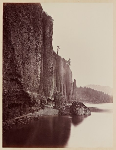
The Columbia River views are even better at making this point. Watkins documents what’s ostensibly a journey along a railroad along the river. The landscape here however dwarfs the technology and rather than documenting how a railroad is imposed on a landscape, the railroad here is often just taking what the landscape will let it take as it squeezes between the river and the cliffs.
The cliffs are huge. The river contains un-dammed rapids. This is spectacular country where the accomplishment is just getting there and reaching the end of the Oregon Trail.
It’s also impossible not to look at these historically. Not only is this San Francisco before the earthquake, it’s San Francisco while it was being built. A very different city with basically nothing recognizable to me, including the coastline. I can count 35 stars on the US flag.* Most-weird is looking at views of the California coast before Eucalyptus took over. This is home before it became home.
*Meaning it must have been taken in the one-year window between West Virginia’s admission in 1863 and Nevada’s in 1864. Assuming that people replaced old flags as soon as new states were admitted.
Watkins’s Yosemite photos also include the Indian names for everything. While we stile use many of those names, a lot has been renamed since. It’s nice to be reminded about whose land we’re on and how we’ve tended to erase or forget the origins of their names.
The exhibition also plays up the historic angle through a series of interactive multimedia displays featuring maps and rephotography so visitors can see what things look like today, where the photos were taken, or what changes have been made to the sites between then and now.
In addition to the multimedia displays, there’s actually a lot of other technical information beyond the photos. The exhibit talks about collodoin and wet-plate photography; albumen and contact printing; and even a bit at how a view camera works in terms of composing the scene. It’s nice to see the awareness that museumgoers probably have a much different concept about cameras and photography and that the difference in technology is hugely important to understanding a lot of what we’re looking at.
The Cantor even goes so far as to include examples of prints from Watkins’s negatives made by an inferior printer as well as calling out when Watkins switched from a normal to a wide angle lens.*
*According to the wall text, his 1861 Yosemite photos led to Congress’s Yosemite Land Grant in 1864 which led to the 1865 California Geologic survey of Yosemite for which Watkins acquired a wide angle lens.
It’s a great show. That it consists of photos that are housed at Stanford is even better. The Bay Area, still, does a lousy job of marketing its art holdings as being hugely important to the art world in general. So for a local institution to take its locally-relevant art holdings and put together a show like this is the icing on the cake.
I’ve always loved this series of images. Much of what I find appealing about Walker Evans in general is his love of type and letterforms. I’ve always seen his Common Tools photos as fitting perfectly with that mentality. First and foremost these are intended to be used for specific tasks and are the kinds of things that are easily overlooked and ignored unless they’re defective.
Stanford University Libraries. Carleton Watkins. The Domes from the Sentinel Dome, Yosemite.The Bancroft Library. Carleton Watkins. The Domes from the Sentinel Dome, Yosemite.J. Paul Getty Museum. Carleton Watkins. The Domes from the Sentinel Dome, Yosemite.The Metropolitan Museum of Art. Carleton Watkins. The Domes from the Sentinel Dome, Yosemite.
This is one Carleton Watkins picture printed four different times. It’s The Domes from the Sentinel Dome, Yosemite (1865-66). Different prints of the picture are in about a dozen different collections around the world.
This post also whets my appetite for the giant Watkins show at Stanford. It’s one of the most must-see things on my summer itinerary. Heck, I’ve already acquired the catalog since I know I’ll love this show.


![Week 8: [Crate Opener]](https://live.staticflickr.com/6118/6286879239_e6e37ba0bf_z.jpg)


