Tag Archives: featured

Trevor Paglen. Untitled (Reaper Drone), 2010

Covert Operations

Note: This originally posted on NJWV.

Jenny Holzer. Phoenix yellow white (detail), 2006

While I was in California this summer, I visited the San José Museum of Art to see the Covert Operations exhibition. Only part of the show was on display when I went* so this post covers both what I saw in the museum and what I’ve gotten from the catalog.** I’m used to treating catalogs as reminders of an exhibition so it’s a bit weird for me to be using one as a stand-in for portions of one. Thankfully, I saw most of the videos and video games in the show and have been using the book for the photography and painting—both of which translate much better to book form.

*It’s all up now.

**Which I flipped through in the museum to determine that it was worth getting. I have since spent a lot more time looking and reading through it.

On National Security

Trevor Paglen. Untitled (Reaper Drone), 2010

While the theme of this exhibition is covert operations, most of the work is actually about National Security and the things that government does under that aegis. A lot of work, such as Jenny Holzer’s redacted Freedom of Information Act request prints and Trevor Paglen’s Defense Department investigations offer glimpses of what’s going on when National Defense world intersects with the civilian world.

Holzer’s work takes advantage of the Freedom of Information Act and the theoretical ability of any citizen to request government records. The resulting documents are anything but transparent as they arrive covered with redactions. Holzer enlarges the documents to the point where they feel like Abstract Expressionist paintings—where text, redactions, handwritten notes, etc. all feel like they’re working together in a cohesive piece. Only instead of being abstract, these very clearly show, despite the redactions, many of the ugly details that go into providing what we think of as security.

Paglen’s photography looks almost conventionally pretty—star trails and sunsets—except that there’s one small detail which is off. Maybe it’s a Reaper Drone way off to the side. Maybe that non-star streak is actually a CIA satellite. His other work—in particular Code Names—similarly explores the small ways that the Security Apparatus intrudes into our world.

Meanwhile, other things aren’t really covert at all and just exist outside of the awareness of regular Americans. In particular, David Taylor’s Working the Line documents the security—and the security theater—on the US-Mexico border. There’s nothing especially confidential here, nor is there the sense that there’s a whole bunch of other infrastructure at the border that we’re not seeing. Still, the extent of physical security at the border and the way it’s actually implemented is quite different than the way that we think of it.

Taryn Simon’s photograph of the Alhurra studio is also something non-covert that we just aren’t aware of in the US. The entire point of this network is to be seen by Arab communities so it’s anything but a secret. Yet it’s not allowed to be broadcast in the US despite being based and funded here.

Taken together, all these pieces describe a massive amount of infrastructure and bureaucracy that we’re not aware of. Revealing only the tip of the iceberg allows us to think about how much is going on that we aren’t seeing at all. The way that much of what we do see is already horrifying should also make us really think about how much worse—whether in scale or in degree—the truly hidden stuff is.

But even the non-awful images reveal an apparatus that treats our safety as something where we don’t really want to know the details and assumes that we’ll sign off on anything in the name of security. It’s this assumption that disturbs me more since it’s carte blanche for security agencies to do whatever they want in the name of security while not informing us what it is that they’re doing. It also makes it very easy for those agencies to dismiss critiques and questions by referencing our ignorance of what’s “really” going on.

We’re assumed to not want to know, kept from knowing, and then criticized for not knowing. All in the name of our own safety and security. So I’m glad that people are calling out and highlighting what we can know. I love that many of these people are artists since it makes the glimpses much more accessible and the more of us who know, even a little bit, the better.

On Weaponizing Art and Games

Harun Farocki. Serious Games I: Watson is Down, 2009

Another extremely interesting concept in this exhibition is how it demonstrates the way art, photography, and video games—things which often get criticized as being inherently non-useful—can actually be effectively weaponized or used as diplomacy.

Photography is the most obvious example due to its interaction with surveillance, intrusiveness, and privacy issues being one of its defining characteristics since day one. That much of photography’s acceptance by the public has been a steady erosion of sensibilities regarding these issues is already scary. But even today, much of the concern is about photographs by other individuals rather than the government—we accept security cameras everywhere but freak out about a stranger with a cell phone. Yet it’s the security cameras which are more intrusive since they feed directly in to monitoring by the state. Which is why it’s important to keep in mind where security cameras get installed, who they’re actually monitoring, and whose interests they’re protecting.

The use of modern art as cultural diplomacy is less obvious but is explicitly mentioned by Taryn Simon’s photograph of the CIA art gallery. The connection between art and culture and the idea that “good” art demonstrates a superior culture is shocking to see laid out—even though it’s used by many people now to malign* art which has not been accepted as “good” in the West. It also forces us to really question our understandings of our own taste and how we learned what we like. I certainly didn’t even consider that it could reflect Cold War indoctrination about what is “American” (or at least non-communist) even though thinking about it now makes complete sense.

*Or the similarly-related phenomenon of only praising “foreign” art that feels western and familiar.

Video games get a lot of play here as well. Harun Farocki shows how, instead of being entertainment, they’re now used for military training—which is pretty cool in that it allows for a safer and more varied training experience. At the same time, it’s disturbing how easy it is to go from a medium of pure entertainment to something that’s life and death and literally training people how to kill other people. There’s no noticeable difference in the form, just the use case. That many of these training videos look less realistic than what’s currently on the market is the kind of thing that makes it very easy to see the defenses of video games as being “just a game” as being somewhat hollow.*

*I’m not anti video games, but I’m increasingly critical of everything about them as mass entertainment. 

On the positive side, the way video games are also used as therapy for soldiers recovering from the stress of battle is both interesting and promising. They’re not fun here either, but seeing them used in a much more life-giving situation is nice to see. Still, it’s interesting to note the differences in quality and how there is more effort spent on training than on rehabilitation—but that’s a comment on the military’s priorities and not the medium itself.

I’ve long been used to technology’s give-and-take with the military. One of the best ways to really refine a technology is to push it to its extremes and the military is great at this. Much of what we take for granted today either started as a military project or got refined there. Art and culture are no different except that many people don’t understand how they’re useful.

Amazingly, the military does. And the way that the military uses art and culture should show us how dismissing them as a waste of time is lazy and incorrect. Art matters. It’s how we know and demonstrate who we are. It’s how we convert other people to our way of seeing the world. Entertainment matters. It’s how we interact with the world and the easiest way to introduce ourselves to new worlds. It’s a shame that for the military, new worlds have to be approached with a gun in hand, but that, again, is more about the military’s priorities rather than the medium.

Rethinking Evidence

David Taylor. Seismic Sensor, TX, 2007

One last thing about this exhibition is that it has me rethinking Mike Mandel and Larry Sultan’s Evidence. Many of the photos in Covert Operations are similarly bizarre in the way they show objects and places that exist outside of our understanding—except where in Evidence I found myself making up my own narratives and finding the humor in things, the Covert Operations photos biased me toward looking at the dark side. I have an inkling what they’re about but I’m still scratching the surface and know that there’s a lot more sinister stuff lurking underneath.

The result is that I can’t help but see Evidence now as a more innocent project* and which has made certain tradeoffs in opting for a fictional sequence rather than revealing or critiquing something real.

*Similar to how looking at Robert Adams’s later work has me rethinking the New Topographics.

This isn’t to say that I don’t like humorous work. It’s just that while I understand and enjoy the impulse to poke fun at banal government photographs, I’ve also come to realize that opting for humor—especially the “WTF this is so bizarre” humor of Evidence—is a choice that tends to rule out critiquing what government is actually doing. And so the next time I view Evidence, I’ll keep in mind how the recontextualization gives a free pass to the ways that the baby boomers were pulling up the ladder on the next generation.

Consuelo Kanaga. Annie Mae Meriwether, 1935

Portraits and Other Likenesses

This originally posted in a slightly different form on NJWV.


I made it up to San Francisco last week to see SFMOMA’s Portraits and Other Likenesses show at the Museum of the African Diaspora. I always love seeing shows which include photos, paintings and sculpture all in conversation together. As a photo-leaning person it’s especially nice to see photography taken out of its own little bubble. This show mixes all media together under the umbrella of portraiture—in this case taken broadly as any artwork that represents a person or people. I’ve seen a few SFMOMA on the go shows now that have done this and I hope it bodes well for the approach the new and improved museum will take when it opens next year.

I am increasingly interested in issues involving portraiture and representation and how frequently-stereotyped communities choose to represent themselvesNavigating the tropes of how they’ve been represented and othered is both difficult and fertile territory. The individual pieces on display aren’t always directly about representation but the entire show, by consisting of representations of blackness by black artists, is.

This is difficult territory. There are so many representations on display— costumespersonalstereotypes, etc. And there are multiple levels of thought behind all of them. This show invites me to look and stare without flinching. As a non-black person of color I ended up both confronting a lot of my socialization as to what my instincts are when viewing black people while simultaneously sympathizing with the amount of effort it takes to present yourself to the white world.

Stereotypes suck. Especially in how they make you second guess and overthink everything in your self-presentation.* Do you avoid the stereotypes even if you happen to enjoy some of them? Do you have to dress extra nice whenever you go out? Is your presentation of beauty based on white beauty standards?

*Man do I wish SFMOMA had a copy of Carrie Mae Weems’s Ain’t Jokin in addition to Boneyard. Also, I wish there was more by Fred Wilson than Me and It. Sadly, SFMOMA appears to be thin on both of their work.

Consuelo Kanaga. Annie Mae Meriwether, 1935

And at a certain level almost everything on display is intended for white consumption. Who else buys art? So while there may be important statements in a piece, the way the art market chooses to frame it ends up being out of the control of the artist—no matter how intelligently-considered the representation is, at the end of things it’s still warped by being put in a museum. I wish I could remember the full details of Annie Mae Meriweather’s* story but the story of Consuelo Kanaga’s portrait of her being reduced to just its beauty demonstrates how cruel the market is.

*Google does turn up a Woody Guthrie story related to her but nothing about the photo.

I have similar feelings of guilt by how much I love Seydou Keïta’s work. I’m reacting to the image because of its almost-effortless grace and beauty* while at the same time not knowing, or even really caring, about the subject—who he is, why he might be having his portrait taken, what was going on in Mali at the time.  Yes, there may be perfectly legitimate reasons for the erasure of much of the contextual information, but at the same time I’m still consuming his image** in a way that embodies a lot of the things I dislike about photography. I don’t like erasing the humanity of the subject and while I try not to do it here, I find myself slipping each time I view it and swoon at its beauty.

*There are days when this is my favorite photograph ever taken.

**I’ve seen this image described on occasion as a self-portrait. I’ve never seen this description though in an actual museum. And I’m not sure if his official website is treating it as a headshot or just the best example of his work. If it is indeed a self-portrait I’ll feel a lot better about liking it.

This is potentially bad behavior with many subjects but with black subjects it’s especially awful. The spectre of Black Lives Matter and all the police violence in the news over the past few years is unavoidable. Pieces here touch on issues of presenting and demonstrating and claiming humanity in the white world—actions that shouldn’t be necessary but frustratingly are. And despite all that it’s still frightening easy to erase their humanity and see just surfaces and tropes. This is deadly and violent behavior.

Which is why Glenn Ligon’s Narratives is my favorite piece in the show. They don’t just reference slave narratives and how humanity gets mediated by whiteness. They also, through their size, suggest fugitive slave posters and the erasure of humanity by whiteness. Yet they’re written fully by Ligon so it’s clear that he’s in control and crafting his own story—explicitly bringing together many different threads of the performative aspects of race, americana, assimilation, and authenticity.

The entire content of the pieces are details about Ligon’s humanity—details you’re invited and encouraged to look closely and really observe. It’s a presentation, and representation, that is difficult to erase. That it’s often wickedly funny is the icing on the cake.

Lynette Yiadom-Boakye. Sapphires Under Cotton, 2013

Caille Millner

I timed my visit to correspond to Caille Millner’s short talk on the exhibition. I’ve been following her on Twitter and Tumblr for a few years now and I was interested in her observations. I was not disappointed. She discussed two of my favorite pieces (Keïta and Ligon) and I especially loved her comments on Keïta where she placed the image as exemplifying, for her, Mali’s belle epoque and the brief joyous period when independence from France was coming but the the realities of being an independent country and undergoing a military coup hadn’t blotted the horizon.* Comparing Keïta and James Van Der Zee by contrasting the societal context and internal migrations going on when each photograph was taken is a great way to think about them

*It helped that I was standing in front of a case of 1960s Malick Sidibé photos while she was making these comments.

Millner also had some nice comments on Lynette Yiadom-Boakye and the idea of portraits of non-existent people. Yiadom-Boakye’s work is also complicated—in a very good way. I share Millner’s concern about how making people up as a way to address a lack of representation may not be the best way to address an erasure. At the same time, there is something to appropriating classic western/white techniques and making them your own. I also thought of Medieval People of Color’s ongoing work in highlighting the black servants in these classic paintings and how those servants are often crushed into unrecognizable shadows in photo reproductions of those works. There’s an aspect of this piece that I see as being the painting equivalent of fighting against Shirley and learning to depict black skin.

The audience discussion about Yiadom-Boakye and Van Der Zee though had me shaking my head and thinking about white comfort. Van Der Zee is a name. When The Met digitized all of its photography holdings, a number of us started counting and confirmed that he was the exception to all their non-white photographers. He’s someone you’re supposed to know and boy did the white audience know him. Lots of comments, most of which seemed intended to demonstrate that they’d heard of him and accepted him as a master. Similarly, Yiadom-Boakye seemed to relax those people because it looked familiar and like other things they’d learned to think of as good.* It was safe and comfortable to appreciate it.

*Reminding me a bit of watching Death and the King’s Horseman at Ashland and how the audience was super-uncomfortable for most of it until the white characters came on stage.

Which frustrates me because this was a museum of black artists. As a visitor, you’d expect and want to be introduced to people you’ve never heard of in the general museum circuit and to gravitate toward the names and styles you recognize misses the point.

Pier 24 / Erik Kessels

Pier 24: (Sloppy) Second(s)hand

Purely coincidentally, I also recently went to see Secondhand at Pier 24. My thoughts about it are fewer and less interesting than @vossbrink’s, so I’ll try to express them with some brevity.

Pier 24

Pier 24 is weird. I’m not big on museums and galleries generally, and this was perhaps my least favorite experience in one, because it is one of the least accessible contexts I’ve encountered for viewing art.

To start with, it is only open during weekday working hours, and by appointment. It’s free, which is nice, but it is essentially never accessible to someone with a regular work week. That speaks volumes to who it (isn’t) for, and is one of the major reasons why I hadn’t visited previously.

The “no text on the walls” gimmick is ::shrug:: for me. I’m sure there’s an argument to be made for letting work speak for itself, but I’m not the one to make it. (And if you make it to me, it’ll probably sound like the voices of the adults in Charlie Brown.) Public-facing displays of art should include as much useful context as is feasible. This is my stance regardless of whether the work in question is something I happen to know a decent bit about or not.1

That said, the information in the book is adequate. I don’t think I gained anything from reading it in a book rather than looking at it on the wall. Mainly it just induced unnecessary cognitive dissonance to navigate a relatively non-linear space while flipping through an extremely linear book.

Kessels

Erik Kessels seemed to be What It Was About, with other artists rounding things out a bit, and in some cases (the Richard Prince cowboy) seeming actually a bit out of place and gratuitous.

The Kessels stuff seemed to be largely about playing with scale. Expanding and exploding. Or reducing and inundating. The result is very clever.2 I was repeatedly put in mind of those Stephen Biesty cross-section books, not because Kessel’s explosions are illustrative, but because they look like something that has been chopped up into pieces.

That being said, I did think the big Photo Cubes were pretty funny.

Pier 24: Secondhand

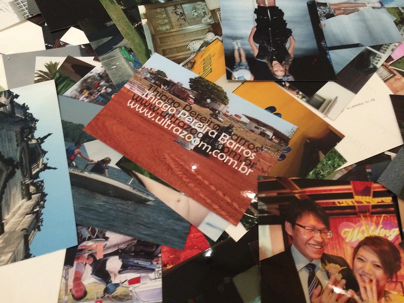
The Big Fucking Roomful of 4×6 Prints3 was also entertaining, mostly just because it was fun to watch people get down into the piles and investigate them under the supervision of a bored-looking docent. I also found myself for the first time actually appreciating watermarks on photos, because they provided a layer of information about the image’s source that was otherwise missing.4

Pier 24: Secondhand

I wasn’t taken with Kessels’s provided explanation of the room’s purpose:

I visualize the feeling of drowning in representations of other peoples’ experiences.

Not to rehash The 1978 Test, but what is the mindset of the artist for whom an image glut is a problem or source of fear and anxiety? Why does or should an abundance of imagery induce a feeling of drowning?

A whole world full of other people and their experiences was always there before. And unless artists are all thoroughgoing solipsists, they must know that. So why is the representation of those experiences perceived as overwhelming? Why does the artist (and why is the viewer expected to) “drown” in it? Why can I not escape the feeling that the so-called vernacular image can only manifest to artists and curators as a problem to be solved or an opportunity to exploited? Is the place of an artist in the world dependent on the anonymity and invisibility of everyone else in it?

I sometimes think that at heart, the “serious” photographer has never really evolved past the original form of the camera operator: a person whose vocation is defined primarily by access to a novel technology which for their audience is still unavailable or mysterious. The photographer as gadgeteer has generally been scorned by those who pursued the medium as an art, but maybe that was always just a case of Protesting Too Much. And maybe, deep down, this secret shame has been driving art photography all along.

Or maybe not. But it’s one way to account for the persistent down-the-decades anxiety of the photographic artist confronted with a world of vernacular images.

Archive of Modern Conflict

Pier 24: Secondhand

Some of my favorite photographs were from the Archive of Modern Conflict—but as a series, it was not so great. Although I cannot find the tweet at the moment, I think @vossbrink put it as the whole being less than the sum of its parts. This, and a few of the other rooms as well, put me in mind of Szarkowski’s statement that

It is important to remember that an anonymous photographer is simply a photographer whose name we have lost, perhaps temporarily. When we recover it, and find out the name of his town and his wife (or her husband), we can begin writing dissertations about him or her, but the work has not changed.

This is, I suppose, a rather old-fashioned way to look at vernacular photographs. But more often than not, what I feel when I am looking at some photograph that has been appropriated into a sequence or other larger work is that really, I would rather know more about the person who made the photograph and less about the what the appropriating artist has decided it should now come to mean.

Hank Willis Thomas

Pier 24: Secondhand

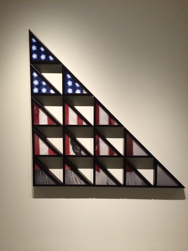
One part of the whole experience that I really, really liked were Hank Willis Thomas’s flag presentation case…I’m not sure how to describe them except as photo tangrams, really. I don’t have anything illuminating to say about them, but they’re great.

And no, I didn’t just like them because I have a thing for flags. Although man, did I kick myself for not bringing my IR camera that day.

Appropriating Down

Something that @vossbrink and I have been talking about lately has been the difference between “appropriating up” and “appropriating down,” in the sense of “punching up” versus “punching down” in comedy.

This useful distinction has seen a lot of action over the last few years in discussions of comedy, and specifically who is or should be fair game as the butt of a joke. Basically, “punching up” means comedy that cuts at someone with more power than you, and “punching down” means comedy that cuts at someone with less power than you. Most non-assholes would agree that it makes more sense to look at edgy comedy this way than according to the rubric that everybody is fair game or that a comedian can be an “equal opportunity offender,” because of course the world is not a fair or equal one. Punching down is the comedic equivalent of bullying.5

Recently, and particularly in the context of discussion of Prince’s Instagram stuff, where—ethics & legality of re-use/copyright stuff notwithstanding—we’ve been thinking about appropriation in those “punch up”/”punch down” terms.

There’s a pretty big difference between the kind and quality of commentary and criticism we find in Prince’s use of Marlboro ad images and what we find in his use of images from Instagram. And thus a difference in the worth of those bodies of work.

I mentioned above that Prince’s cowboy is out of place in Secondhand; it’s because the majority of the show consists of work that appropriates down. I think there is no question that it is exploitive of photography produced by regular human beings—the most charitable question I can think to pose is whether it is merely exploitive in the sense of the exploitation of a natural resource. Conversely, many of the best works in Secondhand are the exceptions to this rule, the images that appropriate up by drawing on iconic historical images or imagery produced by governments or institutions.


  1. Granted, outside of the particular areas of photography that I’m very into, usually that’s “or not.” 
  2. As you may already know, I generally use “clever” in a derogatory sense; this is not an exception. 
  3. Not the actual title. 
  4. “A work of art so bad it made me reconsider my feelings about watermarks on digital photos” is a very mean sentence that I decided to put in a footnote instead of the body of the post. 
  5. Note: The meaning of the word “bullying” has been muddled somewhat recently, especially as regards online debates, especially by being used as a slur against legitimate criticism from women of color. I mean actual bullying as such, in which someone uses their size/power/money/etc. to go after someone with less size/power/money/etc. 
Larry Sultan and Mike Mandel. Evidence.

Pier 24: Secondhand

Note: This originally posted on NJWV.

On Context

Archive of Modern Conflict

While Ai Weiwei wasn’t on my list of things to see at all, Pier 24 was at the top. I’ve been jonesing to go for years and just never managed to get my plans in order to get there. The current show features appropriated photos which, while something I’ve enjoyed intellectually in small doses, I was not sure I was ready for a full-on overload of.

I shouldn’t have worried. The space itself is awesome and the collection is more of a “physical version of a huge website”* in that is seems to have any photo series or print which you’d want to see from the canon.** It’s especially focused on photo series. Many of the rooms have at least one complete series of images. Since I’m used to seeing only one or two prints from each series in a museum, I loved being able to see the complete groups for a change. I can really get into what a specific photographer is doing, both from a sequence and a grouping point of view. It also assuaged a lot of my concerns as a context guy since Pier 24 is also known for its absence of context.

*A description someone much smarter than me came up with but which really captures the scope of the place.

**Comments about the demographics of the canon are best left for a different post.

Pier 24 doesn’t have wall text so you have to open up the exhibition guide to figure out what you’re actually looking at. The guide meanwhile only has super basic information—artist identification and a single project statement. As a result, a lot of people hold up Pier 24 to demonstrate how “only the image matters” or “context is irrelevant.” Inside Pier 24, I can see how that argument holds water. But that’s only because the space provides the context. Displaying the full series all together eliminates a lot of the descriptions that have to accompany a single image displayed by itself. Similarly, the way the different series on display interact with each other provides additional context.

Much of the appeal photography holds for me is in how it’s basically an exercise in recontextualization. As soon as you take a photo, you’ve taken it out of context by choosing what’s in, and out, of the frame. The way you choose to display or share the image after taking it is a new context.* There can be no true absence of context—although I would completely agree that context can be meaningless or unhelpful. In the case of this exhibition, since it’s about appropriated photos and recontextualization, the initial decontextualization serves the general theme.

*As can be the way the world changes after you’ve displayed the images.

The most interesting room in Pier 24 for this is the series of rooms of the Archive of Modern Conflict. These rooms are pretty dense with salon-style hangings of all kinds of photographs. Vernacular photos are mixed with art photos are mixed with functional photos resulting in all kind of new connections between images despite there being no context about the origins of each specific image.

At the same time, something about these rooms doesn’t hold up for me. Without any information, I found myself looking at the images with the half-awake, short-attention-span mindset I look at things on the web. If it doesn’t grab me right now, why bother looking? I wasn’t just missing the original context of the images, I wasn’t finding much compelling in the new context.

Which gets at the dangerous thing about buying into the no-context-needed mindset. Poorly-thought-out context invites short-attention-span consumption. This is easy enough to default to without any additional encouragement and, while a legitimate way of approaching a lot of media, is not something I like museums and other places that typically intend to encourage more thoughtful looking (or, at least, that’s why I go to them) to engage in.

Reappropriating vs Mining

Hank Willis Thomas
Hank Willis Thomas

Pier 24’s Secondhand was an interesting double bill with San José’s Postdate. Both shows used repurposed photos but where San José involved reclaiming images from a colonial past—demonstrating a very activist way of appropriating—Pier 24 is almost all within the same sort of western tradition and feels more concerned with the surface of images rather than what’s underneath them.

A lot of the work,* focuses on mining archives and extracting keepers—whether sequences, groups, or individual images—that look interesting to us today. It’s tempting to call this kind of thing “curation” only there’s no illumination provided.** They’re generally not about what the photo means and are instead going for the “oh this looks interesting” reaction. Other work*** involves doing clever things to photos to create new, interesting things to look at but which don’t didn’t make me rethink the actual photos themselves.

*Such as with The Archive of Modern Conflict and Erik Kessels (more on him later).

**One of my pet peeves is the way “curation” has become used on the web as a way of describing collections which, while often very tastefully selected, provide no information or educational information about what the point is.

***Most notably for me, Daniel Gordon and Maurizio Anzeri.

In both cases, the results can look pretty fun without really saying much. This isn’t a knock on what was on display, just that after having seen another exhibit which really investigated how powerful appropriation could be—especially in the context of colonialism and the representation of the powerless—I found myself wanting to see more work which explicitly examines the cultural context of the images, presents other meanings, and brings the appropriated images from the past into the present.

The only artist on the show who really did this was Hank Willis Thomas. His work in Pier 24—as well as his recent Unbranded work—looks at more than just how the photos look and instead focuses on the content of the photos and how our understanding of that content has changed over time. His work in the show was also particularly relevant given how Black Lives Matter has been constant over the past couple years. Viewing a lot of the older, recognizable but still-charged images through the flag frames suggests how these are commemorated and remembered as accomplishments rather than as part of an ongoing fight.

Erik Kessels & Vernacular Archives

Erik Kessels. Album Beauty.
Erik Kessels. In Almost Every Picture.

Erik Kessels deserves specific comment since, not only does he appear to be the main attraction in the exhibition, much of his work critiques our concepts of vernacular photography and makes us think about how we use images.

One of the things that bugs me about a lot of current photography writing is its tendency to state that people did a good job organizing their photos in the past. From what I’ve seen looking at my friends’s and family’s photos is that staying on top of the photo albums was as rare and difficult to do then as keeping digital images organized now is. Even most people who did do a good job making albums have boxes of decades-old images that they haven’t gone through yet.

Managing and mining this archive—whether digital or physical—is a daunting task. What I like about Kessels is how he suggests other ways of using images than the pure documentary mindset that governs most archives of vernacular photos. In Almost Every Picture has a number of series that pull a common theme—a spouse, a pet, fingers covering the lens, carnival prizes—out of a larger cache of images. The archive doesn’t have to tell a story chronologically, it can have a completely different theme and the chronology will still be accessible. People age, fashions change, we can sense the passage of time despite the focus being something else.

As someone who’s still working through doing something with my photos, seeing alternative ways to approach my own archive is great to see.

Album Beauty meanwhile made me start thinking more about vernacular photos as common memory. While extracting specific series or groups of interest out of a vernacular archive is a nice skill to create fun sequences which tell small quirky stories, much of the appeal of vernacular photos is in their entire corpus and how they show us images that remind us of moments in our own lives.

This is something that Colors of Confinement touched on as well. Because so many Japanese internees have a gap in their family photos from the internment years, the photos that do exist from the camps work to remind them of their own experiences. It’s easy to say how photos erode memories by replacing them with whatever’s in the photograph, looking at other albums demonstrates how photos trigger memories as well.

Vernacular photographs,* describe a sense of place and time in a way that allows for our own memories of that period to be part of the experience. We flip through the contents of an album and pause when we see something that reminds us of our own experiences—a location we also visited, clothing or hairstyles that made us look awful, toys we played with or coveted. Ideally we’re looking through the album with someone else so the pause can become conversation as we share stories. But even if we’re on our own, the pause and remembering and slight smile in recognition will occur before we go back to looking.

*Though this is also something that the “snapshot esthetic” can do too. Blake Andrews’s review of The Family Acid is very relevant here.

And it doesn’t have to be an album. It could be a shoebox of prints or a carousel full of slides. Those are just as much fun to look through and, in some ways are a better shared experiences than an album is since it’s easier to pass individual prints or slides around.

Which brings me to 24 hours of Flickr. This room gets mentioned in every writeup I’ve seen on this show. It didn’t do much for me. It kind of feels like a physical statement about how awful the current deluge of photos is compared to how great the nicely-organized albums of the past were. Yes, people upload way more photos than they’d have printed in the past. And yes, 90% of those photos are crap. But there’s nothing gained by seeing how many 4″×6″ prints a days worth of uploads translates to.

What I took away from that room was how respectfully I treat photographic prints. In a room full of prints, all of which were treated as basically disposable trash, I still found myself trying not to step on any of them—even the brick-wall test shots half-covered in a low-resolution watermark.

Photographs as Byproduct

Larry Sultan and Mike Mandel. Evidence.

24_Baseball
24_Postcards
The rooms I liked best though contained photographs which were, essentially, byproducts of other ventures. Rather than being vernacular photos that people took to document their lives, these are things produced by governmentbig business, or a media company as part of an offered product or service. Some are intended as communication and illustration to accompany other information; some are merely an intermediate step of a production process; and others are artifacts that happen to feature photography but aren’t photos themselves.

The highlight is Larry Sultan and Mike Mandel’s Evidence. It’s one of the granddaddies of the field of appropriated photography and it’s awesome. Is it a bit superficial? Absolutely. But it’s funny and bizarre and simply a very well-selected sequence. I find it hard to believe it’s as old as it is since it still sets the bar for this kind of thing as an example for how decontextualization and recontextualization can work.

The photos in Evidence come from all sorts of governmental and industry archives. By themselves, in their original context, they would have been pretty boring, of interest to a small, specific audience—quite possibly boring to even that audience. Out of context and grouped together though makes these technically-competent photos anything but boring. Rather than wanting to know what’s going on, I found myself making up my own narratives and noticing things in the images that weren’t originally the main point—like the interactions between people in a group shot or the way a headless person is holding the intended subject of the image.

I also really liked Viktoria Binschtok’s work investigating the locations of Google Street View (GSV)photos. There have been a lot of GSV projects but I really like the idea of not just rephotographing the street view image but going inside and making the automated, corporate image into a real place. GSV in many ways demonstrates everything that makes for bad photography. It’s automated and distant and unedited and presents an unnatural point of view. But these are also what make it so compelling to play with. There is no existing editorial voice to contend with and you can sit down, dig though as much of the archive as you can handle, and do whatever you want with the results.

Most of the projects though have been either commentaries of GSV itself or attempted to find street view images that looked like “real”* photographs.  Binschtok though uses GSV as just the jumping off point to play with the concept of intent. Her photographs paired with the GSV imagery produce a result that makes both much more interesting. It reminds me a little of rephotographing Stephen Shore with GSV but rather than starting with the interesting, fully-intended image and showing how bland the location looks on Google, these start with the bland GSV images and force us to see how they can be transformed by looking with intent instead.

*Read, images that look like the accepted canon of “good” photography. This is also an idea that deserves a post all of its own.

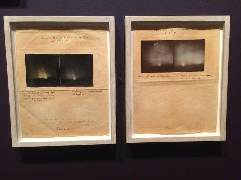
The collections of photos that have been prepared for halftoning and printing are fascinating.* These are byproducts of the printing process. They’re not the original negatives nor are they the final halftoned prints. Instead they’re photographs which have been painted and marked up to improve the contrast and eliminated unwanted details so that they will reproduce well after offset printing.

*Especially given my background in printing. I’ve worked as a prepress operator at an offset printing shop as well as an OEM support lead for digital printing and so have lived the “how to go from paste-up (or digital file) to printed page” life for over a decade.

This is the kind of thing that would be called cheating today so it’s instructive to see how much manipulation was required in order to get a usable final image. None of these photos are lying even though they’re all faked. It’s also a reminder of how much image processing is always needed behind the scenes in order to make a decent photographic print.

Outside of being a reminder of how photographs end up on paper, these objects are also wonderful commentaries on photography as an exercise in recontextualization. They’re not just extracting what’s in the photo from what’s outside it, they’re also painting out details and reframing what’s in the photo as well—in-game action photos become posed studio images, group photos become headshots. And then they’re put on the wall of a museum where we no longer know who the players are you see what an editor selected decades ago as the most-important part of these images.

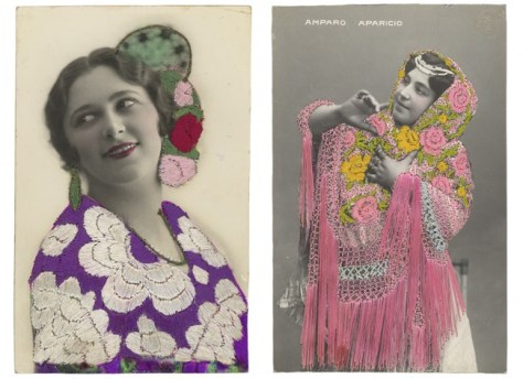
Finally, there are photos which are used as the substrate for other products. The embroidered postcards are beautiful objects and the ID badges are great fun to look at. In neither case am I really looking at the photos though. I’m seeing them as objects and remnants of a specific period of time. I appreciate seeing multiple specimens—Pier 24’s scale does most of the heavy lifting here—as I can get a better sense of the craft and usage of the pieces.

It’s no surprise that my favorite pieces at Pier 24 were these byproduct photos. They were useful objects which we can relate to—even after their previous functions are no longer needed or remembered, we recognize enough about how they were used. Recontextualizing them into a museum allows us to relate to them as useful objects and appreciate the new context along with the original craft. Looking at photography—or really anything else in a museum—needs to be more than just an academic surface-level exercise for me. I need to see what the photos are doing, how they’re being used, or what statement they’re making.

John Malmin. Aug. 13, 1965: National Guard troops secure a stretch of 103rd Street, dubbed Charcoal Alley, in Watts to help Los Angeles authorities restore order. This image is looking east from Compton Avenue.

City Lost and Found

Note: This originally posted on NJWV.

Baltimore on my mind

Paul Rudolph. Lower Manhattan Expressway, New York City. Bird’s-eye perspective section. Rendering. 1970
Paul Rudolph. Lower Manhattan Expressway, New York City. 1970
John Malmin. Aug. 13, 1965: National Guard troops secure a stretch of 103rd Street, dubbed Charcoal Alley, in Watts to help Los Angeles authorities restore order. This image is looking east from Compton Avenue.
John Malmin. Watts. August 13, 1965
Helen Levitt. New York. 1972
Bertrand Goldberg. River City I, Chicago, Illinois, 1972/79
Wall of Respect. Ebony Magazine. December 1967.

Seeing Princeton’s City Lost and Found show a week before Baltimore blew up* was very interesting timing. It’s weird to be working through my reactions to a show while a real world event unfolds which essentially references everything I’m working through. But this show covers the 1960s and 1970s in New York, Chicago, and Los Angeles. Which means it covers the Harlem riots, Chicago riots, and Watts riots—all of which are extremely relevant to the discussions we’re having today about Baltimore. We still haven’t learned the lessons from 1968.

*I’m really curious to see how that Wiki page changes since the whole riot/protest/rebellion/uprising discussion is also ongoing.

The show isn’t about the riots, but rather the way cities were evolving in the 1960s and 1970s as the demographics and industry changed. A lot of people and industry moving out. And a lot of people and infrastructure being left behind in ways that the powers that be viewed as requiring renewal or fixing or controlling.  While the backstory is missing in the show, even the gist of it is enough to get started.

We get to see urban renewal plans, municipal commission documents, documentary photographs, street photographs, photojournalism, investigative art projects, performance art projects, guerrilla art projects, and more, all capturing various ways that the city was in flux and various groups were reacting to the changes, proposed changes, or lack of changes, that were going on. It shows us what the cities were like ~50 years ago and what the primary issues were then. Looking at everything, even before the Baltimore protests erupted, I was struck by how little had really changed since that time period.

The issue between balancing the need to improve aging cities with being fair to the people who still live in the cities* with addressing the injustices that have left many of those people in, or a single catastrophe removed from, poverty is not just a difficult problem we have to solve, it’s the problem we have to solve.

*Whether they’re blacks living in formerly redlined neighborhoods or artists who need affordable housing or immigrants trying to start new lives here.

And the cities do need to be improved and renewed. While urban renewal is frequently code for gentrification or the destruction of existing communities, neglect and non-investment* are just as destructive. The plans all look glorious. Wonderful mixed-use developments. High density—affordable high density—living coupled with urban parks and communal greenspaces. Transportation** accessibility as a key feature of everything. Even a lot of balancing new developments with old architecture by incorporating the old buildings into the design. I look at these plans and wish that they’d built them since they address almost all the issues*** currently afflicting cities.

*Let alone actual theft in the form of subprime mortgages or “buying” homes on contract or the systematic destruction of property and businesses if, against all odds, these areas actually do flourish.

**One of the few things that betrays the age of these plans is how car-focused everything is. Though it is interesting to note that while New York was trying to improve access for cars, the LA plans were trying to improve walkability.

***Public transportation being the notable absence.

A new city built along these lines would be a thing of beauty. The plans still look futuristic because we just can’t do things like this. Part of me wants to tear my hair out because we’ve known that we need to do this for decades. The other part of me looks at the plans and understands why we can’t.

Because I also look at these plans and notice that the ideas for renewal all involve destroying and rebuilding entire swaths of the city. And I know that to do any of this, city government will have to eminent domain the cheapest available land occupied by the least-politically-powerful people. And that the land is cheap because of racist governmental policies and white flight. And that the new growth, even if truly affordable, will not—cannot—replace the former neighborhoods.

And I look at the photos of those neighborhoods and remember the Leonard Freed book in my parents’ house and see that while they look worn down and in need of upgrading, people live their entire lives there and take pride in their neighborhoods.

And this is all ~50 years ago and things are basically the same and this wasn’t a new problem even then and no wonder people are pissed and frustrated and the real wonder is why these kind of demonstrations don’t happen more often.

The reality on the ground and the promised beauty of the plans are two threads that this show is unable to reconcile. This feels like a weakness in the exhibition as much of my time in the galleries involved being frustrated by what felt like the absence of a thesis statement for the exhibition. But this absence also feels honest and when I wasn’t frustrated I was nodding my head in agreement and recognition of this. I want to see an easy answer. We wish there were an easy answer. There is no easy answer.

The only conclusions I can draw from the exhibition require me to think about what I didn’t see there. There are no plans that treat the city as something that needs retrofitting rather than being a complete teardown and rebuild. None that view anything beyond the architectural legacy of the area to be worth considering for selected salvation.* None that involve the communities and give them any agency over what they need. All of these are projects and visions that, if they exist, would live in the disconnect which is on display. I suspect though that they don’t exist, whether 50 years ago or today.

*Not that I disagree with saving architecturally-significant buildings. Just that it says a lot about priorities when it’s only the architecture that’s considered worth saving.

Photography as social document

Richard Nickel. Untitled (Construction of McCormick Place), 1958/60
Aaron Rose. Untitled (The demolition of Pennsylvania Station), 1964-1965
New York City Planning Commission. Spread from Plan for New York City. 1969
Department of City Planning, Los Angeles. Spread from Concepts for Los Angeles. 1967
William Reagh. Bunker Hill to soon be developed. 1971
Thomas Struth. West Broadway, New York. 1978
John Humble. 300 Block of Broadway, Los Angeles, October 3, 1980

Aside from the general reactions I had to this show, it’s also very interesting from a photography point of view. While a lot of the photos on display were intended as art photos, they’re not being used as art here—despite being exhibited in an art museum. These are photos as social history, social documents, items that tell us about the place, who lived there, how it’s changing, what life is like on the ground rather than from the planning offices.

It’s not about the photos as objects: Some of them are vintage prints. Some are slides. Some are mechanical prints. Some are halftones in magazines or books. Some—as with the Itinerant Languages of Photography exhibition—are digital prints from scanned negatives. It’s about the photos and the stories they contain.

I still looked at the photos with an eye toward the art side of things. But even as someone who often looks at the social context around the photography* I was even more tuned into this element here. The photos—and the rest of the art in the exhibition—were telling me the stories. I didn’t have to pull them out on my own. And there are too many stories to mention so I’ll just go over the ones that caught my eye.

*cf. my Winogrand writeup.

Danny Lyon and Aaron Rose’s photos of the destruction of lower Manhattan at first have some ruin porn vibes going on except that rather than capturing the superficial beauty of decay and abandonment, these are about change and questioning the idea that progress requires destroying the past. These photos get compared to the photos that show new buildings going up. Same metal frames, same men in hard hats, and the same dust and dirt of power tools. Just a different side of the coin.

The planning commission documents contain essentially photo essays of street photography as a way of understanding that people live in the city. Where street photography often has a bad reputation, these documents show what it does well. It’s not just about the tropes and getting that decisive moment where everything in the frame lines up perfectly. It also captures a sense of place and time in a way that no other kind of photography really can.

There’s plenty of street photography on display just by itself too. Classic black and white work by Garry Winogrand or Leonard Freed. Color work by Helen Levitt or Bruce Davidson. In a different show I’d be appreciating the photos individually. In this show, between the planning commission documents and the magazine photo essays,* I’m fitting the rest of the photos into my own imagined social documents of how the city works and what it’s like to navigate one on foot.

*Including Gordon Parks’s Harlem Family and Ebony’s Wall of Respect.

Street photography is a human’s-eye view of the city. Even in the age of the automobile, this perspective is necessary to keep in mind. No matter how much the cities need to be fixed, if they don’t work on the street-level human scale they don’t work at all. And while I appreciate Martha Rosler’s attempts reject the theatricality of traditional street photography, the way she added distance between herself and her subjects resulted in a point of view that felt closer to a car’s-eye view of the city. There’s something about being in the middle of things in the city that’s absolutely necessary.

This is of obvious import in a city like New York but it’s also relevant to Los Angeles. There are a series of photographs by various photographers looking at the demolished but undeveloped Bunker Hill site in downtown Los Angeles. These photos are coupled with images of different redevelopment plans that were attempted over the years. Some were not pedestrian-friendly, others were. Part of the problem with the site is that the less pedestrian-friendly plans were tried first and they just didn’t work. The resulting buildings were not a place anyone wanted to be.

This emphasis on the importance of scale comes up in a lot of the more landscape-like photography in the city too. From Thomas Struth’s super-precise photographs of New York to John Humble’s photos of LA, you can see the contrast between new developments and the way they dwarf the older, human-scale architecture. We need both types of building in the modern city and making sure they work together is the challenge.

Other highlights

Art Sinsabaugh. Chicago Landscape #117, 1964
John Divola. MGM #12 1979-80
Asco. Instant Mural. 1974

I really liked Arthur Tress’s Open Space in the Inner City* in that it felt like one of the few instances where the photography and plans where being discussed at a local level. These were originally mechanical prints rather than fine-art prints and the goal was to discuss locally about reclaiming existing open space into real parks. I’m not sure it ever got past this stage but it’s one of the few examples which even kind of sits in the middle of the divide between planning and local input.

*Holy crap he has a Blurb presence and you can get Volumes 1 and 2 there.

Art Sinsabaugh’s panoramas are also great. I’m kind of a sucker for panoramas in general but I enjoy the way these show the commitment to the automobile. One of the things missing from the New Topographics is focusing on the architecture of the highway system itself. Sinsabaugh’s work is interesting to view with that context in mind.

Hans Haake’s real estate holdings piece isn’t photography per se but does rely on photographs of each location to really make concrete the point about the way so few people control so much of the land. And how labyrinthine the holding companies are so as to obscure who’s actually in charge.

Yasuhiro Ishimoto was a nice discovery for me. His quieter Chicago cityscapes feel a lot closer to the kinds of photographs I enjoy making and I’ll be looking more into his work in the future.

John Divola’s MGM lots are a brilliant addition to the show in that they blur the lines between fictitious and real urban decay and the way it’s presented in the media.The lots are fake creations meant to look like New York or Chicago or anywhere else, but they’re also open space that will eventually be developed into self-contained modern cities with Los Angeles.

It’s always nice to see Ruscha’s Every Building on the Sunset Strip. Especially now with more and more Google Street View projects occurring, it’s nice to examine one that predates them all.

Bruce Nauman’s LA Air meanwhile is one of two references in the show to explicit environmental issues in the city.* It’s funny and snarky but also points out one of the things that is an issue now but which wasn’t under consideration ~50 years ago. The environmental movement in the 1970s and 1980s is barely mentioned in this exhibition despite all the grand plans involve improving automobile circulation in the city. While a lot of the race issues would remain the same in a similar exhibit of today’s cities, I’d expect a lot more LEED-certified or Cradle to Cradle ideas in the aspirational city plans.

*The other is Documerica which, while environmental, also feels like a slice of everyday like in the 1970s.

Another blind spot involves non-black ethnic groups in the cities. I understand why the exhibition is so black-focused but other non-white communities are also an important part of the New York, Chicago, and LA experience. I only noticed mentions of these other groups in a few photos by Jonas Dovydenas documenting ethnic enclaves in Chicago, Luis Medina’s photos of Latino gang members in the 1980s, and Asco’s Chicano activist work.

Of those, Asco caught my attention since they combined Latino traditions like mural painting with Chicano activism about how Latinos are mistreated in the city. Asco’s work, by being self-representational, also pointed out how little non-white self-representation was present in the rest of the exhibition.* As with the environmental stuff I’d expect a lot more self-representational work in a modern version of this exhibition.

*I think just Gordon Parks and the Ebony article. Though there’s also a collage by Romare Bearden on display. 

I would also expect a lot more Asians—both traditional Asian communities under pressure to gentrification and the rich Asian gentrifiers who are displacing a lot of the old-time residents. But that’s for the modern show which also has to include the rush back to the city by booming businesses and young professionals alike.