Tag Archives: featured

Unknown. Marius Bourotte

Crime Stories

This originally posted on NJWV

Tom Howard. Electrocution of Ruth Snyder, Sing Sing Prison, Ossining, New York.
Tom Howard.
Electrocution of Ruth Snyder, Sing Sing Prison, Ossining, New York.
Alexander Gardner. Execution of the Conspirators.
Alexander Gardner.
Execution of the Conspirators.
Weegee. Outline of a Murder Victim.
Weegee.
Outline of a Murder Victim.
Unknown. Marius Bourotte
Unknown.
Marius Bourotte
William Klein. Gun 1, New York.
William Klein.
Gun 1, New York.

The one small photo exhibition I saw during my trip to The Met was about Crime Stories. I enjoyed it, especially since when I saw it I was still thinking about war photography. Crime and crime-related photographs operate in a very similar category of allowing us to see and really look at events which we don’t usually get to experience. Rather than war, we’re talking about crime. But in both cases it’s the proximity to death and danger which is compelling.

Photography has always had an intimate relationship with death and danger. Its voyeuristic aspects allow us to see things we’ve been culturally conditioned to think of as of limits and its documentary aspect lends itself to evidence and observation. We don’t want to look but not only is it hard to turn away, we often look closer and try and discern some level of truth out of the photo.

The danger is seductive. Executions have a long history of being public spectacles. As much as we now decry executions and the publishing of images which show death, there is still part of us deep inside which wants to see that evidence. Confronting that violence inside ourselves is how photos like William Klein’s, which don’t actually depict violence, draw their power. It’s all imagery we grow up with in stories, act out as kids, and then act all shocked about when it’s used to attract clicks.*

*I almost wrote “sell tabloids/newspapers” but this is the world we now live in.

Looking at crime photos—whether by Weegee or an unmanned surveillance camera—lets us play amateur detective as we try and spot details and get a sense about what happened. The same thing with looking at mugshots and other typographies of “criminal types.” As much as we know that we can’t really know what criminals look like, I don’t think we fully believe it in our guts. So we look at the photos and try and reach any sort of conclusion.

As much as I liked the show though, I wanted more. I’d love to see these taken to the present day where cell phone cameras and the autopanopticon of citizen photography have taken surveillance to a whole new level. I can’t look at the history of crime photos without thinking about the events of the past couple years. I’m not just thinking about how it’s the police which are committing the crimes either.

It’s been increasingly obvious that we, as a culture, object to crime images a lot more with certain kinds of victims while others are still seen and sold as entertainment. It’s no longer just about the fascination we have with viewing and consuming crime images that we need to discuss, we also have to confront our biases about whose images are still commodities and who we see as human.

Notes
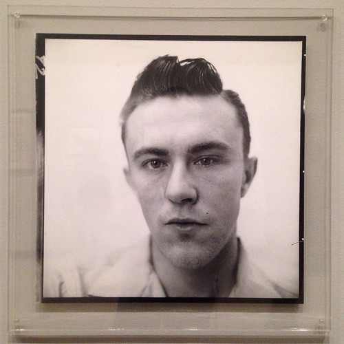
Untitled
Richard Avedon
Dick Hickock, Murderer, Garden City, Kansas, April 15

The mug shot–like portrait captures Hickock’s sullen, lopsided face with mesmerizing clarity, as if searching for physiognomic clues to his criminal pathology.

The Met 

The minimal, straightforward style of the photograph highlights the idiosyncrasies of the killer’s face and suggests that the photographer is looking for evidence, should it exist, of a homicidal pathology.

SFMOMA 

While I would like to think that all the very similar celebrity portraits Avedon made were “looking for evidence, should it exist, of a homicidal pathology,” that seems doubtful.

kukkurovaca

Sometimes museum texts make me smile. I’ve long been amused by SFMOMA’s description of Avedon’s Dick Hickock photo. Seeing essentially the exact same description at The Met made me laugh in the gallery. Yes, while this is what we do when viewing this photo when it’s presented in the context of Crime Stories or some other salacious setting, it seems weird to describe an Avedon this way. As Kukkurovaca points out, this is pretty much the Avedon modus operandi.

All that said, if someone wants to use The Met and SFMOMA’s text as a way of describing The Family I’m totally for it.

Steve McCurry Agra, Uttar Pradesh, India

By Rail Across the Indian Subcontinent

Originally posted on NJWV as part of an occasional series of posts where Nick revisits books which he grew up with.

Steve McCurry Railway between Peshawar and Lahore, Pakistan
Steve McCurry
Railway between Peshawar and Lahore, Pakistan

My earliest memories of just looking at photos all involve National Geographic. My parents had a subscription and I looked forward to the day each month when a thick magazine slipcovered in brown-paper arrived in our mailbox. I was too young to read the articles but I devoured the photos (and the maps of course) for at least the following week. I also would go through our magazine files and pull out my favorite past issues—reading the spines until I found the one with the feature I wanted—and revisit the photos all over again.

June 1984 was my favorite issue. By far. I paged through Paul Theroux’s By Rail Across the Indian Subcontinent repeatedly as I was captivated by Steve McCurry’s photographs. It wasn’t anything specific about the quality of the photos which got me. I just, like many grade-school boys, loved trains and these were like no trains I’d ever seen. Instead of the commuter train pulled by diesel engines which took people up and down the peninsula between San Francisco and San José, these were steam trains which wound through mountains and countrysides, were packed with people—including riders on the outsides of the cars—and had dining cars to accommodate multi-day journeys.

The recent McCurry pile-on which started with Teju Cole’s A Too-Perfect Picture coupled with some photoshop disasters encouraged me to both revisit McCurry’s train photos—the first set of photos I can remember loving—as well as to finally read the text which they accompany.

At some point in the past decade or so, McCurry’s work has lost all the context in which it was originally made. He has indeed gone full White Guy Photography, peddling a mythical third-world exotic beauty via photos that function as desktop backgrounds or hotel art.* Teju Cole says they’re boring. Paroma Mukherjee points out that the ethics behind these photos are dangerous. As McCurry packages them now I completely agree. They don’t tell us anything beyond confirming our stereotypes of the region and suggesting that modernization will ruin the “real” soul of the place.**

*A use case I actually witnessed at The Tech Awards.

**As stated in Image on Paper’s Jimmy Nelson Post: “It is a dangerous move to fictionalize a culture. By promoting a romantic ideal with a naïve set of attributes, the first steps have been taken toward eliminating that culture. Because you say what is authentic and what is not, you can erase entire cultures in an instant.”

While I would be a bit worried about looking through all the 30-year-old National Geographics and seeing what I grew up with, this particular article is thankfully not too bad. Rather than being concerned with any sort of “authenticity,” it’s unabashedly a travelog and photos—most of which do not look like what has become the McCurry brand.

Travelogs, when they’re about the author’s trip and don’t claim to be speaking for the country,* are great. The same goes with travel photos. The more specific and personal the topic is, the more likely I am to like them. And I still like these.

*Or in this case, the entire subcontinent.

The railroad is a wonderful thread to anchor the entire trip. It grounds the narrative and allows for historical diversions where the infrastructure is older than the political boundaries which it crosses. It also offers glimpses at a large range of the people in India. While Theroux is mostly riding first class, he and McCurry are also interacting and talking with the locals crowded in second class, the people riding on the roof, the white tourists in the separate better-than-first-class tourist cars, and the service workers and public workers who run the trains and the stations.

That I still love trains, and train photography, doesn’t hurt. But there is something distinct about the rail travel and the way it filters how you see both the countryside it cuts through and the built environments which have grown up around it. It’s simultaneously part of the landscape while completely imposing itself on that landscape. And it waits for no one. If one of the chief tenets of photography is taking your time and thinking and picking the right moment, the way the train keeps moving introduces a variable which is out of the photographer’s control.

Steve McCurry Agra, Uttar Pradesh, India
Steve McCurry
Agra, Uttar Pradesh, India

Seeing McCurry’s work in this context also serves as a reminder of why he became an acknowledged master. There’s maybe only one of those McCurry™ Portraits and all of his colors are more subdued by the necessity of having to stick with the railway itself. But the photos are great. Strongly composed and timed with a sense of place—and on occasion the photographer’s presence—they illustrate the text so well that I have no use for the captions except when they offer a bit of additional story where McCurry’s experiences differ from Theroux’s.

Even the photo of the train at the Taj Mahal—which out of this context becomes about the men and “how well they work as types”—is instead a perfect “holy crap you can see this from the train” photo.

Despite completely agreeing with the critiques being heaped on McCurry now, I’m still glad that these were some of the formative photos of my youth. I’ve kind of grown out of him but I’m happy that I had access to these. It’s always good to be reminded of both my own growth, and what it means if an artist doesn’t grow.

Timothy H. O’Sullivan. Battle-Field of Gettysburg. View on the Field after Fight of First Day., July 4, 1863

A Strange and Fearful Interest

This originally posted on NJWV.

They were men. They crept upon their hands and knees. They used their hands only, dragging their legs. They used their knees only, their arms hanging idle at their sides. They strove to rise to their feet, but fell prone in the attempt. They did nothing naturally, and nothing alike, save only to advance foot by foot in the same direction. Singly, in pairs and in little groups, they came on through the gloom, some halting now and again while others crept slowly past them, then resuming their movement. They came by dozens and by hundreds; as far on either hand as one could see in the deepening gloom they extended and the black wood behind them appeared to be inexhaustible. The very ground seemed in motion toward the creek. Occasionally one who had paused did not again go on, but lay motionless. He was dead. Some, pausing, made strange gestures with their hands, erected their arms and lowered them again, clasped their heads; spread their palms upward, as men are sometimes seen to do in public prayer.

—from Chickamauga by Ambrose Bierce

Andrew J. Russell. Soldiers’ Burying Ground, Alexandria, Virginia, May 1863
Andrew J. Russell.
Soldiers’ Burying Ground, Alexandria, Virginia, May 1863
Timothy H. O’Sullivan. Battle-Field of Gettysburg. View on the Field after Fight of First Day., July 4, 1863
Timothy H. O’Sullivan.
Battle-Field of Gettysburg. View on the Field after Fight of First Day., July 4, 1863
Andrew J. Russell. Behind Stone Wall, Marye’s Heights, Fredericksburg, Virginia, May 3, 1863.
Andrew J. Russell.
Behind Stone Wall, Marye’s Heights, Fredericksburg, Virginia, May 3, 1863.

While I was looking at War is Beautiful I couldn’t help but think about the iconic, well-known photos from Vietnam or World War 2. Those images are the beginning of what has become the cinematic language of war photography. They’re what the movies reference and are part of our common understanding of what war photography is supposed to look like.

Instead of looking at those images though, I got Jennifer Watts’s A Strange and Fearful Interest off the shelf and decided to look at Civil War photographs. Looking at the Civil War photography shows the beginnings of our current visual culture. We can see the beginnings of personal image sharing as well as the ability for images of “real life” to become larger than life. At the same time, we’re seeing other directions or standards that could’ve been taken.

The Civil War reflects photography’s first big maturation in terms of both how we understand what we’re looking at and in terms of figuring out what practices actually work for documenting and disseminating images. There were no set rules or perspectives to copy, the field photographers had to figure things out on their own. Nor were there guidelines about what’s ethically acceptable with regards to subject matter or staging a scene. The photos of dead soldiers*—and the way those bodies were often moved by the photographers—are so wrong in terms of the current rules of photography.

*Specifically noted in the book with the Antietam photos but applicable to Gettysburg and many other battlefields too.

Where the Vietnam and World War 2 images are still familiar to us, the Civil War photographs are more abstract. Their look—the staging, motion blur, toning, edge effects, etc.—reads as romance and nostalgia rather than documentation. They don’t look real to us anymore even though their existence fundamentally changed our understanding of both warfare and death.

But the photos themselves did say a lot about the war and the nature of violent death which, while people obviously knew,* were not images which were disseminated. There’s something about seeing the images of the bodies in the battlefields which drives home the cost of it all. And it doesn’t surprise me at all that we created National Cemeteries as a response to the Civil War. Our collective sense of war and its outcomes changed during the Civil War—in large part due to having a new medium with which to share and remember these things.

*Warfare, and in particular the Civil War, being something which touched a much larger percentage of the population then than it does now.

Notes

George N. Barnard. Rebel Works in Front of Atlanta, Ga., No. 1, 1864
George N. Barnard.
Rebel Works in Front of Atlanta, Ga., No. 1, 1864
Jay Dearborn Edwards. Scrapbook 2, page 2 – Photographs by J.D. Edwards depicting Confederate soldiers drilling and at rest near Pensacola, Florida, and environs, c. 1861.
Jay Dearborn Edwards.
Scrapbook 2, page 2 – Photographs by J.D. Edwards depicting Confederate soldiers drilling and at rest near Pensacola, Florida, and environs, c. 1861.

It was not just images of war which were suddenly being disseminated across the US. Tintypes and ambrotypes allowed for soldiers to both send images back home and keep images of home with them on the front. While still very much a portrait/sitter arrangement, this was a much more democratic* product in how it opened up the ability for this kind of personal connection to many more people.

*Reminding me of the creation vs consumption debate a few years ago. While I still agree that the Brownie opened up the true democratic floodgates, tintypes, ambrotypes, and cartes de visite did create a massive change in how we treated and understood images too.

Since Confederate photographers all but disappeared after—if not during—the war, J.D. Edwards is the only Confederate photographer featured in the book. This explicitly calls attention to how our visual understanding of the Civil War is almost exclusively the Union point of view. And as much as I hadn’t realized this before, it reminded me how most of my conception of war photography is aligned with the point of view of the US or the west.

I really like George N. Barnard’s landscapes of Sherman in Georgia. Barnard kept taking landscape photographs—very much in the style of O’Sullivan or Watkins—where the view is what’s important. In Barnard’s case though, rather than the promise of taming unspoiled nature, we see the architecture and landscapes of war.

The book also goes into the Lincoln assassination and how Alexander Gardner’s mugshots—well, proto-mugshots since the mugshot hadn’t been invented yet—as well as his photographs of the hangings get right at the intimate relationship that photography has with death. And then there’s his Lewis Powell image which, among all the retro-nostalgic photographs in the book, leaps off the page as being, still, strikingly modern.

WarIsBeautiful

War is Beautiful

This originally posted on NJWV.

Eco believes that hyperreality shows itself in America’s portrayal of history, art and architecture, entertainment, and nature. Eco believes that Americans want everything in a more entertaining way (including entertainment), so we have intertwined hyperreality into our lives.

Umberto Eco on Hyperreality

MOHAMMED ABED/AFP/Getty Images — A Palestinian youth stands in front of a burning vehicle during clashes between rival Fatah and Hamas in Gaza City, 14 May 2007. Two Palestinians were killed in fresh fighting between rival Fatah and Hamas gunmen today despite a truce aimed at ending the worst factional violence since a unity government took office.
Ozier Muhammad/The New York Times — A severe sandstorm blanketed a convoy from the Headquarters Battalion of the 1st Marine Division north of the Euphrates River in Iraq, on March 25, 2003. President Barack Obama announced Oct. 21, 2011, that the United States had fulfilled its commitment in Iraq and would bring all U.S. troops home by the end of the year

The other day, I had a chance to sit down in the library with David Shields’s War is Beautiful. Given how I’ve mentioned previously how appealing the idea of a photographic Aarne–Thompson is, it was a lot of fun to page through a book which did exactly that with the New York Times’ front page War on Terror photographs. I like and tend to agree with Shield’s choice of tropes. I also found it interesting to be forced to question what it means to aestheticize war and the ethics of making beautiful images of ugly horrible things.

These are not new thoughts but it’s worthwhile to be periodically reminded to think about them.

In the case of these images—especially when you see them page after page after page—it’s not the fact that so many of them are pretty or even beautiful* which concerns me, it’s that so many of them look like movie stills. It says a lot about how realistic movies have gotten than this is the case. But it also says bad things about photography if what we consider good, meaningful, impactful photography appears to be influenced by the cinema.

*Despite the notes about how photographers hated the flat light in Iraq.

The news photographs aren’t faked or staged but they’re looking for certain compositions and perspectives.* This is a problem.** The movie look allows for a certain level of glorification which capitalizes on our expectations for the form. We “know” what the “bad guys” look like. We know who’s supposed to be the “hero.” We even have prejudices about the terrain and the buildings. The photographs are less about telling the story and making us think and are instead more about setting the mood for the story using our pre-existing biases.

*A reminder again that perspective is a disease of the eye.

**Also a reminder that Errol Morris’s It Was All Started by a Mouse essay on another war photography trope is very much worth reading here.

A lot of this reminds me of William Gibson’s Zero History where the military and military contractors—specifically in the fashion realm—are dealing with the inversion of the traditional military to civilian workflow. For decades, fashion flowed out of the military setting and became streetwear after it had acquired a level of authenticity and coolness through military use. Zero History explores what happens when military-inspired streetwear has evolved into its own thing and its designs are both influencing military designs and making military designs seem inadequate and uncool.

It’s also worth looking at the video game realm where the comparison between how the military uses video games to recruit people with how those recruits are then trained shows a similar difference. The recruiting game America’s Army is very much in line with mass-market video games. Lots of action to compete with the latest first-person shooters accompanied with a very cinematic look. The training games meanwhile look awful. Lots of waiting around and hoping that there’s no action at all. Lots of uncertainty about what to do. But very realistic since they’re intended to train soldiers on what to actually expect. They just don’t look like what I, as a civilian, would expect based on how war is portrayed in mass media.

And that’s what current war photography is doing. It’s riffing off of the existing cinematic language of hyperreal military settings—suggesting that the real stories might not be eye-catching enough to be told anymore. Movies—and movie photography and cinematography—are our common language in many things. They’ve become our references and touchstones for what real life should look like. And it’s scary when real life can no longer compete with the expectations.

Notes

WarIsBeautiful

While I enjoy the trope categorizations, the best part of the book may be the rear endpapers which show thumbnails of all the New York Times front pages. The Edward Tufte style small multiples makes the point about how the Times has presented the war in a way that looking through the book is unable to convey. Rather than seeing the details in the images, it becomes more apparent how these images are chosen for their graphic (in the sense of graphic design) impact and sense of warness.

Willard Worden. The Portals of the Past (Ruins of the Towne Residence, California Street), 1906

Willard Worden

This originally posted on NJWV.

Willard Worden. Midnight in Chinatown 1903
Willard Worden. The Portals of the Past (Ruins of the Towne Residence, California Street), 1906
Willard Worden, The Arch of the Rising Sun at Night, 1915

While I was in California for the summer, I had a chance to stick my head into a small exhibition of Willard Worden’s photographs. The show is especially interesting from a documentary point of view since many of the photos show San Francisco both immediately before and immediately after the 1906 earthquake. I particularly enjoyed the photographs of the original Chinatown.

One of the weird things about San Francisco is how, despite being a relatively old settlement in American terms, it has reinvented and rebuilt itself over and over again. Sometimes these reinventions and rebuilding are true boomtown cycles. Other times they’re by acts of god. But where Los Angeles seems to be about layering and papering over and appropriating its past, San Francisco doesn’t seem to care.

Which is why it’s wonderful to see photos that show what things were like right before they were destroyed.* The old San Francisco, and Chinatown, photos show a city that I don’t recognize at all today.

*On this note, I should have grabbed a copy of Janet Delaney’s South of Market from the gift store. But I needed to travel light since I was already all packed to travel back to New Jersey.

Worden is also a master of night photography—taking advantage of wet streets and any available-light he could find. This is most evident in his photos of the Panama-Pacific Exposition grounds. Even as low-contrast prints they’re incredibly dramatic.

In many ways offering a closing chapter on the earthquake since the expo was intended to demonstrate San Francisco’s rebirth, these photos also fall into the same category of depicting things that have been destroyed and paved over. The Exposition grounds were temporary and only the Palace of Fine Arts remains—and even that had to be torn down and completely rebuilt in order to do so.

Willard Worden. Poppies and Lupine, ca. 1915

What I ended up thinking about the most in this exhibition though is the idea of photographs as consumable objects. Worden was a working photographer who wanted to sell prints. Lots of them. In whatever size you wanted. This exhibition includes portfolios and pricebooks for selling prints as well as information about which images sold well—though even with so much documentation, I still approached the photos as I do most photographs—looking at the technique and appreciating/critiquing the image.

The colorized photos on the other hand forced me out of that approach and into one where I had to think of the image as an object—how it was intended to be used, by whom, how it was manufactured, etc. I didn’t like the colorized photos—heck, I dislike colorized photos in general—but I loved seeing them here. Worden worked at a time when photography wasn’t considered high art so his market was the middle class who couldn’t afford proper painting. The colorization operation reminded me a little of Thomas Kinkade in how precisely craftsmen had to work on the photograph to make it more paintinglike and acceptable as an object.

Though the Kinkade comparison is a bit cruel of a comparison to Worden,* it’s refreshing to see these objects in a museum displayed as both art and as consumer artifacts—where they can prompt us to think about what kinds of “art” we’re willing to display in our homes and how we judge what other people choose to display.

*Most of Worden’s work is honest about being photography rather than trying to emulate a different medium.

Fine art photos are high brow now. Being reminded of a time when they weren’t reminds us of how high brow taste changes just like any other fashion. Museums tend not to mention this side of things. Art is typically treated as art for art’s sake—even if the museum is showing an exhibition of a specific collector’s holdings. We don’t think about the market and who’s allowed to dictate what’s “good” enough to be allowed into a museum. And museums don’t like us thinking about who they’ve excluded and why.