Tag Archives: featured

Robert Dawson, Private Property, Lake Tahoe, California

Inspiration Points

Note: This originally posted, in a slightly different form, on NJWV.

Ted Orland, One-and-a-Half Domes, Yosemite

I love seeing museum exhibitions where photography, paintings, sculpture, etc. are in the same room, in conversation with each other. I can probably count on one hand the number of times I’ve actually seen this. Which means I’m always on the lookout to post anything which can do this.

My greetings post here

My last museum trip of the summer was to the Oakland Museum. This was partly to get my Fenton’s fix but I was also interested in the Inspiration Points exhibition since it promised to mix photography, painting, and drawing in the galleries. One of my continuing interests with photography is how it can get out of the photography wing and be exhibited alongside, and in conversation with, other artworks. This doesn’t happen often* so I like to keep an eye out for those cases where it does and go see the show with an eye for how the show itself guides the conversation.

*Why I was so excited by SFMOMA’s Flesh and Metal. And the Jay DeFeo exhibition before that.

The Oakland museum show is a little bit of a mixed bag here. It breaks the concept of California Landscape Art into distinct views and themes, some of which end up being heavily biased toward specific media. So no conversations in those room although there is food for thought about why some themes may be tougher for certain media to handle.

Since each theme ends up being somewhat distinct in character, it makes sense to go through the themes. First, the themes which resulted in galleries which were mixed media.

Anne W. Brigman, The Heart of the Storm

Mystic

While being mixed between paintings and photography, a lot of the works in this gallery were heavily biased toward pictorialism—or the paintings that those photos were trying to evoke. This isn’t a complaint as it’s quite nice to see those two concepts mixed together so we can actually see how they inform each other.

At the same time, it feels like a somewhat limited take on what mysticism can mean as it biases more toward early-20th-century concepts of myths and the “unspoiled” land in the west rather than looking at the different ways people have developed the landscape for spiritual reasons over the past century.

Exploitation

This theme is of course the flip side of the mystic landscapes. How California is full of natural resources for us to use or conquer is the real state mythology. Documenting the land as we impose out will on it is something everyone—from artists to corporations*— does here. In this case, the method of documentation doesn’t really matter. I don’t get the sense that these works are in conversation although it is interesting to see how commercial both photography and painting can go in terms of serving corporate needs.

*Sigh.

What’s more interesting is how all these works can be read in multiple ways now. Many of the exploitation artworks originally glorify the men or companies which were taming nature. While this reading is still valid, that they’re now displayed under the heading “Exploitation” means we’re looking at them differently. What was originally optimistic is instead something we’re supposed to reflect on and think about how to change—both our actions with the landscape and our readings of corporate propaganda—moving forward.

Recreation and Tourism

It’s interesting that Recreation and Tourism is a distinct theme outside of exploitation. Not all of the exploitation of California’s resources is through using them up. Recreation and tourism is just as important a part of land management and just as important an industry to the state. Big trees. Big water. Big mountains. These are the landscapes which sell the California image as tourist destination for seeing and taking in and exploring nature.

These are also the landscapes that photographers and painters tend to consume and emulate the most. Where the exploitation artworks are clear what industry they’re depicting, many of the recreation ones end up pointing the finger back at the viewer and the artist and make me think about the fine line between how our desire to see and use these places both allows for their preservation as open space and risks degrading them through overuse.

Beth Van Hoesen, Point Richmond

East Bay

There’s also a gallery dedicated to East Bay landscapes. This is nice to see because it’s local—both the views and the artists—and while the exhibition is about California, it’s also always nice to see items of specific local interest included too. There are a lot of stereotypical nice landscapes on the East Bay but I prefer seeing the depictions of things we typically don’t think of as being picturesque.

Locals have a tendency to undervalue what’s interesting about where they live even while being triggered with intense senses of home from things that non-locals won’t ever understand. It’s those local-specific details which I enjoy seeing the most.

Now, on to the themes which were heavily biased in favor of a specific medium.

Pastoral

This section was all paintings* and pretty much all a nostalgic** view of California as an agricultural paradise. Not really a style of painting I like though it is interesting that there weren’t any photographs present. It’s not like photography can’t do the nostalgia thing.***

*Except for one Edward Weston photo. Oddly enough.

**Making the Weston inclusion even odder.

***Off the top of my head I’m thinking Pirkle Jones would be a good fit here. Or possibly Ken Light.

Between how we also react to old photos as inherently historic and nostalgic documents and how so much of the current trends in photography have been centered around faking and mimicking nostalgia as a reaction to the ubiquity of images and our loss of our lazy-man’s editor, there’s plenty of opportunity for photographs here.

All that said, I think there’s an element of nostalgia which requires things to be kind of made up. Photography, while not real, trades on reality in a way that paintings do not. Looking at nostalgic paintings comes with the understanding that things don’t actually look like that in real life. Looking at photos, especially landscape photos, still comes from a place where we expect the photo to be real.

Yes we should know better here.

Joe Deal, Front Lawn (Watering) Phillips Ranch, California

Urban vs. wild

Meanwhile this theme was all photos, many of which were New Topographics type work. And while this made some sense to me since one of photography’s specialties is highlighting incongruent elements such as this urban vs wild theme, it’s not like people stopped painting or drawing the California suburbs.

And the urban vs. wild theme is in many ways about “California style” developments* which are meant to bring the outside in or incorporate controlled wilderness in the midst of suburbia. This isn’t an exclusive to photography thing at all.**

*Something that I wasn’t fully aware of until I moved East and saw homes listed as “California style” which look nothing like anything I’ve seen in California but instead feature more open floor plans and bigger windows and try to seem like they’re closer to nature.

**A lot of Hockney paintings (one of his joiners was in this gallery) seem to fit here. As does a lot of Bechtle.

Still, as with the nostalgia images, the difference in how we approach paintings compared to photos I think is a major reason why this gallery is photo-biased. The fact that the photos are “real” makes the incongruity more believable here.

Robert Dawson, Private Property, Lake Tahoe, California

Dystopia

This was also all photos. Which, didn’t surprise me at all. The dystopia photos, more than anything else here, are treated as evidence of landscapes taken to illogical extremes. You could create images like these in paintings but something about finding these in the wild makes the point better.* These photos are often wry and funny just as often as they’re sad. They’re also the images I liked the most in the exhibition.

*Sandow Birk’s drawings are pretty dystopian but even when referencing specific things, they’re pretty clearly made up.

Many of the dystopian photos revolve around land use and the weird juxtapositions between private and public. Looking through the rest of the galleries in this show, it’s clear how this idea is a constant issue in all the different themes and as such is really the dominant concept in the California landscape.

So many of the images here are about what we’re doing to the landscape. And who in particular is doing it. It’s up to us to see these images and ask the questions about whether we’re doing the right things or if the right people are doing them, and if not, what the right things are and who the right people should be.

Vivian Maier, via WBEZ.org

Performance and Circulation

Note: This post was started way back in May. Welcome to @kukkurovaca time.

Vivian Maier, via WBEZ.org

Vivian maier, via WBEZ.org

In one of those entertaining instances of RSS synchronicity, two items hit my feed reader at practically the same time: one pointing to a Wall Street Journal meditation by Richard B. Woodward on why Vivian Maier’s own prints aren’t valuable, the other a post at the ICP blog by Chilean photographer Luis Weinstein on the historical and contemporary context for photography in South America.

Both posts take as their stepping off point the relationship between the negative and the print and when, in the life cycle of the image, it transitions from a potential to an actual work. But from that point, they proceed in pretty different directions.

Woodward:

Ansel Adams, a piano prodigy before he picked up a camera, once declared that the photographic negative was like a musical “score,” while the final print was akin to the concert “performance.”….

To extend the Adams analogy, [photographers who had others print their negatives] composed songs or symphonies they did not always play themselves….All of these artists, though, if they delegated one step of the process to others, supervised the final results. And after death, if their estates authorized posthumous work, posterity was able to gauge how a print should look because identical or similar examples had been made when these artists were alive.1

But what if they had died and left behind rolls of film that no one ever developed, even as negatives? Do exposed frames even qualify as photographs or only as potential ones? How is someone supposed to know how to perform a “score” that the artist never finished?

Weinstein:

The first reductionist trap we tend to fall into is to think that a “photograph” as such exists once we click the camera shutter, but if we consider that the photograph, in addition to being an object, is also a form of communication (perhaps even a new form of language), then in order for it to come into being, the shutter-click is necessary, of course, but so is processing, and, fundamentally, this technological object, loaded with symbolism, must circulate. Stashed away in the bottom of a box, a valley, or an isolated continent, it does not develop its full potential.

Woodward is concerned with authorship and salability, and ultimately questions whether a photographer who did not produce good prints “judged by Mr. Maloof or U.S. art dealers to be worthy of exhibition or sale” has knowable “artistic intent.” He groups Maier2 with Disfarmer and Bellocq, and contrasts all of these with Atget, whom he groups with Bresson, as a photographer who either made some of his own prints or signed his name to prints made by others. This dichotomy seems pretty arbitrary to me, especially in the case of Disfarmer.

It’s all quite odd, really, unless you are very concerned that the photographer be the compleat author of his or her work. Or, I guess, if you are concerned that the invisible hand of the market is so concerned? Why get so caught up with print authorship as compared to the much more interesting question of editing, particularly as regards the “discovery” of prolific previously-unknowns like Maier or Cushman?

Weinstein, on the other hand, pursues the reality of the photograph away from individual authorship and toward communal use, on both regional and global scales. He points to the need of a photograph to circulate in a community in order to have meaning, and to the way in which political and economic contexts drive South American photography toward both a politically aware content aimed at the public good, and also to collective/collaborative production and distribution.

It’s an illuminating counterpoint to hand-wringing over whether or not Maier had authorial intent, whether her “score” can be “performed.” The artist cannot be treated as a black box which spits out photography, any more than the camera can. Artistic intent has to be placed in a context of communally constructed meaning.3

On the global scale, Weinstein calls attention to the way photography produced within South American countries is positioned at the periphery of photography as a global medium hegemonically centered in the US and Europe — such that it can only act as a “passive choir” or else as an “exporter” of “exoticism as an image of our reality.”

Weinstein raises the case of Hercules Florence, which I had been completely unaware of. Apparently he independently invented in Brazil some variant(s) of photography at about the same time as Fox-Talbot (So, after Niépce but before Daguerre):

The existence of Hercules Florence and his independent invention of a photographic process in Brazil in 1832, investigated by Boris Kossoy in the 1970s, does not substantially change the official story; on the contrary, it confirms that both a physical object (the image on paper, glass, or metal that Florence did develop) and its circulation (which Florence never achieved on a sufficiently large scale) are necessary for us to be able to speak of “photography” in the sense of an archive of images, given social meaning and recognition and representative of a regional practice.

In a sense, both posts are partly about the specter of a counterfactual. Maier’s posthumous printers labor beside the ghost of the notional Maier who might have made or directed authoritative prints of her work. In Weinstein’s post there is the tantalizing alternate history in which South American photography might have been at the center instead of the periphery of a global medium.

To continue arbitrarily seeking parallels in posts that are really connected solely by my having read them at the same time — compare the US art market as requiring a level of quality in Maier’s prints that Maier herself apparently never met, with Weinstein’s explanation for low-fi production and distribution of photographs in South America:

It is not easy to divert money to the capture, printing, circulation, and exhibition of photographs when scarce resources compete with the daily necessities of food, housing, and shelter.

The solution often involves low-cost printing and circulating the images by hand, so that not only the content, but also the form of the photographs are modified by the conditions of production and the reality from which they emerge.

Note this is framed as the influence of socio-economic conditions upon form and content rather than merely as a limitation. Weinstein is describing neutrally a characteristic trait and its origins, rather than excusing a deficiency. But I wonder, is it also a factor (whether real or supposed) in maintaining the peripheral status of those photographs relative to, say, the US art market? (That is, the same one in which Maier’s prints might not be considered to have value.)

Of course, much art in the US deploys low-fi esthetics, but is that only acceptable if it is avoidable? Perhaps constraint must be filtered through luxury in order to be perceived to show artistic intent.4

Later reproductions of photographs are often made very differently from early ones — better, it is understood, but really just larger, contrastier, sharper, cleaner. These reproductions are often actually vastly different from the originals. I think this has been true almost any time I’ve seen exhibitions of modern reprints of historical photographs. We are not supposed to feel there is anything wrong with this, because the reproductions are either produced by the artists or authorized by them or by someone, whereas with Maier we are perhaps supposed to feel some concern, because she and her heirs are not here to serve that legitimating function.

But I think it is equally problematic in all cases, no matter the consent of the photographer or rightsholder, for historical photographs to be remastered in a way that breaks the integrity of their connection to the conditions under which they were originally made made and circulated. At least, if there remains any intention to trade upon authenticity, either in a scholarly or a commercial context. (And yes, really the problem is with the idea of authenticity, rather than with the practice of alteration.)

Of course, the more important question I should be posing after reading these two posts is: Why are we so interested in scrutinizing, interpreting, and cyclically (re)blogging Maier, as opposed to entire living, practicing communities of photographers who are operating in communities outside the mainstream, US-dominated art discourse?

I sometimes wonder if photographers like Maier — the prolific ones who cannot stand up for themselves against the weight of retrospective curation — are perhaps desirable and valuable precisely because they represent a kind of mirror for the art world, reflecting interpretation and ideas back with perfect clarity and adding nothing of themselves to mar the face of contemporary narratives and values. Much more appealing, perhaps, to spend time with such surfaces than to look upon the faces of other people.


  1. This is maybe something of an oversimplification. One of the most interesting things about the traveling Bresson exhibit from a few years ago was seeing prints from different decades, sometimes of the same negative, reflecting, in part, changing standards of “good” contrast in photographic printing. 
  2. Yep, it’s Vivian Maier O’Clock. Sorry. 
  3. In the case of Maier, a vibrant community (practically a Maier-Industrial Complex) certainly exists, but does not include the artist, since she is deceased. 
  4. I hope it is possible to resist the ascendency of image quality, which I am increasingly suspicious of, without having to issue disclaimers or pass class checks. 
David Levinthal; Untitled (Wild West Sheriff 11-94), from the series “The Wild West”

David Levinthal: Make Believe

Note: This originally posted on NJWV.

Toys are intriguing, and I want to see what I can do with them. On a deeper level, they represent one way that society socializes its young.

David Levinthal

David Levinthal; Untitled #64

David Levinthal; Untitled (No. 159 alt), from the series, Modern Romance

David Levinthal; Untitled (No. 124), from the series, XXX

David Levinthal; Untitled (Willie Mays, No. 43), from the series, Baseball

David Levinthal; Untitled (Wild West Sheriff 11-94), from the series “The Wild West”

David Levinthal; Blackface (#1), from the series “Blackface”

David Levinthal; Untitled (No. 8), from the series, Mein Kampf

David Levinthal; Untitled (No. 1), from the series, Hitler Moves East,

I had a chance a few weeks ago to check out David Levinthal at the San José Museum of Art. It’s worth seeing. While at one level, photographs of toys can feel like something which falls into the clever gimmick side of things.* These are not just photos of toys—in fact, there’s nothing juvenile about anything here.

*Especially in our upworthy-saturated age where this exhibition just felt like something that could be titled “Common toys photographed as if they were real, you won’t believe the results!”

A lot of times, Levinthal directly apes existing photographers or photographic work. Just as often though, he starts off aping something specific and proceeds to get sidetracked into deeper investigations into the nature of the toy itself—and what the toy represents in our socialization. In both cases, the results retain hints of the toyness but also take us beyond into realms were we start rethinking how we perceive and react to the subjects of  photos in general.

There’s a lot of cultural baggage present. In the subjects, in ourselves, and in how we approach and react to the medium of photography.

Even though we know—or should know—better, it’s so easy to fall into the trap of thinking that photography is true and that certain manipulations of the subject are somehow unethical. Maybe it’s photographic cheating. Maybe it’s more along the lines of the current market for unretouched photos—typically of women—which is either about shaming celebrities for “lying,” embarrassing them for being real, or setting a “good example” for our girls.*

*I’ll admit that I don’t understand the gotcha nature of these photos and I’ve never understood exactly what the intended message accompanying their release is.

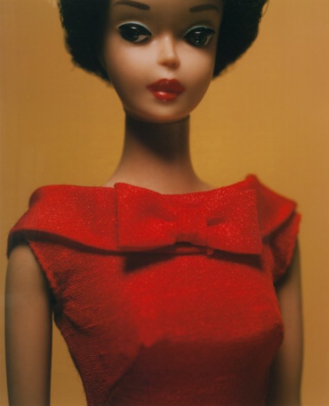
For me, Levinthal’s photos of Barbie do a lot more at calling out the artifice in photography—especially fashion photography—than any of the supposed ethical violations. By photographing Barbie in the style of Irving Penn and Richard Avedon, we can see how artificial everything really is. The images read as fashion—heck we’re looking at the clothes more than we do in most fashion photos where we can be distracted by the charisma of the model. At the same time, we know none of it is real and can start asking questions about lighting and makeup and color and depth of field and focus and what message this kind of toy sends to our kids.

Light and focus in particular are two tools which get a lot of extra attention in this show. Many of the photos are intentionally out of focus—emphasizing form over details. This makes it easy to lose track of the fact that these are toys so we start filling in our own details. When things are theatrically lit on top of this, I found myself reacting to these as if they were real even though I knew they weren’t.

But not in an uncanny valley way. The lighting and focus tricks manage to avoid both the valley and any sense of hyperreality. We see mood and gesture and more adult natures in the toys instead.

Levinthal is troubled by the proliferation of porn and sexuality, especially when it becomes embedded in toys and child socialization. I can see his point while also finding it kind of quaint; art museums tend to skew in the complete opposite direction.

His approach with the dolls manages to point a lot of this out without being either skeevy or crackpot. He’s not being a creep with kids’ toys nor is he looking for things which aren’t there. He’s mining all these toys for their mythic imagery and pulling out all kinds of things that kids just absorb.

They’re never just toys. Kids play with toys to roleplay and figure out their reality. When toys get pushed into situations beyond the orthodox use cases,* a lot of this latent imagery becomes more apparent.

*As someone who fully agrees with Micheal Chabon’s rant about the orthodoxy of Toy Story, I sure hope they do.

So many of Levinthal’s series are about mining specific myth families. Whether they’re famous baseball moments or the Wild West or iconic historic moments (e.g. Little Bighorn, Iwo Jima, and The Alamo), in all cases the toys become larger than life. They’re gateways into movies and fantasies and learning what it means to be American.

Many of them speak to me and my youth and remind me both of being a kid again and  what I get to see my own sons play with. The nostalgia though is tempered with warnings about how almost all this imagery is, or can be, problematic. These are all myths from a simpler time. We know better about them now.

Nowhere is this more clear than in the blackface photos. Where most of Levinthal’s work is subtle and allows us to imagine things as being real, these photos are in-your-face grotesque. They emphasize how these can’t be fun no matter how “harmless” people claim them to be. This isn’t a fantasy myth, it’s a dash of cold water on top of what used to be common imagery.

This is quite a different approach to this subject than Carrie Mae Weems’s subtlety. It’s no less powerful and very interesting to compare American Icons with Levinthal. The subtext of common household toy is the same. Weems shows how insidiously common they could be. Levinthal forces us to really observe the nastiness of the stereotype.

The photos of Nazi toys are similarly troubling. In this case, the toys aren’t grotesque; they’re seductively beautiful. By being toys, we can kind of explore this seduction in a safe space. At the same time, even blurred, these photos remind us how much we’ve been socialized. Holy crap is an out of focus Hitler doll still pretty fucking menacing.

From a design impact point of view, the Nazis knew exactly what they were doing. It’s clear in the photos how much Levinthal was drawn to the designs too. From a kid’s point of view, it’s also an important lesson on making sure that we adequately explain how we can be seduced by things that are bad for us. And that it’s okay to feel that and even acknowledge the compulsion without having to act on it.

It’s especially interesting to compare the Nazi photos with the photos from Hitler Moves East. In this case, Levinthal isn’t mining the myths as much as he’s staging and creating his own. Since there are few photos of Operation Barbarossa, the result is almost a graphic novel illustrated with Capa-like photos of toys.

Just like a graphic novel can pack serious punches when softened with the appearance of kids-stuff, these photos illustrate material which may have been too heavy to handle if actual photos existed.

I haven’t seen a photo exhibition like this which made me truly question how real every image was or to what explicit portion of the image I was reacting to, or whether my reaction was a product of my socialization. I was second guessing myself a lot. In the best way. With a lot of questions I should ask myself about all photographs I encounter.

Also:

Most of the prints on display are large-format Polaroids. I’m not going to go into tech geekery here. It’s just wonderful to see them in person.

Carleton Watkins. Sugar Loaf Islands and Seal Rocks, Farallons, 1868–69.

Carleton Watkins: The Stanford Albums

Note: This post was originally published on NJWV. It may also be of interest to read @kukkurovaca’s and @kalli’s views on Watkins and albumen prints from one125.

Carleton Watkins. The Wreck of the Viscata, 1868.
The Wreck of the Viscata, 1868
Carleton Watkins. Sugar Loaf Islands and Seal Rocks, Farallons, 1868–69.
Sugar Loaf Islands and Seal Rocks, Farallons, 1868–69
Carleton Watkins. Alcatraz from North Point, 1862–1863.
Alcatraz from North Point, 1862–1863
Carleton Watkins. Magenta Flume Nevada Co. Cal., c. 1871.
Carleton Watkins. Magenta Flume Nevada Co. Cal., c. 1871
Carleton Watkins. The Yosemite Valley from the "Best General View" 1866.
The Yosemite Valley from the “Best General View” 1866.
Carleton Watkins. Pohono, the Bridal Veil, Yosemite 900 ft., 1865–1866.
Pohono, the Bridal Veil, Yosemite 900 ft., 1865–1866
Carleton Watkins. Mt. Hood and the Dalles, Columbia River, 1867.
Mt. Hood and the Dalles, Columbia River, 1867
Carleton Watkins. Cape Horn, Columbia River, 1867.
Cape Horn, Columbia River, 1867
Carleton Watkins. Cape Horn near Celilo, 1867.
Cape Horn near Celilo, 1867

I’ve been gradually moving toward an appreciation of the older landscape photographers. This doesn’t mean I suddenly dislike the contrasty, technically-perfect Ansel Adams school of landscape photography.* But I’m finding myself liking photography which contains elements of embracing the inherent limitations of the medium—while pushing as hard against them as possible—rather than photography which tends to treat those limitations as flaws.

*Quite the opposite. Heck I still use a red-filter way too often when shooting black and white film.

Also, now that I’m living on the East Coast, I’ve gotten a lot more possessive about the West and find that media, of all sorts, has a tendency to trigger stronger feelings of home than it used to. Watkins, and much of the early landscape photography in general, is all about the American West and its myths. It’s what I grew up with and absorbed as part of my visual culture.

Which is why Carleton Watkins at Stanford was the exhibition I was most looking forward to seeing in California this summer. It did not disappoint.

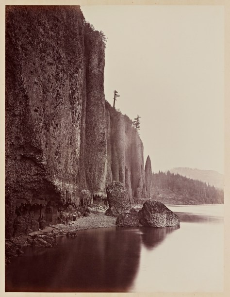
The photos themselves are great. Albumen prints from mammoth plates show a lot of detail but in a hazy low-contrast way that’s quite different than what we’re used to seeing from “good” photography. In particular, there’s a lack of distance detail (blue-sensitive emulsions are sensitive to atmospheric haze) as well as often an uncertain black point (more like the D-max isn’t as dark as a modern D-max would be).

Water also behaves a lot differently between the long exposures and lack of highlight detail. Waves get flattened into haze and waterfalls turn into lightsources. It feels different than modern long-exposure water shots since Watkins’s photos don’t actually feel like long-exposures to me.

There’s something very evocative about all this. I find myself mentally adjusting the contrast and filling in details as I look over the photos. These details aren’t necessary to the images themselves but they engage my mind as I look them over. As “realistic” as the images are, they’re also much closer to paintings than modern photography in terms of how they make me imagine the scene. I’m not looking for small specific details in the frame (or noting those details the photographer has called out for me), I’m getting a sense of the place and letting my mind do the rest of the interpretation.

The technical limitations also mean that these photos often rely on shapes and forms and large-scale compositional elements which don’t require a lot of fine detail—something that will make all photographs better but is even more critical here. That said, there is a lot of fine detail present as well. For example, you can see the birds and the seals roosting on the Farallon Islands just as clearly as you can make out the forms of the rocks.

I also like the older landscape photography because of how its message differs from landscape photography today. Modern landscape photography is often environmental-minded, relying on the glory of unspoiled nature to remind the viewer that nature needs to be preserved. 150 years ago, the message was almost the opposite. The glory of unspoiled nature was all potential and something we could, and should, tame.

I don’t prefer the older message, I just like seeing the world when it had a different mindset. And I find that seeing that mindset makes a better case for why things should be different today. It’s been a century and a half. We should know better now.

One of the wonderful things about Watkins when compared to O’Sullivan and Russell is how his photos can work with both messages.

Much of Watkins’s work are industrial commissions showing development in San Francisco or mining operations in the Sierras. It’s very clear that he’s a working photographer tasked with making functional documentary images.

At the same time, his Yosemite photos directly resulted in Congress granting Yosemite to California in 1864, “upon the express conditions that the premises shall be held for public use, resort, and recreation.” Not a National Park. Yet. But not for development either.*

*There’s a great note in the wall text about how in the 1860s, the only two photographic series being viewed in the US were Watkins’s photos of the Pacific and Brady’s (and Gardner’s) photos of the Civil War. The text suggests how different these series must have seemed to the public. I also can’t wrap my head around there being only two photographic series in public consciousness for those years. Definitely not the world we live in today.

In both his commissioned work and in his Yosemite photos, you can see the conflicts between settlement and industry versus nature. Many of his industry photos feel like the struggle is still ongoing rather than complete—cities are still being built, nature still dwarfs the structures. Even where massive amounts of earth have been moved, the environmental consequences should already have been somewhat common knowledge in California.*

*Malakoff Diggins and the Marysville flooding.

Similarly, many of his unspoiled Yosemite views feature development. A cabin or lodge here. A bridge there. Trees with all of their lower limbs harvested. Nature is glorious but our footprints are all over it still.

The Columbia River views are even better at making this point. Watkins documents what’s ostensibly a journey along a railroad along the river. The landscape here however dwarfs the technology and rather than documenting how a railroad is imposed on a landscape, the railroad here is often just taking what the landscape will let it take as it squeezes between the river and the cliffs.

The cliffs are huge. The river contains un-dammed rapids. This is spectacular country where the accomplishment is just getting there and reaching the end of the Oregon Trail.

It’s also impossible not to look at these historically. Not only is this San Francisco before the earthquake, it’s San Francisco while it was being built. A very different city with basically nothing recognizable to me, including the coastline. I can count 35 stars on the US flag.* Most-weird is looking at views of the California coast before Eucalyptus took over. This is home before it became home.

*Meaning it must have been taken in the one-year window between West Virginia’s admission in 1863 and Nevada’s in 1864. Assuming that people replaced old flags as soon as new states were admitted.

Watkins’s Yosemite photos also include the Indian names for everything. While we stile use many of those names, a lot has been renamed since. It’s nice to be reminded about whose land we’re on and how we’ve tended to erase or forget the origins of their names.

The exhibition also plays up the historic angle through a series of interactive multimedia displays featuring maps and rephotography so visitors can see what things look like today, where the photos were taken, or what changes have been made to the sites between then and now.

In addition to the multimedia displays, there’s actually a lot of other technical information beyond the photos. The exhibit talks about collodoin and wet-plate photography; albumen and contact printing; and even a bit at how a view camera works in terms of composing the scene. It’s nice to see the awareness that museumgoers probably have a much different concept about cameras and photography and that the difference in technology is hugely important to understanding a lot of what we’re looking at.

The Cantor even goes so far as to include examples of prints from Watkins’s negatives made by an inferior printer as well as calling out when Watkins switched from a normal to a wide angle lens.*

*According to the wall text, his 1861 Yosemite photos led to Congress’s Yosemite Land Grant in 1864 which led to the 1865 California Geologic survey of Yosemite for which Watkins acquired a wide angle lens.

It’s a great show. That it consists of photos that are housed at Stanford is even better. The Bay Area, still, does a lousy job of marketing its art holdings as being hugely important to the art world in general. So for a local institution to take its locally-relevant art holdings and put together a show like this is the icing on the cake.

Andrew J. Russell. Hanging Rock, foot of Echo Canon.

Andrew J. Russell’s Great West Illustrated

NOTE: This post is part of a post I originally published on NJWV. I’ve changed the beginning to focus on just the Russell photographs here.

Andrew J. Russell. Carmichael's Cut, Granite Canon.
Carmichael’s Cut, Granite Canon
Andrew J. Russell. Skull Rock.
Skull Rock
Andrew J. Russell. Dial Rock, Red Buttes.
Dial Rock, Red Buttes
Andrew J. Russell. Snow and timber line, Laramie Mountains.
Snow and timber line, Laramie Mountains
Andrew J. Russell. Valley of the Great Laramie, from the mountains.
Valley of the Great Laramie, from the mountains
Andrew J. Russell. The wind mill at Laramie.
The wind mill at Laramie
Andrew J. Russell. On the mountains of Green River.
On the mountains of Green River
Andrew J. Russell. Castle Rock, Green River Valley.
Castle Rock, Green River Valley
Andrew J. Russell. Coal beds of Bear River.
Coal beds of Bear River
Andrew J. Russell. Hanging Rock, foot of Echo Canon.
Hanging Rock, foot of Echo Canon
Andrew J. Russell. Echo City, looking up Weber River.
Echo City, looking up Weber River
Andrew J. Russell. Salt Lake City, from the top of the Tabernacle.
Salt Lake City, from the top of the Tabernacle
Andrew J. Russell. Great Mormon Tabernacle.
Great Mormon Tabernacle

I spent some family time at the California State Railroad Museum last month and managed to escape long enough to check out the special photography exhibition they had on display. While the rest of the exhibition was interesting,* the highlight was being able to look through a full-size reproduction of Andrew J. Russell’s Great West Illustrated. As someone whose favorite photobook may be Mark Ruwedel’s Westward the Course of Empire, looking through, in many ways, an identical project documenting the landscape around a railroad’s construction, rather than its ruins, was great and pointed out a lot of details that were lost by the time Ruwedel did his project.

*Sort of covered on my own blog.

Much of the geography of railroading involves cutting through the landscape in order to keep a track graded correctly. These scars are prominent in Ruwedel as they’re the most-permanent landscape modification from railroading. I was unaware that they had names and seeing each cut given a special name in Russell’s album, gives a a more personal sense of things.

It’s not just a scar on the landscape. The cuts reflect a lot of manpower and effort and each one is unique. We no longer see the uniqueness since we’re looking at the absence of the railroad rather than marveling at its presence.

Russell’s photos also include a number of references to coal beds and even a town called Coalville. This is something else that is easy to forget. Railroads are inherently tied to the natural resources they need to consume in order to run. Especially when building them in a place without any existing railroads for transport.

That the photos include a lot of the infrastructure required to support the railroads shows that it’s not just about the achievement of laying the track, this is about development and taming nature.

It’s this intersection of development and nature which really puts Russell’s photos into the tradition of people like Timothy O’Sullivan and Carleton Watkins who are credited with defining much of the way we view the American West. When Russell isn’t showing how the railroad infrastructure is conquering the landscape, he’s showing us photos of the incredible views and wide open spaces available for people to move into. This is a land of opportunity, a land of growth, a land of potential.

There’s also a completely different scale to the landscape in the West. Almost all of the photos include a human figure in the image. Some of this may be to hammer the “we’re here and can conquer this” point. But a lot of it is also just to provide scale. The landscape is huge.

But it’s settleable. Russell ends his journey in Salt Lake City with images that show a legitimate city nestled in the mountains. There’s also some curiosity about the Mormons, but it’s very clear that we can live in the West. And the railroads can take us there.

Besides the history side of things, I like a lot of the photos as photos even though all I had available to look at was a laminated digital print from a copy of the albumen print in the book. It’s not enough for him to just photograph the distinct landscape elements, I like his compositions and the way he’s able to situate so many of them in the landscape. I especially like the Hanging Rock photo and the way he’s used it to frame the settlement below it. Makes me wonder how much it would cost to buy a real print from the Oakland Museum.