All posts by @vossbrink

Splitting time between Princeton NJ and the San Francisco Bay Area. Photography at vossbrink.net, kensabe.tumblr.com, and vossbrink.exposure.co. Blogging at njwv.wordpress.com. Tweeting from @vossbrink.
Jim Golden, Relics of Technology

Relics of Technology

When I look back on that tech, there’s a nostalgia element, a love for all those forms and textures and sounds and smells, I wanted to elevate those items to art and remind people of all those overlooked objects.

Jim Golden

Jim Golden, Relics of Technology

Jim Golden, Relics of Technology

Jim Golden, Relics of Technology

Jim Golden, Relics of Technology

Jim Golden, Relics of Technology

Jim Golden, Relics of Technology

Jim Golden, Relics of Technology

Jim Golden, Relics of Technology

Jim Golden, Relics of Technology

Jim Golden, Relics of Technology

I like these very much. Yes, they feel commercial. But the commercial view works here since that view is designed to invite us to inspect  and notice the object details. As someone who grew up in the 80s and 90s, many of these relics still feel familiar and relooking at them now reminds me both of being a kid and the magic that this now-outdated tech was able to create.

As with most displays of old technology though, I’m curious how people who are unfamiliar with the technology react to these.* For now, we still use icons which evoke a lot of this technology. But for how much longer will the floppy disk make sense as the save icon?

*Similar to questions I had at SFMOMA’s Dieter Rams exhibition.

Though speaking of icons, I also  like how these photos mirror  the 1990’s isometric icon design as well. Seeing these on my computer doesn’t just remind me of the objects, I’m also remembering all the MacOS8/Copland Apple floundering and how computers interfaces used to look then.

Followers of Golden’s work might notice the introduction of short animated GIFs is a bit of a departure from his standard style. Encouraged to incorporate more motion into his commercial work, Golden hoped to find a way to put his own stamp on it without being ostentatious or giving up his voice. As he started to photograph the reel-to-reel tape player, his assistant flipped it on. Golden suddenly found a way to present the images: as animations. The small movements show the object in its original, intended use, but in a way that doesn’t overwhelm the quiet nature of the series as a whole.

Ariel Zambelich

The GIFs are also worth noting. I like that not all the photos have been giffed. And I like the quiet way the ones that are animated still read as photos. It’s going to be interesting to watch as we see more and more blurring the lines where photos become closer to Harry Potter photos. Why I like these more than Romain Laurent’s or Jeffrey Bennett’s is something I’m still figuring out for myself.

Arthur Tress. Daymares.

Dark Side of Dreams

The children would be asked means of acting out their visions or to suggest ways of making them into visual actualities. Often the location itself, such as an automobile graveyard or abandoned merry-go-round, would provide the possibility of dreamlike themes and spontaneous improvisation to the photographer and his subjects. In recreating these fantasies there is often a combination of actual dream, mythical archetypes, fairytale, horror movie, comic hook, and imaginative play. These inventions often reflect the child’s inner life, his hopes and fears…

Arthur Tress

Arthur Tress. Daymares.

Arthur Tress. Daymares.

Arthur Tress. Daymares.

Arthur Tress. Daymares.

Arthur Tress. Daymares.

Arthur Tress. Daymares.

Arthur Tress. Daymares.

Arthur Tress. Daymares.

Arthur Tress. Daymares.

Arthur Tress. Daymares.

Arthur Tress. Daymares.

Saw these on Tumblr. Went looking for more information. I don’t have much more to add except that anyone saying that staged photography isn’t real probably needs to look at these.

David Levinthal; Untitled (Wild West Sheriff 11-94), from the series “The Wild West”

David Levinthal: Make Believe

Note: This originally posted on NJWV.

Toys are intriguing, and I want to see what I can do with them. On a deeper level, they represent one way that society socializes its young.

David Levinthal

David Levinthal; Untitled #64

David Levinthal; Untitled (No. 159 alt), from the series, Modern Romance

David Levinthal; Untitled (No. 124), from the series, XXX

David Levinthal; Untitled (Willie Mays, No. 43), from the series, Baseball

David Levinthal; Untitled (Wild West Sheriff 11-94), from the series “The Wild West”

David Levinthal; Blackface (#1), from the series “Blackface”

David Levinthal; Untitled (No. 8), from the series, Mein Kampf

David Levinthal; Untitled (No. 1), from the series, Hitler Moves East,

I had a chance a few weeks ago to check out David Levinthal at the San José Museum of Art. It’s worth seeing. While at one level, photographs of toys can feel like something which falls into the clever gimmick side of things.* These are not just photos of toys—in fact, there’s nothing juvenile about anything here.

*Especially in our upworthy-saturated age where this exhibition just felt like something that could be titled “Common toys photographed as if they were real, you won’t believe the results!”

A lot of times, Levinthal directly apes existing photographers or photographic work. Just as often though, he starts off aping something specific and proceeds to get sidetracked into deeper investigations into the nature of the toy itself—and what the toy represents in our socialization. In both cases, the results retain hints of the toyness but also take us beyond into realms were we start rethinking how we perceive and react to the subjects of  photos in general.

There’s a lot of cultural baggage present. In the subjects, in ourselves, and in how we approach and react to the medium of photography.

Even though we know—or should know—better, it’s so easy to fall into the trap of thinking that photography is true and that certain manipulations of the subject are somehow unethical. Maybe it’s photographic cheating. Maybe it’s more along the lines of the current market for unretouched photos—typically of women—which is either about shaming celebrities for “lying,” embarrassing them for being real, or setting a “good example” for our girls.*

*I’ll admit that I don’t understand the gotcha nature of these photos and I’ve never understood exactly what the intended message accompanying their release is.

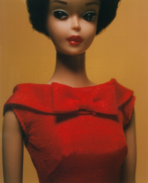
For me, Levinthal’s photos of Barbie do a lot more at calling out the artifice in photography—especially fashion photography—than any of the supposed ethical violations. By photographing Barbie in the style of Irving Penn and Richard Avedon, we can see how artificial everything really is. The images read as fashion—heck we’re looking at the clothes more than we do in most fashion photos where we can be distracted by the charisma of the model. At the same time, we know none of it is real and can start asking questions about lighting and makeup and color and depth of field and focus and what message this kind of toy sends to our kids.

Light and focus in particular are two tools which get a lot of extra attention in this show. Many of the photos are intentionally out of focus—emphasizing form over details. This makes it easy to lose track of the fact that these are toys so we start filling in our own details. When things are theatrically lit on top of this, I found myself reacting to these as if they were real even though I knew they weren’t.

But not in an uncanny valley way. The lighting and focus tricks manage to avoid both the valley and any sense of hyperreality. We see mood and gesture and more adult natures in the toys instead.

Levinthal is troubled by the proliferation of porn and sexuality, especially when it becomes embedded in toys and child socialization. I can see his point while also finding it kind of quaint; art museums tend to skew in the complete opposite direction.

His approach with the dolls manages to point a lot of this out without being either skeevy or crackpot. He’s not being a creep with kids’ toys nor is he looking for things which aren’t there. He’s mining all these toys for their mythic imagery and pulling out all kinds of things that kids just absorb.

They’re never just toys. Kids play with toys to roleplay and figure out their reality. When toys get pushed into situations beyond the orthodox use cases,* a lot of this latent imagery becomes more apparent.

*As someone who fully agrees with Micheal Chabon’s rant about the orthodoxy of Toy Story, I sure hope they do.

So many of Levinthal’s series are about mining specific myth families. Whether they’re famous baseball moments or the Wild West or iconic historic moments (e.g. Little Bighorn, Iwo Jima, and The Alamo), in all cases the toys become larger than life. They’re gateways into movies and fantasies and learning what it means to be American.

Many of them speak to me and my youth and remind me both of being a kid again and  what I get to see my own sons play with. The nostalgia though is tempered with warnings about how almost all this imagery is, or can be, problematic. These are all myths from a simpler time. We know better about them now.

Nowhere is this more clear than in the blackface photos. Where most of Levinthal’s work is subtle and allows us to imagine things as being real, these photos are in-your-face grotesque. They emphasize how these can’t be fun no matter how “harmless” people claim them to be. This isn’t a fantasy myth, it’s a dash of cold water on top of what used to be common imagery.

This is quite a different approach to this subject than Carrie Mae Weems’s subtlety. It’s no less powerful and very interesting to compare American Icons with Levinthal. The subtext of common household toy is the same. Weems shows how insidiously common they could be. Levinthal forces us to really observe the nastiness of the stereotype.

The photos of Nazi toys are similarly troubling. In this case, the toys aren’t grotesque; they’re seductively beautiful. By being toys, we can kind of explore this seduction in a safe space. At the same time, even blurred, these photos remind us how much we’ve been socialized. Holy crap is an out of focus Hitler doll still pretty fucking menacing.

From a design impact point of view, the Nazis knew exactly what they were doing. It’s clear in the photos how much Levinthal was drawn to the designs too. From a kid’s point of view, it’s also an important lesson on making sure that we adequately explain how we can be seduced by things that are bad for us. And that it’s okay to feel that and even acknowledge the compulsion without having to act on it.

It’s especially interesting to compare the Nazi photos with the photos from Hitler Moves East. In this case, Levinthal isn’t mining the myths as much as he’s staging and creating his own. Since there are few photos of Operation Barbarossa, the result is almost a graphic novel illustrated with Capa-like photos of toys.

Just like a graphic novel can pack serious punches when softened with the appearance of kids-stuff, these photos illustrate material which may have been too heavy to handle if actual photos existed.

I haven’t seen a photo exhibition like this which made me truly question how real every image was or to what explicit portion of the image I was reacting to, or whether my reaction was a product of my socialization. I was second guessing myself a lot. In the best way. With a lot of questions I should ask myself about all photographs I encounter.

Also:

Most of the prints on display are large-format Polaroids. I’m not going to go into tech geekery here. It’s just wonderful to see them in person.

Black Americana

Black Americana

Creative Producer, Brandon Littlejohn, and Photographer, Rod Gailes OBC, are collaborating to create a brilliant four-part photography series that showcases classic American settings through an Afro-Elite lens. The “Black Americana” series encourages African Americans to challenge societal messages about Blackness, while aspiring to higher levels of art and education on their own terms.

Taylor N. Lewis

Black Americana

Black Americana

Black Americana

Black Americana

Black Americana

Black Americana

Black Americana

Black Americana

Black Americana

When we weren’t marching, dodging fire hoses, and police dogs biting at our brown skin—when we weren’t singing songs of freedom, and training how to peacefully resist in southern sit-ins, we were doing what other Americans did—we went to the beach. “Island in the Sun”, a first installment in the ground-breaking series “Black Americana” re-introduces, and reclaims the image—the representation of free Black women and men living their lives openly and beautifully. The series seeks to offer a broader lens of Black American life not often seen—a restoration of Black bodies on a summer day in 1950’s America.

Geneva S. Thomas

This came across tumblr with a link to an Indiegogo campaign from 2012. That campaign appears to have failed mightily. Which is kind of depressing since our retrofetish nature* NEEDS images like these. So much of our romantic view of the 1950’s ignores how divided society was at the time.** To that end, these photos serve two purposes.

*It may be interesting to read to my post on Cars. And its followup.

**For example. How many non-blacks know about the Green Books?


First, they force us to confront how much we expect these kinds of images to be only white people.* The photos read retro. And affluent. And black. And all of a sudden we’re in uncharted territory and questioning our assumptions. This is almost always a good place to be.

*Something Kerry James Marshall does a lot.

Second, we then get to think about what kind of retro images we expect to see black people in. My guess is that it’s probably very much like every single Hollywood biopic where the character grows up impoverished in the South. While it was obviously much more difficult to be Black in the 1950s than it was to be White,  picturing an entire group of people in such a limited way is dangerous territory.

I’m sad that the rest of this series didn’t get made. There are more images on the Tumblr but it’s been two years since the last update.

Daniel Kukla. The Edge Effect.

The Edge Effect

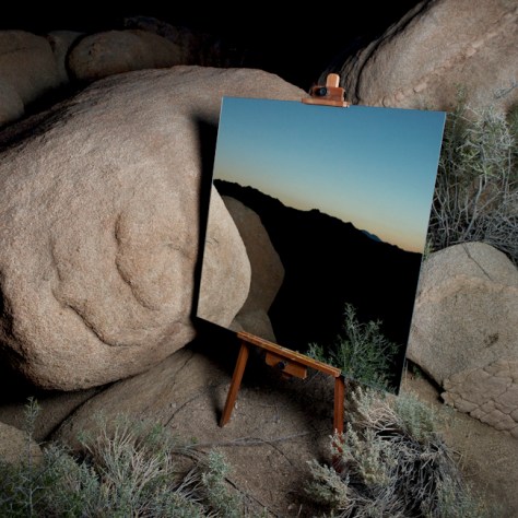
While hiking and driving, I caught glimpses of the border space created by the meeting of distinct ecosystems in juxtaposition, referred to as the Edge Effect in the ecological sciences. To document this unique confluence of terrains, I hiked out a large mirror and painter’s easel into the wilderness and captured opposing elements within the environment.

Daniel Kukla

Daniel Kukla. The Edge Effect.

Daniel Kukla. The Edge Effect.

Daniel Kukla. The Edge Effect.

Daniel Kukla. The Edge Effect.

Daniel Kukla. The Edge Effect.

Daniel Kukla. The Edge Effect.

Came across this on tumblr but I felt a little weird about posting the entire sequence here like the tumblr did. A lot of times the mirror thing seems a bit much—looks neat in the ways that mirrors fascinate us but doesn’t really say much more than that. These though use the mirror to actually reveal interesting things about the landscape.

We’ve all been in places where the view in one direction is quite different than the view in the opposite.  Telling that story in a visually interesting way—let alone finding something interesting in the story itself is hard. These photos do both.