Tag Archives: portraiture

Duane Michals. Empty New York. c1964.

Duane Michals

Duane Michals. Empty New York. c1964.

When I made those pictures, I knew nothing about photography. I found a wonderful book by Eugène Atget. He had photographed empty rooms and empty streets in Paris and I was stunned. So I would get out onto the streets early in the morning and take pictures. I called it my “five-finger exercise.”

All these rooms began to look like stage sets. I saw them as pure theatre. My classic example is the barbershop photo: the jacket hanging, the clock over the chair. I thought, well, this is a mise en scène. The man comes in, he puts on his barber costume, and he does his barber act. I began to see the empty streets or empty shops as theatrical backdrops. “Empty New York” is the beginning of me seeing everything as total theatre.

Duane Michals

Duane Michals. Rene Magritte.

I have a new concept. I call it the “prose portrait.” A prose portrait doesn’t necessarily show you what someone looks like; it’s not a line-for-line reproduction of a face. A prose portrait tells you what the nature of the person is about. When I photographed Magritte, the portrait was made in the nature of Magritte. When I photographed Warhol, the portrait was in the character, the mystery—if there is one—of Warhol. You can’t capture someone, per se. How could you? The subject probably doesn’t even know who he (or she) is. So, for me, a prose portrait is about a person, rather than of a person.

Duane Michals

Really like this interview. Really really like these two points about photos as theatrical backdrops and portraiture about the nature of the person.

The note about photos as theatrical backdrops in particular gives me some additional language to explain how ruin porn (among other photography genres) often fails.

And this is just flat-out good advice for any novice photographer too. If you’re photographing a place, give us a sense of how it’ll be populated, change., etc. If you’re photographing a person, make it about the person, not of the person.

Kip Praslowicz

Dismissal via Snapshot

Kip Praslowicz. Chester Park. Duluth, MN. November

Start with the snapshot. Start with the connection. Figure out why grandma cares about the subject and make that the keystone in a photograph. Then pile on the better gear, experience and technical tricks to make it a better damn photograph than grandma can take.

(via Dismissal Via Snapshot | Kip Praslowicz)

Yes! Yes! Yes!

The irony of dismissal via snapshot is that “snapshots” are almost always the most-posed and edited photos in the album. Seriously. Think about all the photos your parents, relatives, friends’ parents, etc. took of you. “Everybody get together. Smile. Stop screwing around! You too! Okay let me back up and get everyone in. On three. Okay, I think someone blinked, let me take another just to be safe. etc. etc.”

Aspiring to take meaningful and good family photos is all I truly care about in my photography. That this is somehow an inferior practice? Please. Those are the only photos most of us really care about.

Anne Geddes, Down in the Garden.

Flower pots

“Look, I’m one of these people, I do not have a green thumb. I look at plants, and they wither and die. And so I had this empty flowerpot that was sitting in my studio, and a mother came in with this little 6-month-old baby, who was wearing a little woolen hat, a little fluffy woolen hat, and I saw the flowerpot and I thought, well, wow, she’d look like a lovely little cactus. And so we sat her in the flowerpot, and it was a black-and-white image, and that was that.”

(via Anne Geddes “in a very lucky situation” with baby photography fame – CBS News)

From humble beginnings to a publishing powerhouse. And yes, it’s totally important to look at photographers who are popular but not necessarily good or important* since it forces you to confront issues of taste and why you like or dislike something.

*More on the popular vs good vs important discussion. Also relevant to this is where I decide to call this kind of photography kitsch.

Geddes is easy to use as a punchline. But she’s popular and a ton of people want to ape her style when taking photos of their kids. I have my photographic influences as well. I’d like to think that I’m not aping them just because I like what the images look like.

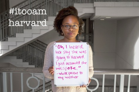
I, Too, Am Harvard

Me Too Am

Note: This was originally posted on NJWV.

A photo campaign highlighting the faces and voices of black students at Harvard College. Our voices often go unheard on this campus, our experiences are devalued, our presence is questioned—this project is our way of speaking back, of claiming this campus, of standing up to say: We are here. This place is ours. We, TOO, are Harvard.

I, Too, Am Harvard

I, Too, Am Harvard
I, Too, Am Harvard
I, Too, Am Harvard
I, Too, Am Harvard

Our project was inspired by the recent ‘I, too, am Harvard’ initiative. The Harvard project resonated with a sense of communal disaffection that students of colour at Oxford have with the University. The sharing of the Buzzfeed article ‘I, too, am Harvard’ on the online Oxford based race forum, ‘Skin Deep’ led to students quickly self organising a photoshoot within the same week. A message that was consistently reaffirmed throughout the day was that students in their daily encounters at Oxford are made to feel different and Othered from the Oxford community.

I, Too, Am Oxford

I, Too, Am Oxford
I, Too, Am Oxford
I, Too, Am Oxford
I, Too, Am Oxford

We hope to offer the opportunity to build a stage on which men and women of color can be included in the atmosphere of this campus. Most of all, we want to continue the momentum pushed forth by other I Am movements across the nation and the world.

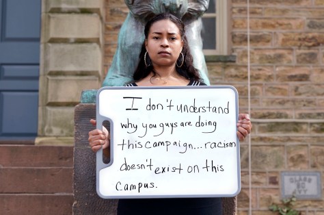
I, Too, Am Princeton

I, Too, Am Princeton

So this has become a proper meme on college campuses now. I’ve also seen a Johns Hopkins version on Twitter. I’m sure there are others going on as well. Part of me is resistant to this type of “me too” project in that it risks becoming Yet-Another-I-Too-Am project—where the perceived lack of creativity makes it easier to dismiss the concerns the project raises.

Part of me though sees it as being absolutely necessary since an all-too-easy response to seeing I, Too, Am Harvard is to think “that would never happen here.” It’s very easy to dismiss these as someone else’s problem until one shows up on your campus or alma mater.

This assumes that people, say at Princeton, even saw the Harvard or Oxford projects. I’m totally okay with doing a me too project because you think your audience is ignorant of the other projects. A lot of the point of privilege is being completely unaware of this sort of thing until it gets held up in your face.

I also like looking at these as listing microaggressions rather than completely eggregious racism since it’s very easy for us to dismiss and distance ourselves from the obviously-racist stuff and very difficult for us to even be aware of how we’re all committing microaggressions. The more we’re aware of how these little comments hurt—even the intended-compliments about “good english”and how we all use them, the better off we’ll all be.

And yes, I’m saying “we all” because I fully subscribe to the idea that we’re all a little bit racist and that acknowledging as much is the most-important  step to dealing with it.

About the form

The other thing about these projects that interests me is the form itself. This kind of portrait where the subject is holding a sign isn’t anything new. But it’s become an increasingly popular form on the web. I think a lot of this is because of how popular image macros have become; holding your own sign is a very easy way to make your own in-camera image macro.

It’s also representative of how much photography has become the medium of communication these days. It’s no longer text or images. It’s both. And fluency in both is what all the kids are doing now.

Marie Cosindas, Mrs Jack’s Floral, a dye transfer print of 1966

Marie Cosindas

Marie Cosindas, Andy Warhol, NYC, 1966.

All of Cosindas’ portraits have, as Rohrbach says, a composition that demands the viewer study the image carefully. “They’re dark; they come from an earlier sensibility, where one was meant to look at prints over a long period of time and let these intimate images come to you up out of the darkness.” They also have a timeless feel, difficult to date to the 1960s.

(via The colour photography pioneer that time forgot – Telegraph)

A photographer I’d never heard of until reading this article. Considering how much the narrative is that we only started valuing color photography as art in the mid-1970s, it’s important to note that Cosindas was being exhibited a decade earlier.

The way Cosindas’s photos look like paintings and evoke the sense of classic portraiture is also perfectly timed on the heels of my post on erasure which thought about how photographic portraiture differs from painted portraits.