This previously posted on NJWV.


After viewing the Met’s Irving Penn Centennial, I can’t remember ever having had to reevaluate my understanding of an artist to this degree. This is different than recognizing that someone who I hadn’t paid attention to is actually a legit talent;* I knew and respected Irving Penn’s work as a portraitist and the Met’s show made me completely reconsider whether that was what he was.
*e.g. Ai Weiwei
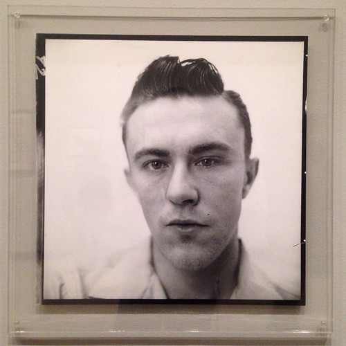
Don’t get me wrong, Penn’s portraits are great and there’s a reason I conceived of him as a portraitist first. I especially love the corner portraits in how the constraint of the set gives the sitters things to do—suggesting certain poses and postures, offering places to put their arms—which don’t involve props but allow people who may not be used to posing ways of finding their angles. It’s a fantastically simple idea which more people should steal.
His later portraits are also wonderful in that they’re very clearly collaborations with the sitters and as such are often beautifully tight and intimate*—often just a face and a hand being constrained by the edges of Penn’s viewfinder in the same way he used the tight corner to constrain his sitters a decade earlier.
*I also love that the Met has his backdrop on display—even if it’s being used as selfie-bait.
But at heart he’s clearly a still life photographer. The Met makes this point by both starting and ending the exhibition with his still lifes—the implication being that they’re both his first love and the thing which has kept him sane through decades of commercial photography.
I’m not usually a still life guy* but these are wonderful in their restraint and attention to detail. Every small thing matters. Every detail is considered. If a still life is an opportunity to essentially brag about how good you are at your craft, Penn is indeed a master.
*It doesn’t matter what genre or medium we’re talking about. I very rarely find myself interested in still lifes.
But there’s more to it than that. Penn, as a photographer, is extremely interested in doing the most with the least and making sure that the few details we can see not only adequately describe everything which we don’t see but also overwhelm us with their textures and tones so we feel like we don’t even need to see anything else.
It’s this sensibility which makes Penn such a fantastic fashion photographer. We don’t need to see the full garment—let alone the entire look. Just a sleeve will suffice. Or a hat. Or the ruffle of a collar.
He understands how fashion works—how clothing works. It’s not about looking pretty, it’s about the structure and construction and the little details and textures which distinguish one garment from another—not only giving them character but also suggesting what events or occasions they could be used for.
Clothing, even at it’s most impractical extreme, is functional. It’s always doing something whether it’s merely protecting the body or making a statement about the wearer.
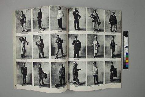
There’s no reason why this approach should be limited to high fashion and indeed, Penn does not limit himself to that world either. His small trades series is fantastic as an August Sanderesque approach to functional clothing.
I love his Small Trades series so much. We’re invited to look—really look—at the different ways that tradesmen dress in order to do their jobs. How they need to present or protect themselves. Where their clothing gets worn out or reinforced. Every photo is a reminder of how clothing works and is intimately connected to what the person wearing it is doing.
That so many of these trades are blue-collar jobs which we—or at least the people who visit the Met—are no longer familiar with adds an extra layer of interest to these photos. I overheard a number of people trying to figure out what jobs like “blast furnace tender” were before settling on things like “the guy who takes care of the heating in your apartment building.”
Most of the jobs still exist somewhere in the world but to us these photos also serve as a memorial to a more physical world as seen through the clothing of the people who worked in it.
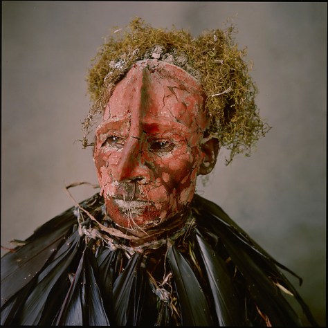
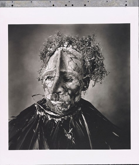
Which brings us to Penn’s ethnographic work. In another setting this would’ve deserved a massive amount of side-eye but here, it’s not only enjoying the context of the fashion and trades photography, it’s a continuation of that photography.
The Met does a great job at flagging how the idea of documenting indigenous cultures before they disappear is a dated concept.* But it’s not really necessary here. Penn isn’t really doing ethnographic work. He’s making the same photos he always does—treating the Peruvian clothing with the same respect and reverence he treats all clothing whether it’s a Balenciaga gown or a dirty apron.
*Sadly not as dated as it should be but at least new projects which continue to reduce cultures to an artificially-imposed appearance of “authenticity” receive the criticism they deserve.
For Penn everything is Balenciaga.
So we get to see the clothing in whatever view best presents the clothing. Maybe it’s a typical model shot which also works as a portrait of the villagers. Or maybe it’s a pose where the villager’s is looking at the ground so we can appreciate the full glory of her hat.
He skirts very close to reducing culture to appearance but, for me, he steers clear of that pitfall and winds up in a much more interesting place. Nowhere is this more apparent than in his photographs of the Moroccan women still wearing their veils.
Again, Penn approaches the veils like he approaches all clothing. But because of the austere nature of these garments and the way that the women wearing them are posing, instead of looking at the fabric and construction details, we see how the garments themselves are worn. How they’re tucked and folded. Where they hit on the body and where they drape.
We get a sense of character through the different ways each women carries herself in the photo. There’s a wonderful video showing how Penn took these photos in a mobile tent with wind swirling all over the place. The degree of cooperation and trust between him and the veiled women is also readily apparent.
I also enjoy the sense that Penn grappled with the morality of his work as a fashion photographer. In addition to being a still-life photographer at heart, the way his personal work serves as a way for him to sort of rebel against his commercial work is very interesting. That he chose decidedly non-fashion-figure women for his nude photography is great. And I love his cigarette photography and the way it reflects his pathos over glamorizing it.
The photos are beautiful but ugly with strong recognizable branding that’s burned and trash. 40 years later I’m amazed at how I recognize the brands even though I don’t think Pall Mall, Lucky Strike, and Chesterfield even existed while I was alive.
This was a good show as it was just based on the content on display. Lots of good photos and every period covered well. But the way it balanced Penn’s personal work with his commercial work in terms of both who he is as a photographer and what he felt about the photos he was paid to make makes it a great show.
On Process


There’s not a lot of information on Penn’s process but what there is is fascinating. One of the long-running jokes we have online is the color vs black and white debate and how a number of people on the web trot out the axiom that photographing in color is photographing clothes. That much of Penn’s work involves shooting on color slide film then printing in black and white repeatedly made me chuckle since Penn essentially specialized in taking pictures of clothes.
I found myself wondering a lot about how Penn converted his slide film to black and white prints. There’s a lot of information about Penn’s Platinum printing but precious little about everything leading up to the printmaking itself. Is the internegative an enlargement made in the darkroom? Did he do any color filtering while making the enlargement?
The Platinum Printing information on the other hand is very interesting in how Penn created registration pins and repeatedly coated and exposed the paper so as to have more control over the final print. It’s a pretty interesting refinement on standard contact printing which definitely appeals to my background working in a printshop.
At the same time, I didn’t like a lot of his Platinum prints and—I readily admit how blasphemous this is—often preferred the halftoned prints in Vogue. I felt like Penn may have been a bit too seduced by what he could do with his fancy pin-registration contact-printing rig and, while I like the photos, found a lot of the details to be unnecessarily muddy.
And I say unnecessarily because the magazines were on display and the details were clearer there—as if someone in Vogue’s prepress recognized that shadows would block up on press and opened everything up so that would print nicely.
The magazines on display also included many more color prints of photos which were only black and white on the walls. It’s great to see both and see how Penn reimagined the scene in black and white.


