Tag Archives: 1/125

Carleton Watkins. Sugar Loaf Islands and Seal Rocks, Farallons, 1868–69.

Carleton Watkins: The Stanford Albums

Note: This post was originally published on NJWV. It may also be of interest to read @kukkurovaca’s and @kalli’s views on Watkins and albumen prints from one125.

Carleton Watkins. The Wreck of the Viscata, 1868.
The Wreck of the Viscata, 1868
Carleton Watkins. Sugar Loaf Islands and Seal Rocks, Farallons, 1868–69.
Sugar Loaf Islands and Seal Rocks, Farallons, 1868–69
Carleton Watkins. Alcatraz from North Point, 1862–1863.
Alcatraz from North Point, 1862–1863
Carleton Watkins. Magenta Flume Nevada Co. Cal., c. 1871.
Carleton Watkins. Magenta Flume Nevada Co. Cal., c. 1871
Carleton Watkins. The Yosemite Valley from the "Best General View" 1866.
The Yosemite Valley from the “Best General View” 1866.
Carleton Watkins. Pohono, the Bridal Veil, Yosemite 900 ft., 1865–1866.
Pohono, the Bridal Veil, Yosemite 900 ft., 1865–1866
Carleton Watkins. Mt. Hood and the Dalles, Columbia River, 1867.
Mt. Hood and the Dalles, Columbia River, 1867
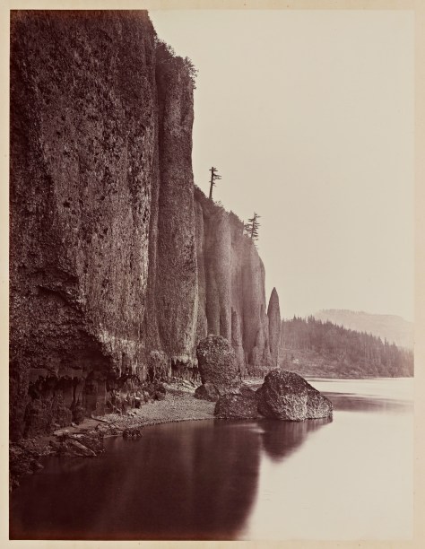
Carleton Watkins. Cape Horn, Columbia River, 1867.
Cape Horn, Columbia River, 1867
Carleton Watkins. Cape Horn near Celilo, 1867.
Cape Horn near Celilo, 1867

I’ve been gradually moving toward an appreciation of the older landscape photographers. This doesn’t mean I suddenly dislike the contrasty, technically-perfect Ansel Adams school of landscape photography.* But I’m finding myself liking photography which contains elements of embracing the inherent limitations of the medium—while pushing as hard against them as possible—rather than photography which tends to treat those limitations as flaws.

*Quite the opposite. Heck I still use a red-filter way too often when shooting black and white film.

Also, now that I’m living on the East Coast, I’ve gotten a lot more possessive about the West and find that media, of all sorts, has a tendency to trigger stronger feelings of home than it used to. Watkins, and much of the early landscape photography in general, is all about the American West and its myths. It’s what I grew up with and absorbed as part of my visual culture.

Which is why Carleton Watkins at Stanford was the exhibition I was most looking forward to seeing in California this summer. It did not disappoint.

The photos themselves are great. Albumen prints from mammoth plates show a lot of detail but in a hazy low-contrast way that’s quite different than what we’re used to seeing from “good” photography. In particular, there’s a lack of distance detail (blue-sensitive emulsions are sensitive to atmospheric haze) as well as often an uncertain black point (more like the D-max isn’t as dark as a modern D-max would be).

Water also behaves a lot differently between the long exposures and lack of highlight detail. Waves get flattened into haze and waterfalls turn into lightsources. It feels different than modern long-exposure water shots since Watkins’s photos don’t actually feel like long-exposures to me.

There’s something very evocative about all this. I find myself mentally adjusting the contrast and filling in details as I look over the photos. These details aren’t necessary to the images themselves but they engage my mind as I look them over. As “realistic” as the images are, they’re also much closer to paintings than modern photography in terms of how they make me imagine the scene. I’m not looking for small specific details in the frame (or noting those details the photographer has called out for me), I’m getting a sense of the place and letting my mind do the rest of the interpretation.

The technical limitations also mean that these photos often rely on shapes and forms and large-scale compositional elements which don’t require a lot of fine detail—something that will make all photographs better but is even more critical here. That said, there is a lot of fine detail present as well. For example, you can see the birds and the seals roosting on the Farallon Islands just as clearly as you can make out the forms of the rocks.

I also like the older landscape photography because of how its message differs from landscape photography today. Modern landscape photography is often environmental-minded, relying on the glory of unspoiled nature to remind the viewer that nature needs to be preserved. 150 years ago, the message was almost the opposite. The glory of unspoiled nature was all potential and something we could, and should, tame.

I don’t prefer the older message, I just like seeing the world when it had a different mindset. And I find that seeing that mindset makes a better case for why things should be different today. It’s been a century and a half. We should know better now.

One of the wonderful things about Watkins when compared to O’Sullivan and Russell is how his photos can work with both messages.

Much of Watkins’s work are industrial commissions showing development in San Francisco or mining operations in the Sierras. It’s very clear that he’s a working photographer tasked with making functional documentary images.

At the same time, his Yosemite photos directly resulted in Congress granting Yosemite to California in 1864, “upon the express conditions that the premises shall be held for public use, resort, and recreation.” Not a National Park. Yet. But not for development either.*

*There’s a great note in the wall text about how in the 1860s, the only two photographic series being viewed in the US were Watkins’s photos of the Pacific and Brady’s (and Gardner’s) photos of the Civil War. The text suggests how different these series must have seemed to the public. I also can’t wrap my head around there being only two photographic series in public consciousness for those years. Definitely not the world we live in today.

In both his commissioned work and in his Yosemite photos, you can see the conflicts between settlement and industry versus nature. Many of his industry photos feel like the struggle is still ongoing rather than complete—cities are still being built, nature still dwarfs the structures. Even where massive amounts of earth have been moved, the environmental consequences should already have been somewhat common knowledge in California.*

*Malakoff Diggins and the Marysville flooding.

Similarly, many of his unspoiled Yosemite views feature development. A cabin or lodge here. A bridge there. Trees with all of their lower limbs harvested. Nature is glorious but our footprints are all over it still.

The Columbia River views are even better at making this point. Watkins documents what’s ostensibly a journey along a railroad along the river. The landscape here however dwarfs the technology and rather than documenting how a railroad is imposed on a landscape, the railroad here is often just taking what the landscape will let it take as it squeezes between the river and the cliffs.

The cliffs are huge. The river contains un-dammed rapids. This is spectacular country where the accomplishment is just getting there and reaching the end of the Oregon Trail.

It’s also impossible not to look at these historically. Not only is this San Francisco before the earthquake, it’s San Francisco while it was being built. A very different city with basically nothing recognizable to me, including the coastline. I can count 35 stars on the US flag.* Most-weird is looking at views of the California coast before Eucalyptus took over. This is home before it became home.

*Meaning it must have been taken in the one-year window between West Virginia’s admission in 1863 and Nevada’s in 1864. Assuming that people replaced old flags as soon as new states were admitted.

Watkins’s Yosemite photos also include the Indian names for everything. While we stile use many of those names, a lot has been renamed since. It’s nice to be reminded about whose land we’re on and how we’ve tended to erase or forget the origins of their names.

The exhibition also plays up the historic angle through a series of interactive multimedia displays featuring maps and rephotography so visitors can see what things look like today, where the photos were taken, or what changes have been made to the sites between then and now.

In addition to the multimedia displays, there’s actually a lot of other technical information beyond the photos. The exhibit talks about collodoin and wet-plate photography; albumen and contact printing; and even a bit at how a view camera works in terms of composing the scene. It’s nice to see the awareness that museumgoers probably have a much different concept about cameras and photography and that the difference in technology is hugely important to understanding a lot of what we’re looking at.

The Cantor even goes so far as to include examples of prints from Watkins’s negatives made by an inferior printer as well as calling out when Watkins switched from a normal to a wide angle lens.*

*According to the wall text, his 1861 Yosemite photos led to Congress’s Yosemite Land Grant in 1864 which led to the 1865 California Geologic survey of Yosemite for which Watkins acquired a wide angle lens.

It’s a great show. That it consists of photos that are housed at Stanford is even better. The Bay Area, still, does a lousy job of marketing its art holdings as being hugely important to the art world in general. So for a local institution to take its locally-relevant art holdings and put together a show like this is the icing on the cake.

Haunted Air

Haunted Air

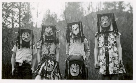
The photographs in Haunted Air provide an extraordinary glimpse into the traditions of this macabre festival from ages past, and form an important document of photographic history. These are the pictures of the dead: family portraits, mementos of the treasured, now unrecognizable, and others.

David Lynch

Haunted Air

Haunted Air

Haunted Air

Haunted Air

Haunted Air

Haunted Air

Haunted Air

Haunted Air

Haunted Air

Haunted Air

Another through the tumblr wires. In this case, while these are indeed striking images from a historical point of view,* it’s really the portraiture point view which is more interesting to me here. Being a parent has reminded my of how important Halloween costumes are to us when we’re little. These are all family portraits which function as portraits despite, and because of, their uncanniness. The masks don’t hide anything. They never hide anything.

*Before Halloween became dominated by slickly-manufactured costumes and merchandising tie ins.

I don’t have much more to add which isn’t already covered by @kukkurovaca’s writing on Meatyard and hope that this post encourages him to migrate some of those over to this blog.

“Colby (Colby’s Music), 2001.” Beth Yarnelle Edwards

From the 1/125 Archives: Suburban Dreams

One of the things we’re planning for Hairy Beast is sporadic reposts from 1/125. This isn’t just because I’m so hard up for material I have to cannibalize our past—well, it’s not just that. I also want to make sure that stuff exists outside of the Tumblr ecosystem. First up is this post on Suburban Dreams by Beth Yarnelle Edwards, which recently came up in conversation on twitter. This post was originally published on January 23, 2013.

No one appears to be impoverished…these are not the ‘cool’ photos of down and out drug users, strippers and hookers. These are our own neighbors. We immediately recognize ourselves and our friends.

Amazon review by G. Rothman of Suburban Dreams.

“Colby (Colby’s Music), 2001.” Beth Yarnelle Edwards

This weekend I stopped by the Oakland Museum to see “Beth Yarnelle Edwards: Suburban Dreams,” an exhibition drawn from the California portion of Edwards’s Suburban Dreams series. (See here and here) The exhibit includes around a couple dozen photographs, as well as a handy binder containing reproductions of ephemera — samples of Edwards’s working notes, correspondence with subjects, etc. I went on the 19th for the talk by Edwards and curator Drew Johnson, which proved quite interesting.

Pictures authentic to the people

Edwards photographs subjects in their homes, in scenes that are staged but also intended to be “authentic” depictions of the family’s life. She follows a set protocol which includes showing subjects examples of her work, and asking if they are comfortable looking like the people in those pictures and interviewing them with intentionally vague, non-leading questions (e.g., “tell me something about your lives,” “what are your favorite things?”) Based on the interview, semi-improvised scenes are staged in which subjects act out some aspect of their daily lives. Specific poses are held for moderately long exposures.

It’s an interesting approach. Johnson contrasted it with the model of the “invisible documentarian,” and asserted that Edwards’s results can be “more real than a candid, unstaged photograph.” I’m not sure I’d agree with that, quite, but I find the approach appealing, especially in the context of my recent discussion of my hangup about portraiture. (I respond negatively to portraits in which the photographer seems to be fully in charge of what the subject means.)

Edwards’s very interactive way of working strikes a good balance: she’s producing images that have a great thematic and stylistic consistency and strong authorship, but her subjects are active in determining how they will appear. Her intention is to “make the pictures authentic to the people, not just use the people to illustrate my ideas.”

All of which is very appealing to me. But I find myself rather ambivalent about the actual photos.

Everyone can recognize

Part of my difficulty has to do with the type of photograph Edwards is making. My natural inclination is to read them as documentary, even ethnography, but that’s not really what they’re for. Edwards is actually emulating genre painting rather than making photographic documents. Her repeatedly declared intention is to portray her subjects as universal archetypes, which “everyone” can recognize. And that’s the second, larger part of my difficulty: the presumption of universality.

Edwards identifies as a cultural insider relative to the subjects she’s working with. In the California photos, the families are, while not necessarily her friends, within her extended social network — people who know people she knows, etc. In discussing her work, she used “we” and “our” often, apparently referring to a category inclusive of her subjects, herself, and those in attendance(?). (Although she also referred to the suburbs as an “aspirational” world, as seen on TV, and part of her motivation for the project is that she became “interested in the aspiration and what it meant.”)

I asked, given that she produced the work as a cultural insider, whether the photographs were intended for an insider audience as well, or whether they are intended for a different or broader audience — in short, who she thought the viewer of these photographs was. For whom are these archetypes “universal”?

Her response was that while the “stuff” is not universal, posture, gesture, etc. is. For example, a boy about to become a man will stand a certain way whether here or “two thousand miles away,” whether now or in a painting made hundreds of years ago. (The association of universality with the tradition of painting was a recurring and prominent theme.)

This jibes with her take on Europe. (The project includes several European countries, although what’s exhibited at OMCA is just from California.) She said that “increasingly, with globalization, a lot of European homes look like our suburban homes,” and in discussing distinctions between homes in Europe and homes here, she was careful to explain how what differences she did observe were in comparisons between homes of people in the same social class and professional status. And tellingly, when asked about the impact of economic recession on the people in her photographs, she pointed out that people who were doing poorly thanks to economic downturns would not be in the houses she was photographing — they would have left and been replaced by others.

Of course, there’s nothing wrong with focusing on a specific social class — but I say it is telling because class is the parameter she did not use in talking about the trans-historical, trans-cultural range of viewers who are intended to be able to recognize the “universal” in her work.

(For examples of different relationships between a subject group, an insider or semi-insider photographer, and a viewership, consider Gordon Parks as “Mr. Negro”, which is a case of the photographer overtly acting as a bridge between one group and another, or Daniela Rossell, from whose Ricas y Famosas I think Suburban Dreams differs more in degree than in kind, except that Ricas y Famosas is perceived/used as indicting evidence against the subculture it represents.)

Family of (Upper Middle Class) Man

Jumping back a bit: part of the function of documentary and especially ethnographic photography is to explain a culture to an audience which is not presumed to have extensive prior knowledge of it. This is a function I know how to read in photographs (more or less). It orients the viewer toward the specific, toward information, toward the cultural context of the photograph. It helps the viewer to account for what they are seeing. And it does not presume that the viewer is an insider.

Now, that’s not the function Suburban Dreams is meant to serve, so not doing it is not an intrinsic deficit. But to the extent that the series presumes a relatively “insider” audience alongside its insider author, it is rendered less accessible and less useful to those who are not insiders. I believe Edwards that Suburban Dreams is about showing people as types that transcend place and time, but I think there is a real hiccup when it comes to class. As much as I like Edwards’s protocol and methodology, I think to some extent the photographs that result from them serve as family photographs of the upper middle class en masse: an internally directed self-depiction of people as they are willing to see themselves and be seen.

There’s nothing wrong with family photographs, and there’s nothing wrong with an insider producing something that is implicitly intended for the appreciation of other insiders. But there’s a potentially sharp discontinuity between that appreciation and the appreciation of outsiders. In the case of depictions of “universal” archetypes, the predictable outcome of crossing this discontinuity is that the archetype devolves to stereotype. The result is not an incomprehensible image, but an all-too-comprehensible one — stereotypes being always the easiest type to judge, read, and dismiss.

Our Own Neighbors

This aspect stands out to me particularly in the context of the Oakland Museum, which is located — well, here. If you don’t know what I mean, stop by some time, and walk a couple of miles in a couple of directions from the museum, and see what you see, including but not limited to, abject poverty, notable affluence, everything in between, and both urban decay and gentrification. There are few areas in California where class is more in need of socially critical interpretive context. And the rest of the museum — particularly the California history exhibits, but also plenty of the art — has that in spades.

Still, as I left Suburban Dreams, I wondered if maybe it was really just me — whether I was just personally/idiosyncratically insensitive to the universal in Edwards’s photographs. Would I find the same gazes, the same gestures, the same types, in, say, the photographs William Gedney made in Kentucky? Probably yes, at least in some cases. It’s likely that to some extent, maybe a great extent, my ambivalence toward Edwards’s photographs stems directly from my very real bias against the universal and toward the specific.

Then I went around the corner from Suburban Dreams, and I looked at photographs of Black Panthers and Diggers, and Dorothea Lange’s Richmond welders and Manzanar detainees. And I thought: images of well-off people at leisure, no matter in what posture or gesture, simply cannot be meaningfully regarded as universal representations of humanity, except insofar as rich people all look alike.

PS: To be clear, I am not presenting this as an comprehensive review — there is a great deal that one can get out of these photographs, although I think many of the best uses would go against their grain. (E.g., as records of a specific culture isolated in time and place.) What I am saying is that photographs like these do not get to casually or by default be for everyone, and if it is not clear whom they are for, it is questionable how much light they can shed on the suburban lifestyle, either as actual culture or as aspirational ideal.