All posts by @vossbrink

Splitting time between Princeton NJ and the San Francisco Bay Area. Photography at vossbrink.net, kensabe.tumblr.com, and vossbrink.exposure.co. Blogging at njwv.wordpress.com. Tweeting from @vossbrink.
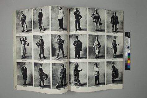
“America, Inc.,” Vogue

Irving Penn Centennial

This previously posted on NJWV.

Joe Louis, New York
Joe Louis, New York
Pablo Picasso at La Californie, Cannes
Salad Ingredients, New York
Balenciaga Sleeve (Régine Debrise), Paris
Marchande de Ballons, Paris
Garçon de Café
Garçon de Café
Cuzco Father and Son with Eggs
Two Women in Black with Bread, Morocco
Nude No. 105
Nude No. 105
Cigarette No. 98, New York

After viewing the Met’s Irving Penn Centennial, I can’t remember ever having had to reevaluate my understanding of an artist to this degree. This is different than recognizing that someone who I hadn’t paid attention to is actually a legit talent;* I knew and respected Irving Penn’s work as a portraitist and the Met’s show made me completely reconsider whether that was what he was.

*e.g. Ai Weiwei

Don’t get me wrong, Penn’s portraits are great and there’s a reason I conceived of him as a portraitist first. I especially love the corner portraits in how the constraint of the set gives the sitters things to do—suggesting certain poses and postures, offering places to put their arms—which don’t involve props but allow people who may not be used to posing ways of finding their angles. It’s a fantastically simple idea which more people should steal.

His later portraits are also wonderful in that they’re very clearly collaborations with the sitters and as such are often beautifully tight and intimate*—often just a face and a hand being constrained by the edges of Penn’s viewfinder in the same way he used the tight corner to constrain his sitters a decade earlier.

*I also love that the Met has his backdrop on display—even if it’s being used as selfie-bait.

But at heart he’s clearly a still life photographer. The Met makes this point by both starting and ending the exhibition with his still lifes—the implication being that they’re both his first love and the thing which has kept him sane through decades of commercial photography.

I’m not usually a still life guy* but these are wonderful in their restraint and attention to detail. Every small thing matters. Every detail is considered. If a still life is an opportunity to essentially brag about how good you are at your craft, Penn is indeed a master.

*It doesn’t matter what genre or medium we’re talking about. I very rarely find myself interested in still lifes.

But there’s more to it than that. Penn, as a photographer, is extremely interested in doing the most with the least and making sure that the few details we can see not only adequately describe everything which we don’t see but also overwhelm us with their textures and tones so we feel like we don’t even need to see anything else.

It’s this sensibility which makes Penn such a fantastic fashion photographer. We don’t need to see the full garment—let alone the entire look. Just a sleeve will suffice. Or a hat. Or the ruffle of a collar.

He understands how fashion works—how clothing works. It’s not about looking pretty, it’s about the structure and construction and the little details and textures which distinguish one garment from another—not only giving them character but also suggesting what events or occasions they could be used for.

Clothing, even at it’s most impractical extreme, is functional. It’s always doing something whether it’s merely protecting the body or making a statement about the wearer.

There’s no reason why this approach should be limited to high fashion and indeed, Penn does not limit himself to that world either. His small trades series is fantastic as an August Sanderesque approach to functional clothing.

I love his Small Trades series so much. We’re invited to look—really look—at the different ways that tradesmen dress in order to do their jobs. How they need to present or protect themselves. Where their clothing gets worn out or reinforced. Every photo is a reminder of how clothing works and is intimately connected to what the person wearing it is doing.

That so many of these trades are blue-collar jobs which we—or at least the people who visit the Met—are no longer familiar with adds an extra layer of interest to these photos. I overheard a number of people trying to figure out what jobs like “blast furnace tender” were before settling on things like “the guy who takes care of the heating in your apartment building.”

Most of the jobs still exist somewhere in the world but to us these photos also serve as a memorial to a more physical world as seen through the clothing of the people who worked in it.

Which brings us to Penn’s ethnographic work. In another setting this would’ve deserved a massive amount of side-eye but here, it’s not only enjoying the context of the fashion and trades photography, it’s a continuation of that photography.

The Met does a great job at flagging how the idea of documenting indigenous cultures before they disappear is a dated concept.* But it’s not really necessary here. Penn isn’t really doing ethnographic work. He’s making the same photos he always does—treating the Peruvian clothing with the same respect and reverence he treats all clothing whether it’s a Balenciaga gown or a dirty apron.

*Sadly not as dated as it should be but at least new projects which continue to reduce cultures to an artificially-imposed appearance of “authenticity” receive the criticism they deserve.

For Penn everything is Balenciaga.

So we get to see the clothing in whatever view best presents the clothing. Maybe it’s a typical model shot which also works as a portrait of the villagers. Or maybe it’s a pose where the villager’s is looking at the ground so we can appreciate the full glory of her hat.

He skirts very close to reducing culture to appearance but, for me, he steers clear of that pitfall and winds up in a much more interesting place. Nowhere is this more apparent than in his photographs of the Moroccan women still wearing their veils.

Again, Penn approaches the veils like he approaches all clothing. But because of the austere nature of these garments and the way that the women wearing them are posing, instead of looking at the fabric and construction details, we see how the garments themselves are worn. How they’re tucked and folded. Where they hit on the body and where they drape.

We get a sense of character through the different ways each women carries herself in the photo. There’s a wonderful video showing how Penn took these photos in a mobile tent with wind swirling all over the place. The degree of cooperation and trust between him and the veiled women is also readily apparent.

I also enjoy the sense that Penn grappled with the morality of his work as a fashion photographer. In addition to being a still-life photographer at heart, the way his personal work serves as a way for him to sort of rebel against his commercial work is very interesting. That he chose decidedly non-fashion-figure women for his nude photography is great. And I love his cigarette photography and the way it reflects his pathos over glamorizing it.

The photos are beautiful but ugly with strong recognizable branding that’s burned and trash. 40 years later I’m amazed at how I recognize the brands even though I don’t think Pall Mall, Lucky Strike, and Chesterfield even existed while I was alive.

This was a good show as it was just based on the content on display. Lots of good photos and every period covered well. But the way it balanced Penn’s personal work with his commercial work in terms of both who he is as a photographer and what he felt about the photos he was paid to make makes it a great show.

On Process

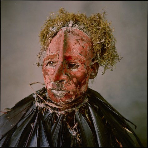
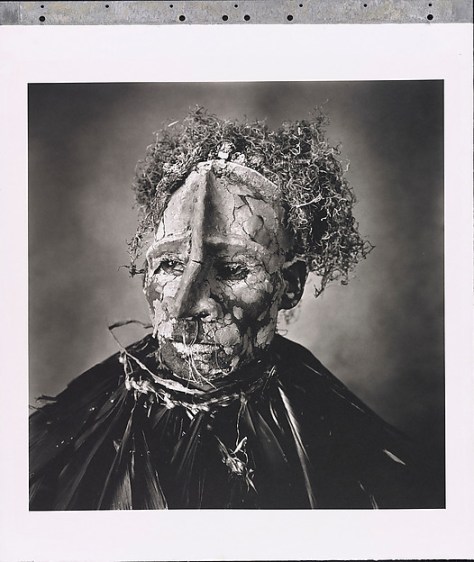
Man with Pink Face, New Guinea
“America, Inc.,” Vogue
“Christmas at Cuzco,” Vogue

There’s not a lot of information on Penn’s process but what there is is fascinating. One of the long-running jokes we have online is the color vs black and white debate and how a number of people on the web trot out the axiom that photographing in color is photographing clothes. That much of Penn’s work involves shooting on color slide film then printing in black and white repeatedly made me chuckle since Penn essentially specialized in taking pictures of clothes.

I found myself wondering a lot about how Penn converted his slide film to black and white prints. There’s a lot of information about Penn’s Platinum printing but  precious little about everything leading up to the printmaking itself. Is the internegative an enlargement made in the darkroom? Did he do any color filtering while making the enlargement?

The Platinum Printing information on the other hand is very interesting in how Penn created registration pins and repeatedly coated and exposed the paper so as to have more control over the final print. It’s a pretty interesting refinement on standard contact printing which definitely appeals to my background working in a printshop.

At the same time, I didn’t like a lot of his Platinum prints and—I readily admit how blasphemous this is—often preferred the halftoned prints in Vogue. I felt like Penn may have been a bit too seduced by what he could do with his fancy pin-registration contact-printing rig and, while I like the photos, found a lot of the details to be unnecessarily muddy.

And I say unnecessarily because the magazines were on display and the details were clearer there—as if someone in Vogue’s prepress recognized that shadows would block up on press and opened everything up so that would print nicely.

The magazines on display also included many more color prints of photos which were only black and white on the walls. It’s great to see both and see how Penn reimagined the scene in black and white.

DSC_0195

Looking at Baseball Cards

Note: this previously posted on NJWV.

While National Geographic is one of main ways I grew up consuming photographs, baseball cards are a close runner up. I never considered them as photos, but in coming back to the hobby, I’m realizing how interesting the photography side of them is and how learning about their history served as a primer on photographic history. Just by looking at the way that the photos have changed over the decades we can see how differently we’ve seen the game.

Being able to recognize within the photos what kind of equipment was used allows us to think about both how the gear has changed and how the gear influences the way we see the world—and the cues we take to determine what age a photo comes from.

I’ve been thinking about this a lot because of the retro-style card trend. Both in my recent post as well as in two posts on SABR,* I’ve been grappling with what I like, and what I don’t, and why. And a lot of it comes down to photographic technology and technique more than anything else.

*Not Hooked on Heritage and an appropriately-titled response called Hooked on Heritage.

Yes, there’s a lot of printing technology and graphic design to talk about too, but when we’re looking at cards and deciding what we like, we’re talking about photos. When we’re comparing eras, we’re comparing photographic techniques. And when we’re looking at baseball card history, we’re looking at photographic history. Maybe it’s best to start from the beginning.

OldJudge1 OldJudge2

In the late 19th century (all three examples here are 1887) the cards were albumen prints of posed studio photos—basically cabinet cards but with baseball players. By being cabinet cards, many of them are larger (4.5×6 inches) than modern baseball cards. Some however, like the Gypsy Queen card here, are closer to carte de visite in size (1.125×3.5 to 2.5×4 inches) and thus, much closer to our concept of the modern baseball card.

These photos are typically posed in the studio—backdrop detail is all over the map—in poses which are still familiar. Little leaguers today take pictures in a batting stance and the throwing motion is a long-standing baseball card staple. Others though—such as the pretend fielding—are wonderfully dated and scream nostalgia. In all cases, the poses have to be positions which can be held for a long-enough time to take the photo. Photography needed a lot of light at the time for stopping action

I was surprised to find one card which was taken outside. It’s nice to see bleachers and get a sense of a possible ballpark but I suspect it’s staged for where the best light is. These are all photographs taken within the limitations of the view camera, its plate processing requirements, and the aforementioned shutter speeds. While such cameras could travel, that was not what they were best at and you risked things blurring when you were outside.

Reading about how people used and traded cabinet cards and cartes de visite of celebrities is eerily familiar to me as a baseball card collector. It’s not just trading personal photos between friends, these cards were souvenirs and mementos to be collected into albums and shown off.

It’s in the ability to produce prints en masse and the celebrity subject matter which distinguishes these from tintypes* and other one-off forms of photography. These early baseball cards highlight that it’s not only a matter of creation or consumption of photographs which is important. The technology for distribution and printmaking** is just as integral a part of our visual literacy.

*Baseball tintypes do exist and that’s not even getting into Tabitha Soren’s work—a book I totally need to buy.

**Which is why it’s important to distinguish between cabinet cards and cartes de visite which functioned as baseball trading cards versus those which were for personal use.

Danforth Burdick 314, E120.32 kelly

By the 1920s the poses were all outside and the printing was no longer photographic. Instead of contact printing from the camera negatives, the new cards are photos from large-format cameras* which were then re-photographed and reduced in size for lithographic printing.

*My guess is 4×5 inch sheet film.

The film is larger and more sensitive. The cameras are still cumbersome* but are more portable and capable of faster shutter speeds. As a result the poses can be more dynamic and photos can be taken in the actual stadiums. Larger negatives means that the backgrounds are pretty blurry but we can still make out some park details. There’s not enough to really figure out where the photos were taken—for the most part these appear to be in empty ballparks during special photo sessions—but they’re very clearly in a proper ballpark.

*I love this photo from 1911.

Unless the photo is a headshot, the camera is pretty far away so it can show all of the player. Where before the player and the photographer were clearly working together to get a portrait, these photos feel like the photographer is playing things kind of safe with the action and doesn’t want to waste any shots. Since the cameras only held one sheet of film at a time* photography is still a pretty slow process and I understand being extremely conservative with compositions and timing.

*Maybe two if they had backs which could be loaded on both sides.

It’s worth mentioning here that I’m not writing about the classic T206 Tobacco Cards and other releases through the 1950s which consisted of clearly-painted images derived from photographic sources. While these are important parts of baseball card history, the way that the backgrounds can be painted in means that it’s impossible to get a good sense of the photograph itself.

At the same time, it is also important to remember than almost all of the photographs have gone through a painting step to prepare them for printing. These painted-on prints* are fascinating objects in and of themselves in how they reveal a bit of photographic process—especially the cropping that occurs from the original negative—as well as how the printing itself changes the image.

*More info in the Pier 24 Secondhand post.

Bowman

By the 1940s it’s clear that we’ve evolved a bit further. Instead of large-format cameras we have medium-format.* So smaller negatives, even faster film,** sharper lenses, faster shutter speeds, and the ability to get closer and interact with the subject a lot more. Roll film enables much more rapid photography and the ability to try a bunch of different things quickly results in better images. Where the 1920s photos all feel kind of distant and safe, these 1940s photos are much more intimate.

*6×6 or 6×7 so 10 or 12 shots of 2¼-inch-wide images.

**but still really slow compared to what we’re used to today.

Tight crops. Even better ability to freeze action while posing. The smaller negatives mean that we have larger depth of field available and can start to make out the details of where the photos are taken. And the fact that there are probably a dozen images to choose from for each player means that what we’re seeing are indeed better photos.

The only thing missing is color but these photos themselves represent the dominant look of baseball cards through the 1960s.

DSC_0195

We can clearly see faces and with the color photos we can tell that baseball is a game to be played during the day when the sun is high, the skies are blue, and the light can shine across the subjects for a nice even exposure. There’s not a lot of latitude with slide film but even with professional gear these photos mimic a lot of the advice I’ve seen in photography guides from that time period.

This is an era where every house had a Brownie Hawkeye Flash and slow medium format film was the standard. Backgrounds are busy but still blurred and the main variation in the cards is whether they’re a tightly-cropped headshot or an above-the-waist pose.

Adding to the view and focal depth of these photos is the actual camera placement. Most of the cards feel like they were shot with a waist-level viewfinder. The camera is both pretty low and the players rarely look directly into the lens. This allows for Topps to do a lot of fudging with players who get traded as the hat logos aren’t visible. But it’s also a viewpoint which comes naturally to this kind of camera. As eye-level and through-the-lens gain acceptance, the camera’s point of view creeps higher and players begin to make more and more eye contact with the lens.

caldwell harrelson

By the 1970s it feels like 35mm has taken over.* In addition to the higher point of view, we have casual shots now which suggest that photographers are a lot more mobile and using photojournalist-style techniques which 35mm is especially well-suited for. We’re also seeing more wide-angle lenses and can really make out a lot of detail in the stadiums. And we’re seeing more obvious uses of photographic flash.

*You can see some of this in the late 1960s but the player boycott marks a pretty clear dividing line in photographic approach which just happens to coincide with the rise to dominance of 35mm cameras.

It’s not just the cameras which have gotten extremely mobile, the flashes have too, and a smaller film format* is more conducive to taking risks and not getting screwed by having to reload so often. There’s often less interaction with the players again as photographers have the ability to work very quickly and get in and out with pictures. But the posed portrait sessions still exist and, with the additional depth of field available** these photos often give us ballpark detail we hadn’t seen previously.

*36 exposures per roll instead of 10 or 12.

**For a given field of view and lens aperture, the smaller the image sensor the larger the depth of field.

marichal Aaron

35mm film also meant that action photography was all of a sudden a legitimate possibility. In the early 1970s, these photos were pretty bad. Telephoto lenses at this time were pretty short, pretty slow, and not very sharp.* Autofocus didn’t exist yet so photographers had to be on the top of their game in order to get anything in focus. Plus Topps still required 100 speed film for quality reasons** so you were constantly pushing the limits of your equipment.

*We’re talking about when a 200mm f/4 was standard.

**As per Doug McWilliams.

It’s no wonder that the action cards feel like novelties here. The fact that the exist at all is in many ways more important than the quality of the photograph. Plus, after decades of posed shots, it must’ve felt exciting to see photos of in-game action. There are some gems—I love the 1973 Marichal card—but most of the time we have a generic moment without any emotion and the horrible lighting which comes from trying to get a decent photo of someone wearing a baseball cap in the middle of the day.

DSC_0196

By the early 1980s lens technology and quality had improved to the point where the action shots became more common and no longer felt like novelties. We’re also getting decent zoom and catadioptric lenses* which allow even more options for photographers with both reach and flexibility.

*A lot of the 1980 cards like the Jack Clark above show the characteristic ringed highlights in the background

As a result, in this time period we have a really good mix of posed vs action vs casual photos. No one variant truly dominates.

DSC_0197

What did change in the 1980s though is the portrait lighting. Instead of the Topps standard of “photograph the player facing the sun with a shadow of the across their face”* we start to see a lot more reliance on flash to create separation between the subject and the background. This gets increasingly obvious in the mid-1980s when many of the photos have backgrounds which have been underexposed by a stop or two.

*Doug McWilliams again.

Even if taken on a bright sunny day, these photos are a lot more moody and stand our as a distinct 1980s look.

weiss

In the 1980s and 1990s autofocus lenses became commonplace and film emulsions continue to get faster. Couple that with motor drives and we’re able to get much more reliably good action photos. Lots of film wasted but they blow the 1970s photos out of the water.

It’s not a surprise that companies like Score which had only action shots emerged in the late 1980s. Such a set was impossible even five years earlier but there was finally enough good action photography available.

We’re still not particularly close to the plays though. I suspect that 500mm lenses were still the longest reach anyone had. But that’s good enough for anything in the infield.

lindor topps_arenado

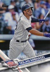
It took another format change to get us to where we are today. Digital cameras, longer lenses, faster lenses, and smaller sensors have allowed us to get closer than we ever have before. It also means that we‘re able to get “portraits” and casual images from further and further away. These images are both distinct in the tightness of the crops and in how blurred the background is.

We didn’t have the technology to do this before and the super-blurred background is a pretty clear tell—along with super-punchy color both from better printing, being able to shoot in flatter light, and digital imaging tricks—of photographic trends in the past decade. Most baseball games are at night now and cameras are good enough to be able to focus on and freeze action in artificial light now.

One of the reasons why a lot of the Heritage card designs feel weird is that they appear to be shot with the same equipment as the action cards. Digital SLRS. Super-long lenses or professional zoom lenses. We know intuitively what kind of photo to expect from those card designs and when that doesn’t match up our brains kind of freak out.

I’d love to see modern cards shot with medium format film and waist-level viewfinders just to see how that changes things. Or large-format film and view cameras. Or in the studio with props, silly poses, and long exposure times. We’ve a long history of baseball photography and, while computers are wonderful things, there’s still no replicating the way that different equipment allows us to see things differently. For a game which is so steeped in history like baseball it’s important to remember all the aspects of that history and how much of that history is tied to its visual record.

Leonce Raphael Abbodjelou

Revealing Pictures 2.0

Note: this previously posted on NJWV.

Leonce Raphael Abbodjelou
Sheng Qi
Sheng Qi

So I was back in the Princeton Museum and found that when they changed the galleries they hung more photographs related to their Revealing Pictures show. the show itself is the same, but there are more photos in the surrounding galleries which are now part of it. The new photos are almost all by non-white or non-western photographers and completely change—on a good way—my reaction to the show.

Initially I had mixed feelings. I convinced myself to like it but still found a lot of it to emphasize trauma as being the easiest context in which to understand photographs. It’s nice to see photos from the non-western world but a main narrative of poverty or trauma or suffering indulges Western stereotypes about the rest of the world.

The additional photos are much more representative, both in terms of their subject matter and in terms of the contexts they exist within. They’re photographers photographing themselves and their own communities and, while they require us to understand what else is going on, challenge the western gaze in ways that the original set of photos did not.

I especially liked Deana Lawson and Leonce Raphael Abbodjelou here in terms of how their images feel like inside jobs where the connection between the photographer and the subject is one of being a trusted member of the community. Through this trust we’re allowed to learn about the conditions of the photo and that context is an additional educational experience.

Abbodjelou in particular stood out to me because he reminded me of color Keïta or Sibide work. I realized that I hadn’t made the Vlisco connection with Keïta’s work and, while still in awe of the beauty in his photographs, I kind of want to know what color they were now. Also, knowing the stories behind the fabrics in his backdrops makes me appreciate them even more.

A lot of the new photos also reminded me of Ragnar Kjartansson in how they’re both the evidence of performance or conceptual art pieces and photos which are their own works of art by themselves. Sheng Qi and Zhang Huan* stand out here in how their photos both document their performances and make us viscerally react to the concepts once we read about the context.

*Whose work I saw in San José years ago too.

Also at the Princeton Museum

While not part of the Revealing Pictures show, the Princeton Museum was also showing off its recent acquisition of Susan Meiselas’s Life of an Image. I blogged about is a few years ago and I’m so happy I got to see it live. I don’t have much to add over my Itinerant Languages post but it is indeed very cool to see a collection which shows how a photo has basically become a meme. We live in a remix culture and the more museums and artists embrace this and bring it into the galleries the better our visual literacy will get.

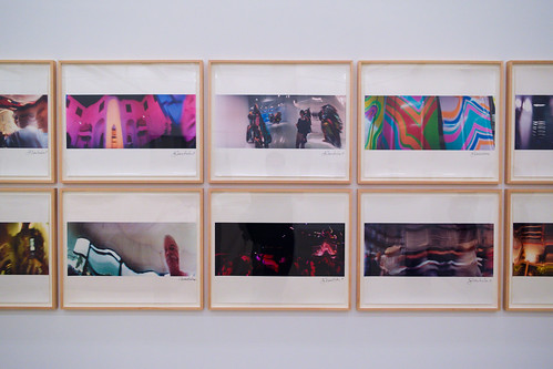
John Chamberlain, Untitled, 1989-2002, from the Widelux series

John Chamberlain

This previously posted in a slightly different form on NJWV.

John Chamberlain, Untitled, 1989-2002, from the Widelux series

DSC_0125

DSC_0126

I’m familiar with John Chamberlain’s sculptures of twisted metal. I had no idea about his photography. He’s a Widelux junkie* and his photos are just a ton of fun. A lot of them are playing with the distortion capabilities of the swing lens. While this is the kind of thing which could easily become a trite gimmick, in Chamberlain’s hands the resulting images look a lot like his sculptures.

*The most famous of which may be Jeff Bridges. God damn do I want a book of his photos.

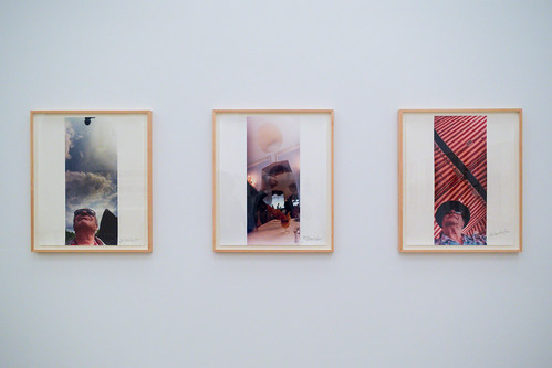
His series of vertical selfies meanwhile is goofy and a good reminder that panoramas don’t have to be horizontal. They suggest a more casual project and are a nice reminder that not everything an artist works on has to be high-concept.

The worst part of this room is that now I want a Widelux—or at least a Horizon—more than ever.