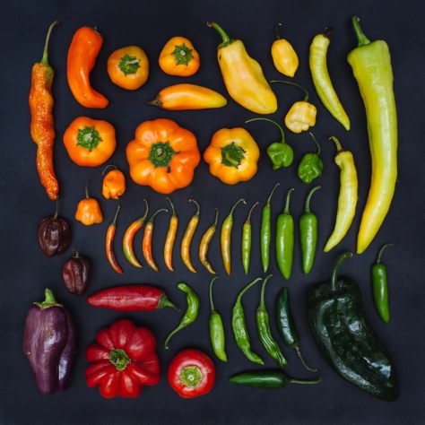
Came across these on Tumblr. Sometimes it really is this (deceptively) simple. This feels like one of my basic design assignments—take a selection of colors and sort them in multiple ways—taken to another level via repetition.
In class, the common mistake was to rely on paint chips—a mistake since paint chips are all based on a white base so the palette is way more limited than anyone realized. The point of the assignment was to really get to know and understand color gamuts and how they interact. You had to sort by light to dark, warm to cool, and bright to dull. It’s not just about hues interacting.
Emily Blincoe’s work is more hue-based but because of the limited palette in each arrangement, does a similar thing since each sorting has to determine the distinguishing feature of the selected objects. They look neat. But they’re also a great exercise in thinking about color.


