All posts by @vossbrink

Splitting time between Princeton NJ and the San Francisco Bay Area. Photography at vossbrink.net, kensabe.tumblr.com, and vossbrink.exposure.co. Blogging at njwv.wordpress.com. Tweeting from @vossbrink.
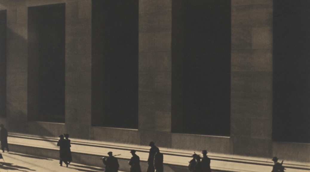
Paul Strand. Wall Street, New York

Paul Strand

Note: This originally posted on NJWV.

Paul Strand. Blind Woman, New York
Blind Woman, New York
Paul Strand. Wall Street, New York
Wall Street, New York
Paul Strand. Church, Massachusetts
Church, Massachusetts
Paul Strand. Door Latch, Stockburger's Farm, East Jamaica, Vermont
Door Latch, Stockburger’s Farm, East Jamaica, Vermont
Paul Strand. Young Boy, Gondeville, Charente, France
Young Boy, Gondeville, Charente, France
Paul Strand. The Family, Luzzara (The Lusettis).
The Family, Luzzara (The Lusettis)
Paul Strand. Lily Leaves, Winter, Orgeval.
Lily Leaves, Winter, Orgeval

The Paul Strand show turned out to be the motivation I needed to finally make the trip to Philadelphia. I’m glad I went. Strand—like Weston was for a long time—is one of those photographers whose work I’ve absorbed but never really looked at in a specific, comprehensive way before. Sure, some of the images are extremely well-known, but many of the rest I’ve never seen before yet have sensibilities which feel just as familiar to me.

Needless to say, I really like his work—especially his precise framing and composition. He’s able to find the order within the type of scenes that often catch my eye but which challenge me when it comes to finding the photograph in them—door hardware, a clump of plants, items which I can’t abstract to pure texture or sculpture because they contain both an interesting structure as well as their real-world function.

Strand’s work is also very interesting because he was right there at the beginning of photography as an art form. From his early work consisting of “fuzzy” pictorial contact prints to portraits and street photography to urban abstractions and still lifes to contrasty enlargements to finally combining photos and text together in book form, his journey as an artist parallels a lot of the medium’s journey as he learns to embrace what the medium does well and address things it doesn’t. The result of this is that many of his photos remind me of other photographers’ work. Not in a rip off way, just that looking at Strand’s work made me realize how much of an influence he had on other photographers. He’s not someone to ape. He’s someone to study and learn from and take what he learned and apply it to whatever I’m interested in.

What most struck me was realizing that while Strand’s most-famous images—those that you’re supposed to know and recognize—came from his early work, this doesn’t mean that that work is better. Instead it reflects on how his sensibilities shifted and he went from producing individually great photos to collections and books that, while consisting of great photos, are more about the way the photos work together to describe a place.

It’s his later work which has stuck with me after seeing this show. Strand would spend a long time in a location, photographing details, buildings, people, etc. all of which together form a portrait of the area. His images though don’t try and explain the area to us but rather provide a sense of how it was when Strand was there. They’re documentary without feeling anthropological or journalistic. They’re positive and empathic without being propaganda, Looking at them is like looking through an exceptionally high-quality photo album and offers a lot of food for thought as I think about making my own photo albums and books.

The exhibition itself is also noteworthy for having a lot of technical detail about the different printing methods Strand used. It does a great job at demonstrating how they differ—both on the production side and in the final product—but especially the final product. There are examples of copy negatives and interpositives and information about how they were modified before contact printing. There are also displays of the same images, or similar images from the same shoot, reproduced as platinum, silver gelatin, and photogravure prints set up so we can compare the differences in detail and contrast each method allows for. Mixed with these comparisons are discussions about how his cameras impacted his working methods and different printing methods impacted distribution.

It was nice to see an exhibition which realized and explained how much the tools of photographic capture and print production impact the art. It’s even nicer to see an exhibition discuss issues of distribution and display. While his prints are great, that Strand eventually settled on books as the ideal form for his photography puts a very different frame regarding the intended audience of the artwork. Most things we see in museums are elite objects for elite people. Strand’s work is more populist. It’s only fitting that I’ll be aware of his influence everywhere I look now.

shea_blisner

Tropes, gaze, and objectification

Note: This originally posted in a slightly different form on NJWV.

Kukkurovaca and I have had an on-again, off-again discussion about doing a photographic Aarne-Thompson or photography version of TV Tropes. It’s a super interesting and often quite amusing idea since photography is incredibly trope-driven to the point where many times the appeal of a photograph is actually in the execution of the trope. I don’t see this as a bad thing most of the time* but tropes can be a double-edged sword.

*I think that the idea that good photography has to always be something new, or of something that’s never been photographed, is dangerously misguided.

If we ever did do a photographic Aarne-Thompson, a significant portion of it would have to be dedicated to racist or damaging tropes in the depiction of people—including how these tropes are typically created by white culture as a way of representing non-white culture.

I’ve recently taken to listening to Floyd Westerman’s Here Come the Anthros—mentally substituting “anthros” with “photogs” in the lyrics. It’s a much more fun description of the kind of photography which bores me and really gets at issues of representation and tropes and how people resent always being studied and depicted by outsiders. It’s why self-representation is so interesting to me and why I side with the ability for anyone to take a photo as being more democratizing than the ability of anyone to have a photo.

The history of black liberation movements in the United States could be characterized as a struggle over images as much as it has also been a struggle for rights, for equal access.

—bell hooks
(read John Edwin Mason’s post for more info)

A lot of self-representation goes right at the tropes: Carrie Mae Weems, John Edmonds, LaToya Ruby Frazier, Zun Lee, etc. all show black women, men, families, fathers, bodies, etc. in ways that both differ from and explicitly call out the representational tropes in art photography. They’re filling in gaps in the way they have been represented and taking control over those representations. It shouldn’t be novel or noteworthy to see gentle portraits, working families, or caring fathers, but many of these projects still get picked up in a semi-viral “as you’ve never seen them” way.

There’s so much historical baggage and objectification going on that it’s difficult to subtly critique things here. Tropes gain strength through repetition and riffs, so getting close to a trope tends to result in getting subsumed by that trope. This blunts most intended critiques. It’s not that people don’t understand the point a subtle critique is trying to make, it’s that they’re triggered by the trope and decide that the critique failed to make its point effectively.

I’ve been thinking about this again because of a series of exchanges on tumblr last month over an image by Daniel Shea.

Daniel Shea. Untitled (Fishing Diptych) from Blisner, IL, 2013.

The initial exchange involves a response by Je Suis Perdu to the image and then a response from Shea to Je Suis Perdu. There was some pile-on after this which I found distasteful* but the initial back-and-forth got me thinking.

*Mostly tone policing of the “we’re on the same liberal team so stop being such a bully” type which directly dismisses the validity of Je Suis Perdu’s original reaction and tries to silence him for some kind of liberal solidarity.

I read the initial response as a gut-level reaction rather than a fully-realized critique. Tumblr, like twitter and any other stream-based media, encourages quick reactions where responding first is often preferable to responding best. So I tend to give responses I see on there the benefit of the doubt of being an opening statement in a conversation rather than a complete critique. The statement in this case indicates that something in Shea’s images triggered Je Suis Perdu’s white-gaze spidey sense.

It’s a perfectly legitimate response. One of photography’s racist tropes is the dehumanizing gaze with which it treats black bodies—especially young, fit black men—as objects to be admired and/or feared. This photo, without any additional context, can easily be read this way. If you’re a white guy and toss a portrait of a young, fit, shirtless, black male on tumblr without much additional context? You shouldn’t be surprised that it’ll raise a few hackles.

I like most of Shea’s response. He starts well by acknowledging his gaze and trying to deal with it. Unfortunately he also tries to claim he doesn’t have white gaze and is instead trying to be engaging and neutral. While he goes on to say that he doesn’t believe photographs can be neutral, it’s reads to me like he’s trying to have it both ways in saying “I have white gaze and am trying to critique it” while also saying “white gaze is evil of course I don’t have that.”

I don’t think the white gaze is inherently evil. My major problem is that it gets conflated with neutral—implying that everyone else’s gaze is non-neutral. It’s not, it’s merely the most dominant gaze, which is why it, and its tropes, are worth thinking about. The issue isn’t “white gaze or not” but rather “damaging trope or not.”

This isn’t about the idea that white guys should only photograph white guys or that they shouldn’t be “allowed” to photograph non-whites.* It’s about acknowledging your gaze, owning your point of view and the fact that it’s inherently non-neutral, and being willing to listen to the way other people react to your work—especially if the reaction is critical.

*Heck, all too often, instead of listening to why someone may have been upset, the immediate response is to paint the offended party as trying to censor free speech by using the “not allowed” language coupled with the “you’ve offended us by calling us racist when we’re not” claim.

When I say “own” it’s in the sense of not running from the label (or criticizing the reaction) if it gets thrown out there. It’s entirely possible to be both enlightened and racist—or both feminist and misogynist. It’s nearly impossible to grow up in this society without absorbing any of that bias and working on correcting that stuff is not an overnight process. Learning the tropes that we’ve internalized, understanding how they’re triggering, and figuring out how they work is the only way we can actually critique this kind of stuff.

Ruth Prieto Arenas. Blue.

Safe Heaven

This project is a new interpretation of immigration using color as a unifying metaphor of diversity and acceptance. Each woman will be identified with a color palette so that a mosaic of color represents diversity.

Ruth Prieto Arenas

Ruth Prieto Arenas. Red.

Ruth Prieto Arenas. Red.
A waitress at stands at the counter where she hands back the check and the tips.
Ruth Prieto Arenas. Yellow.
Details on the wall reveal Juanita’s partner main hobby and their devotions. A ferrari and a vigen of Guadalupe hang on the wall as details of culture and preferences.
Ruth Prieto Arenas. Yellow.
Lluvia sits on her bed with a pink dress bought for special occasions.

Ruth Prieto Arenas. Yellow.

Ruth Prieto Arenas. Yellow.
Juanita sweeps the floor of her house. When she doesn’t get a job from her maid agency, she stays home and cleans.
Ruth Prieto Arenas. Blue.
Delia is on the phone with her boyfriend. She lives in a house of two rooms with her two sisters. She shares her room with one of them. In the other room lives her other sister Mirella , mother of two and her husband.
Ruth Prieto Arenas. Blue.
Typical food from Oaxaca such as Tlayudas is sent over by Delia’s mother. Tlayudas are a type of tortilla made out of blue corn and slighty bigger than common tortillas. Its taste and consitency is different due to the way is toasted and how it is prepared.
Ruth Prieto Arenas. Blue.
La Virgen de Guadalupe has a beautiful altar at Delia’s house. She is full with red roses and candles that adorn her everyweek.
Ruth Prieto Arenas. Purple.
Maribel (21) lives in two bedroom apartment. She shares one room with her husband a two daughters. They live with another Mexican.
Ruth Prieto Arenas. Purple.
Maribel has been pregnant for six months. married for two years. Her husband works double shifts and gets home very late. She takes care of Sherlyne (2) and Evelyn (9 months)

I am presenting the lives of Juanita in yellow, Delia’s in blue and Sabel in green. Homes have deep emotional meaning. Through their homes we get to know them, their motivations, their thoughts and aspirations along with the conditions they live in that reveal how much they have achieved and struggled. They have painted and decorated their rooms according to their own personal story and choice. I am exploring the notion of safety and confidence in relation to space.

The NYC Mind

Another project which caught my eye on Tumblr. Artspeak and ambitious goal aside, I really like these as representations of a community by someone kind of in that community. These are photos about people, not just of them and the way that so many have of them have detailed captions is as important to the story as just the images.

Also, I really love the way Prieto Arenas is using color. It’s not just the colors of the walls, there’s a lot of subtle lighting and color temperature stuff going on which gives each series an internal consistency.

Ray Yoshida. Detail of a Chicago shop window, between 1972 and 1981.

Ray Yoshida

Ray Yoshida, Detail of a storefront sign in Chicago, between 1972 and 1981.

Ray Yoshida. Sign with bodybuilders in Chicago, between 1972 and 1981.

Ray Yoshida. Detail of a sign in Chicago, between 1972 and 1981.

Ray Yoshida. Detail of a commercial sign in Chicago, between 1972 and 1981.

Ray Yoshida. Storefront sign in Chicago, between 1972 and 1981.

Ray Yoshida. Detail of a Chicago shop window, between 1972 and 1981.

Ray Yoshida. Detail of a beauty salon sign, between 1972 and 1981.

Ray Yoshida. Detail of a Chicago storefront, between 1972 and 1981.

Something interesting which came across tumblr and caused me to click through to his papers at the Smithsonian. These are too much fun. The signs are great in a vernacular hand-drawn way that we’re not used to seeing anymore. And the polaroids—direct flash and all—are perfect.

Yes, these are hipstagram before hipstagram. But what I love about these is how the camera is placed so as to crop out everything unnecessary and any keystoning or other “issues” are accepted. The only things in these prints are what needs to be there.

SFAC2

The Valley/El Valle

The Valley/El Valle features twenty diverse prints taken by staff photographers over the past decade. The Chronicle images serve to emphasize the diverse citizens and lifestyles in the Central Valley and include subjects such as members of a mosque in prayer, Hmong dancers and rodeo stars.

San Francisco Arts Commission

SFAC1

SFAC2

SFAC3

SFAC4

SFAC5

SFAC6

SFAC7

SFAC8

I was a bit annoyed that there were no photographer credits on SFAC’s original tumblr post. It’s even more annoying that the SFAC official webpage didn’t have any information either.

Still, I liked these. A lot. I may admittedly be a sucker for images from the Central Valley* but I also like images which show people working and having fun and living in a California which is vastly different from the California which people travel to see. This is the California people travel through on the interstate where they can ignore and avoid everything in these pictures.

*Previous posts have touched on Alec SothLisa M. Hamilton, and Ken Light. And I’ve actually posted some of my own work from the Valley too.

It’s also interesting to see these photos online without any of the context in the exhibition. Especially since they’re all photojournalism literally from the news archives. I don’t feel like I need the stories when I see them this way. There’s a sense of place and life that I get when looking at these as they are. Maybe that’s just me filling in my own context as a native Californian. But it’s still something worth noting.