Steve McCurry Railway between Peshawar and Lahore, Pakistan
My earliest memories of just looking at photos all involve National Geographic. My parents had a subscription and I looked forward to the day each month when a thick magazine slipcovered in brown-paper arrived in our mailbox. I was too young to read the articles but I devoured the photos (and the maps of course) for at least the following week. I also would go through our magazine files and pull out my favorite past issues—reading the spines until I found the one with the feature I wanted—and revisit the photos all over again.
June 1984 was my favorite issue. By far. I paged through Paul Theroux’s By Rail Across the Indian Subcontinent repeatedly as I was captivated by Steve McCurry’s photographs. It wasn’t anything specific about the quality of the photos which got me. I just, like many grade-school boys, loved trains and these were like no trains I’d ever seen. Instead of the commuter train pulled by diesel engines which took people up and down the peninsula between San Francisco and San José, these were steam trains which wound through mountains and countrysides, were packed with people—including riders on the outsides of the cars—and had dining cars to accommodate multi-day journeys.
The recent McCurry pile-on which started with Teju Cole’s A Too-Perfect Picture coupled with some photoshop disasters encouraged me to both revisit McCurry’s train photos—the first set of photos I can remember loving—as well as to finally read the text which they accompany.
At some point in the past decade or so, McCurry’s work has lost all the context in which it was originally made. He has indeed gone full White Guy Photography, peddling a mythical third-world exotic beauty via photos that function as desktop backgrounds or hotel art.* Teju Cole says they’re boring. Paroma Mukherjee points out that the ethics behind these photos are dangerous. As McCurry packages them now I completely agree. They don’t tell us anything beyond confirming our stereotypes of the region and suggesting that modernization will ruin the “real” soul of the place.**
**As stated in Image on Paper’s Jimmy Nelson Post: “It is a dangerous move to fictionalize a culture. By promoting a romantic ideal with a naïve set of attributes, the first steps have been taken toward eliminating that culture. Because you say what is authentic and what is not, you can erase entire cultures in an instant.”
While I would be a bit worried about looking through all the 30-year-old National Geographics and seeing what I grew up with, this particular article is thankfully not too bad. Rather than being concerned with any sort of “authenticity,” it’s unabashedly a travelog and photos—most of which do not look like what has become the McCurry brand.
Travelogs, when they’re about the author’s trip and don’t claim to be speaking for the country,* are great. The same goes with travel photos. The more specific and personal the topic is, the more likely I am to like them. And I still like these.
*Or in this case, the entire subcontinent.
The railroad is a wonderful thread to anchor the entire trip. It grounds the narrative and allows for historical diversions where the infrastructure is older than the political boundaries which it crosses. It also offers glimpses at a large range of the people in India. While Theroux is mostly riding first class, he and McCurry are also interacting and talking with the locals crowded in second class, the people riding on the roof, the white tourists in the separate better-than-first-class tourist cars, and the service workers and public workers who run the trains and the stations.
That I still love trains, and train photography, doesn’t hurt. But there is something distinct about the rail travel and the way it filters how you see both the countryside it cuts through and the built environments which have grown up around it. It’s simultaneously part of the landscape while completely imposing itself on that landscape. And it waits for no one. If one of the chief tenets of photography is taking your time and thinking and picking the right moment, the way the train keeps moving introduces a variable which is out of the photographer’s control.
Steve McCurry Agra, Uttar Pradesh, India
Seeing McCurry’s work in this context also serves as a reminder of why he became an acknowledged master. There’s maybe only one of those McCurry™ Portraits and all of his colors are more subdued by the necessity of having to stick with the railway itself. But the photos are great. Strongly composed and timed with a sense of place—and on occasion the photographer’s presence—they illustrate the text so well that I have no use for the captions except when they offer a bit of additional story where McCurry’s experiences differ from Theroux’s.
Even the photo of the train at the Taj Mahal—which out of this context becomes about the men and “how well they work as types”—is instead a perfect “holy crap you can see this from the train” photo.
Despite completely agreeing with the critiques being heaped on McCurry now, I’m still glad that these were some of the formative photos of my youth. I’ve kind of grown out of him but I’m happy that I had access to these. It’s always good to be reminded of both my own growth, and what it means if an artist doesn’t grow.
They were men. They crept upon their hands and knees. They used their hands only, dragging their legs. They used their knees only, their arms hanging idle at their sides. They strove to rise to their feet, but fell prone in the attempt. They did nothing naturally, and nothing alike, save only to advance foot by foot in the same direction. Singly, in pairs and in little groups, they came on through the gloom, some halting now and again while others crept slowly past them, then resuming their movement. They came by dozens and by hundreds; as far on either hand as one could see in the deepening gloom they extended and the black wood behind them appeared to be inexhaustible. The very ground seemed in motion toward the creek. Occasionally one who had paused did not again go on, but lay motionless. He was dead. Some, pausing, made strange gestures with their hands, erected their arms and lowered them again, clasped their heads; spread their palms upward, as men are sometimes seen to do in public prayer.
Andrew J. Russell. Soldiers’ Burying Ground, Alexandria, Virginia, May 1863Timothy H. O’Sullivan. Battle-Field of Gettysburg. View on the Field after Fight of First Day., July 4, 1863Andrew J. Russell. Behind Stone Wall, Marye’s Heights, Fredericksburg, Virginia, May 3, 1863.
While I was looking at War is Beautiful I couldn’t help but think about the iconic, well-known photos from Vietnam or World War 2. Those images are the beginning of what has become the cinematic language of war photography. They’re what the movies reference and are part of our common understanding of what war photography is supposed to look like.
Instead of looking at those images though, I got Jennifer Watts’s A Strange and Fearful Interest off the shelf and decided to look at Civil War photographs. Looking at the Civil War photography shows the beginnings of our current visual culture. We can see the beginnings of personal image sharing as well as the ability for images of “real life” to become larger than life. At the same time, we’re seeing other directions or standards that could’ve been taken.
The Civil War reflects photography’s first big maturation in terms of both how we understand what we’re looking at and in terms of figuring out what practices actually work for documenting and disseminating images. There were no set rules or perspectives to copy, the field photographers had to figure things out on their own. Nor were there guidelines about what’s ethically acceptable with regards to subject matter or staging a scene. The photos of dead soldiers*—and the way those bodies were often moved by the photographers—are so wrong in terms of the current rules of photography.
*Specifically noted in the book with the Antietam photos but applicable to Gettysburg and many other battlefields too.
Where the Vietnam and World War 2 images are still familiar to us, the Civil War photographs are more abstract. Their look—the staging, motion blur, toning, edge effects, etc.—reads as romance and nostalgia rather than documentation. They don’t look real to us anymore even though their existence fundamentally changed our understanding of both warfare and death.
But the photos themselves did say a lot about the war and the nature of violent death which, while people obviously knew,* were not images which were disseminated. There’s something about seeing the images of the bodies in the battlefields which drives home the cost of it all. And it doesn’t surprise me at all that we created National Cemeteries as a response to the Civil War. Our collective sense of war and its outcomes changed during the Civil War—in large part due to having a new medium with which to share and remember these things.
*Warfare, and in particular the Civil War, being something which touched a much larger percentage of the population then than it does now.
Notes
George N. Barnard. Rebel Works in Front of Atlanta, Ga., No. 1, 1864Jay Dearborn Edwards. Scrapbook 2, page 2 – Photographs by J.D. Edwards depicting Confederate soldiers drilling and at rest near Pensacola, Florida, and environs, c. 1861.
It was not just images of war which were suddenly being disseminated across the US. Tintypes and ambrotypes allowed for soldiers to both send images back home and keep images of home with them on the front. While still very much a portrait/sitter arrangement, this was a much more democratic* product in how it opened up the ability for this kind of personal connection to many more people.
*Reminding me of the creation vs consumption debate a few years ago. While I still agree that the Brownie opened up the true democratic floodgates, tintypes, ambrotypes, and cartes de visite did create a massive change in how we treated and understood images too.
Since Confederate photographers all but disappeared after—if not during—the war, J.D. Edwards is the only Confederate photographer featured in the book. This explicitly calls attention to how our visual understanding of the Civil War is almost exclusively the Union point of view. And as much as I hadn’t realized this before, it reminded me how most of my conception of war photography is aligned with the point of view of the US or the west.
I really like George N. Barnard’s landscapes of Sherman in Georgia. Barnard kept taking landscape photographs—very much in the style of O’Sullivan or Watkins—where the view is what’s important. In Barnard’s case though, rather than the promise of taming unspoiled nature, we see the architecture and landscapes of war.
The book also goes into the Lincoln assassination and how Alexander Gardner’s mugshots—well, proto-mugshots since the mugshot hadn’t been invented yet—as well as his photographs of the hangings get right at the intimate relationship that photography has with death. And then there’s his Lewis Powell image which, among all the retro-nostalgic photographs in the book, leaps off the page as being, still, strikingly modern.
Eco believes that hyperreality shows itself in America’s portrayal of history, art and architecture, entertainment, and nature. Eco believes that Americans want everything in a more entertaining way (including entertainment), so we have intertwined hyperreality into our lives.
MOHAMMED ABED/AFP/Getty Images — A Palestinian youth stands in front of a burning vehicle during clashes between rival Fatah and Hamas in Gaza City, 14 May 2007. Two Palestinians were killed in fresh fighting between rival Fatah and Hamas gunmen today despite a truce aimed at ending the worst factional violence since a unity government took office.Ozier Muhammad/The New York Times — A severe sandstorm blanketed a convoy from the Headquarters Battalion of the 1st Marine Division north of the Euphrates River in Iraq, on March 25, 2003. President Barack Obama announced Oct. 21, 2011, that the United States had fulfilled its commitment in Iraq and would bring all U.S. troops home by the end of the year
The other day, I had a chance to sit down in the library with David Shields’s War is Beautiful. Given how I’ve mentioned previously how appealing the idea of a photographic Aarne–Thompson is, it was a lot of fun to page through a book which did exactly that with the New York Times’ front page War on Terror photographs. I like and tend to agree with Shield’s choice of tropes. I also found it interesting to be forced to question what it means to aestheticize war and the ethics of making beautiful images of ugly horrible things.
These are not new thoughts but it’s worthwhile to be periodically reminded to think about them.
In the case of these images—especially when you see them page after page after page—it’s not the fact that so many of them are pretty or even beautiful* which concerns me, it’s that so many of them look like movie stills. It says a lot about how realistic movies have gotten than this is the case. But it also says bad things about photography if what we consider good, meaningful, impactful photography appears to be influenced by the cinema.
*Despite the notes about how photographers hated the flat light in Iraq.
The news photographs aren’t faked or staged but they’re looking for certain compositions and perspectives.* This is a problem.** The movie look allows for a certain level of glorification which capitalizes on our expectations for the form. We “know” what the “bad guys” look like. We know who’s supposed to be the “hero.” We even have prejudices about the terrain and the buildings. The photographs are less about telling the story and making us think and are instead more about setting the mood for the story using our pre-existing biases.
**Also a reminder that Errol Morris’s It Was All Started by a Mouse essay on another war photography trope is very much worth reading here.
A lot of this reminds me of William Gibson’s Zero History where the military and military contractors—specifically in the fashion realm—are dealing with the inversion of the traditional military to civilian workflow. For decades, fashion flowed out of the military setting and became streetwear after it had acquired a level of authenticity and coolness through military use. Zero History explores what happens when military-inspired streetwear has evolved into its own thing and its designs are both influencing military designs and making military designs seem inadequate and uncool.
It’s also worth looking at the video game realm where the comparison between how the military uses video games to recruit people with how those recruits are then trained shows a similar difference. The recruiting game America’s Army is very much in line with mass-market video games. Lots of action to compete with the latest first-person shooters accompanied with a very cinematic look. The training games meanwhile look awful. Lots of waiting around and hoping that there’s no action at all. Lots of uncertainty about what to do. But very realistic since they’re intended to train soldiers on what to actually expect. They just don’t look like what I, as a civilian, would expect based on how war is portrayed in mass media.
And that’s what current war photography is doing. It’s riffing off of the existing cinematic language of hyperreal military settings—suggesting that the real stories might not be eye-catching enough to be told anymore. Movies—and movie photography and cinematography—are our common language in many things. They’ve become our references and touchstones for what real life should look like. And it’s scary when real life can no longer compete with the expectations.
Notes
While I enjoy the trope categorizations, the best part of the book may be the rear endpapers which show thumbnails of all the New York Times front pages. The Edward Tufte style small multiples makes the point about how the Times has presented the war in a way that looking through the book is unable to convey. Rather than seeing the details in the images, it becomes more apparent how these images are chosen for their graphic (in the sense of graphic design) impact and sense of warness.
While I was in California this summer, I visited the San José Museum of Art to see the Covert Operations exhibition. Only part of the show was on display when I went* so this post covers both what I saw in the museum and what I’ve gotten from the catalog.** I’m used to treating catalogs as reminders of an exhibition so it’s a bit weird for me to be using one as a stand-in for portions of one. Thankfully, I saw most of the videos and video games in the show and have been using the book for the photography and painting—both of which translate much better to book form.
*It’s all up now.
**Which I flipped through in the museum to determine that it was worth getting. I have since spent a lot more time looking and reading through it.
On National Security
Trevor Paglen. Untitled (Reaper Drone), 2010
While the theme of this exhibition is covert operations, most of the work is actually about National Security and the things that government does under that aegis. A lot of work, such as Jenny Holzer’s redacted Freedom of Information Act request prints and Trevor Paglen’s Defense Department investigations offer glimpses of what’s going on when National Defense world intersects with the civilian world.
Holzer’s work takes advantage of the Freedom of Information Act and the theoretical ability of any citizen to request government records. The resulting documents are anything but transparent as they arrive covered with redactions. Holzer enlarges the documents to the point where they feel like Abstract Expressionist paintings—where text, redactions, handwritten notes, etc. all feel like they’re working together in a cohesive piece. Only instead of being abstract, these very clearly show, despite the redactions, many of the ugly details that go into providing what we think of as security.
Paglen’s photography looks almost conventionally pretty—star trails and sunsets—except that there’s one small detail which is off. Maybe it’s a Reaper Drone way off to the side. Maybe that non-star streak is actually a CIA satellite. His other work—in particular Code Names—similarly explores the small ways that the Security Apparatus intrudes into our world.
Meanwhile, other things aren’t really covert at all and just exist outside of the awareness of regular Americans. In particular, David Taylor’s Working the Line documents the security—and the security theater—on the US-Mexico border. There’s nothing especially confidential here, nor is there the sense that there’s a whole bunch of other infrastructure at the border that we’re not seeing. Still, the extent of physical security at the border and the way it’s actually implemented is quite different than the way that we think of it.
Taryn Simon’s photograph of the Alhurra studio is also something non-covert that we just aren’t aware of in the US. The entire point of this network is to be seen by Arab communities so it’s anything but a secret. Yet it’s not allowed to be broadcast in the US despite being based and funded here.
Taken together, all these pieces describe a massive amount of infrastructure and bureaucracy that we’re not aware of. Revealing only the tip of the iceberg allows us to think about how much is going on that we aren’t seeing at all. The way that much of what we do see is already horrifying should also make us really think about how much worse—whether in scale or in degree—the truly hidden stuff is.
But even the non-awful images reveal an apparatus that treats our safety as something where we don’t really want to know the details and assumes that we’ll sign off on anything in the name of security. It’s this assumption that disturbs me more since it’s carte blanche for security agencies to do whatever they want in the name of security while not informing us what it is that they’re doing. It also makes it very easy for those agencies to dismiss critiques and questions by referencing our ignorance of what’s “really” going on.
We’re assumed to not want to know, kept from knowing, and then criticized for not knowing. All in the name of our own safety and security. So I’m glad that people are calling out and highlighting what we can know. I love that many of these people are artists since it makes the glimpses much more accessible and the more of us who know, even a little bit, the better.
On Weaponizing Art and Games
Harun Farocki. Serious Games I: Watson is Down, 2009
Another extremely interesting concept in this exhibition is how it demonstrates the way art, photography, and video games—things which often get criticized as being inherently non-useful—can actually be effectively weaponized or used as diplomacy.
Photography is the most obvious example due to its interaction with surveillance, intrusiveness, and privacy issues being one of its defining characteristics since day one. That much of photography’s acceptance by the public has been a steady erosion of sensibilities regarding these issues is already scary. But even today, much of the concern is about photographs by other individuals rather than the government—we accept security cameras everywhere but freak out about a stranger with a cell phone. Yet it’s the security cameras which are more intrusive since they feed directly in to monitoring by the state. Which is why it’s important to keep in mind where security cameras get installed, who they’re actually monitoring, and whose interests they’re protecting.
The use of modern art as cultural diplomacy is less obvious but is explicitly mentioned by Taryn Simon’s photograph of the CIA art gallery. The connection between art and culture and the idea that “good” art demonstrates a superior culture is shocking to see laid out—even though it’s used by many people now to malign* art which has not been accepted as “good” in the West. It also forces us to really question our understandings of our own taste and how we learned what we like. I certainly didn’t even consider that it could reflect Cold War indoctrination about what is “American” (or at least non-communist) even though thinking about it now makes complete sense.
Video games get a lot of play here as well. Harun Farocki shows how, instead of being entertainment, they’re now used for military training—which is pretty cool in that it allows for a safer and more varied training experience. At the same time, it’s disturbing how easy it is to go from a medium of pure entertainment to something that’s life and death and literally training people how to kill other people. There’s no noticeable difference in the form, just the use case. That many of these training videos look less realistic than what’s currently on the market is the kind of thing that makes it very easy to see the defenses of video games as being “just a game” as being somewhat hollow.*
*I’m not anti video games, but I’m increasingly critical of everything about them as mass entertainment.
On the positive side, the way video games are also used as therapy for soldiers recovering from the stress of battle is both interesting and promising. They’re not fun here either, but seeing them used in a much more life-giving situation is nice to see. Still, it’s interesting to note the differences in quality and how there is more effort spent on training than on rehabilitation—but that’s a comment on the military’s priorities and not the medium itself.
I’ve long been used to technology’s give-and-take with the military. One of the best ways to really refine a technology is to push it to its extremes and the military is great at this. Much of what we take for granted today either started as a military project or got refined there. Art and culture are no different except that many people don’t understand how they’re useful.
Amazingly, the military does. And the way that the military uses art and culture should show us how dismissing them as a waste of time is lazy and incorrect. Art matters. It’s how we know and demonstrate who we are. It’s how we convert other people to our way of seeing the world. Entertainment matters. It’s how we interact with the world and the easiest way to introduce ourselves to new worlds. It’s a shame that for the military, new worlds have to be approached with a gun in hand, but that, again, is more about the military’s priorities rather than the medium.
Rethinking Evidence
David Taylor. Seismic Sensor, TX, 2007
One last thing about this exhibition is that it has me rethinking Mike Mandel and Larry Sultan’s Evidence. Many of the photos in Covert Operations are similarly bizarre in the way they show objects and places that exist outside of our understanding—except where in Evidence I found myself making up my own narratives and finding the humor in things, the Covert Operations photos biased me toward looking at the dark side. I have an inkling what they’re about but I’m still scratching the surface and know that there’s a lot more sinister stuff lurking underneath.
The result is that I can’t help but see Evidence now as a more innocent project* and which has made certain tradeoffs in opting for a fictional sequence rather than revealing or critiquing something real.
This isn’t to say that I don’t like humorous work. It’s just that while I understand and enjoy the impulse to poke fun at banal government photographs, I’ve also come to realize that opting for humor—especially the “WTF this is so bizarre” humor of Evidence—is a choice that tends to rule out critiquing what government is actually doing. And so the next time I view Evidence, I’ll keep in mind how the recontextualization gives a free pass to the ways that the baby boomers were pulling up the ladder on the next generation.
While Ai Weiwei wasn’t on my list of things to see at all, Pier 24 was at the top. I’ve been jonesing to go for years and just never managed to get my plans in order to get there. The current show features appropriated photos which, while something I’ve enjoyed intellectually in small doses, I was not sure I was ready for a full-on overload of.
I shouldn’t have worried. The space itself is awesome and the collection is more of a “physical version of a huge website”* in that is seems to have any photo series or print which you’d want to see from the canon.** It’s especially focused on photo series. Many of the rooms have at least one complete series of images. Since I’m used to seeing only one or two prints from each series in a museum, I loved being able to see the complete groups for a change. I can really get into what a specific photographer is doing, both from a sequence and a grouping point of view. It also assuaged a lot of my concerns as a context guy since Pier 24 is also known for its absence of context.
*A description someone much smarter than me came up with but which really captures the scope of the place.
**Comments about the demographics of the canon are best left for a different post.
Pier 24 doesn’t have wall text so you have to open up the exhibition guide to figure out what you’re actually looking at. The guide meanwhile only has super basic information—artist identification and a single project statement. As a result, a lot of people hold up Pier 24 to demonstrate how “only the image matters” or “context is irrelevant.” Inside Pier 24, I can see how that argument holds water. But that’s only because the space provides the context. Displaying the full series all together eliminates a lot of the descriptions that have to accompany a single image displayed by itself. Similarly, the way the different series on display interact with each other provides additional context.
Much of the appeal photography holds for me is in how it’s basically an exercise in recontextualization. As soon as you take a photo, you’ve taken it out of context by choosing what’s in, and out, of the frame. The way you choose to display or share the image after taking it is a new context.* There can be no true absence of context—although I would completely agree that context can be meaningless or unhelpful. In the case of this exhibition, since it’s about appropriated photos and recontextualization, the initial decontextualization serves the general theme.
The most interesting room in Pier 24 for this is the series of rooms of the Archive of Modern Conflict. These rooms are pretty dense with salon-style hangings of all kinds of photographs. Vernacular photos are mixed with art photos are mixed with functional photos resulting in all kind of new connections between images despite there being no context about the origins of each specific image.
At the same time, something about these rooms doesn’t hold up for me. Without any information, I found myself looking at the images with the half-awake, short-attention-span mindset I look at things on the web. If it doesn’t grab me right now, why bother looking? I wasn’t just missing the original context of the images, I wasn’t finding much compelling in the new context.
Which gets at the dangerous thing about buying into the no-context-needed mindset. Poorly-thought-out context invites short-attention-span consumption. This is easy enough to default to without any additional encouragement and, while a legitimate way of approaching a lot of media, is not something I like museums and other places that typically intend to encourage more thoughtful looking (or, at least, that’s why I go to them) to engage in.
Reappropriating vs Mining
Hank Willis Thomas
Pier 24’s Secondhand was an interesting double bill with San José’s Postdate. Both shows used repurposed photos but where San José involved reclaiming images from a colonial past—demonstrating a very activist way of appropriating—Pier 24 is almost all within the same sort of western tradition and feels more concerned with the surface of images rather than what’s underneath them.
A lot of the work,* focuses on mining archives and extracting keepers—whether sequences, groups, or individual images—that look interesting to us today. It’s tempting to call this kind of thing “curation” only there’s no illumination provided.** They’re generally not about what the photo means and are instead going for the “oh this looks interesting” reaction. Other work*** involves doing clever things to photos to create new, interesting things to look at but which don’t didn’t make me rethink the actual photos themselves.
*Such as with The Archive of Modern Conflict and Erik Kessels (more on him later).
**One of my pet peeves is the way “curation” has become used on the web as a way of describing collections which, while often very tastefully selected, provide no information or educational information about what the point is.
In both cases, the results can look pretty fun without really saying much. This isn’t a knock on what was on display, just that after having seen another exhibit which really investigated how powerful appropriation could be—especially in the context of colonialism and the representation of the powerless—I found myself wanting to see more work which explicitly examines the cultural context of the images, presents other meanings, and brings the appropriated images from the past into the present.
The only artist on the show who really did this was Hank Willis Thomas. His work in Pier 24—as well as his recent Unbranded work—looks at more than just how the photos look and instead focuses on the content of the photos and how our understanding of that content has changed over time. His work in the show was also particularly relevant given how Black Lives Matter has been constant over the past couple years. Viewing a lot of the older, recognizable but still-charged images through the flag frames suggests how these are commemorated and remembered as accomplishments rather than as part of an ongoing fight.
Erik Kessels & Vernacular Archives
Erik Kessels. Album Beauty.Erik Kessels. In Almost Every Picture.
Erik Kessels deserves specific comment since, not only does he appear to be the main attraction in the exhibition, much of his work critiques our concepts of vernacular photography and makes us think about how we use images.
One of the things that bugs me about a lot of current photography writing is its tendency to state that people did a good job organizing their photos in the past. From what I’ve seen looking at my friends’s and family’s photos is that staying on top of the photo albums was as rare and difficult to do then as keeping digital images organized now is. Even most people who did do a good job making albums have boxes of decades-old images that they haven’t gone through yet.
Managing and mining this archive—whether digital or physical—is a daunting task. What I like about Kessels is how he suggests other ways of using images than the pure documentary mindset that governs most archives of vernacular photos. In Almost Every Picture has a number of series that pull a common theme—a spouse, a pet, fingers covering the lens, carnival prizes—out of a larger cache of images. The archive doesn’t have to tell a story chronologically, it can have a completely different theme and the chronology will still be accessible. People age, fashions change, we can sense the passage of time despite the focus being something else.
As someone who’s still working through doing something with my photos, seeing alternative ways to approach my own archive is great to see.
Album Beauty meanwhile made me start thinking more about vernacular photos as common memory. While extracting specific series or groups of interest out of a vernacular archive is a nice skill to create fun sequences which tell small quirky stories, much of the appeal of vernacular photos is in their entire corpus and how they show us images that remind us of moments in our own lives.
This is something that Colors of Confinement touched on as well. Because so many Japanese internees have a gap in their family photos from the internment years, the photos that do exist from the camps work to remind them of their own experiences. It’s easy to say how photos erode memories by replacing them with whatever’s in the photograph, looking at other albums demonstrates how photos trigger memories as well.
Vernacular photographs,* describe a sense of place and time in a way that allows for our own memories of that period to be part of the experience. We flip through the contents of an album and pause when we see something that reminds us of our own experiences—a location we also visited, clothing or hairstyles that made us look awful, toys we played with or coveted. Ideally we’re looking through the album with someone else so the pause can become conversation as we share stories. But even if we’re on our own, the pause and remembering and slight smile in recognition will occur before we go back to looking.
And it doesn’t have to be an album. It could be a shoebox of prints or a carousel full of slides. Those are just as much fun to look through and, in some ways are a better shared experiences than an album is since it’s easier to pass individual prints or slides around.
Which brings me to 24 hours of Flickr. This room gets mentioned in every writeup I’ve seen on this show. It didn’t do much for me. It kind of feels like a physical statement about how awful the current deluge of photos is compared to how great the nicely-organized albums of the past were. Yes, people upload way more photos than they’d have printed in the past. And yes, 90% of those photos are crap. But there’s nothing gained by seeing how many 4″×6″ prints a days worth of uploads translates to.
What I took away from that room was how respectfully I treat photographic prints. In a room full of prints, all of which were treated as basically disposable trash, I still found myself trying not to step on any of them—even the brick-wall test shots half-covered in a low-resolution watermark.
Photographs as Byproduct
Larry Sultan and Mike Mandel. Evidence.
The rooms I liked best though contained photographs which were, essentially, byproducts of other ventures. Rather than being vernacular photos that people took to document their lives, these are things produced by government, big business, or a media company as part of an offered product or service. Some are intended as communication and illustration to accompany other information; some are merely an intermediate step of a production process; and others are artifacts that happen to feature photography but aren’t photos themselves.
The highlight is Larry Sultan and Mike Mandel’s Evidence. It’s one of the granddaddies of the field of appropriated photography and it’s awesome. Is it a bit superficial? Absolutely. But it’s funny and bizarre and simply a very well-selected sequence. I find it hard to believe it’s as old as it is since it still sets the bar for this kind of thing as an example for how decontextualization and recontextualization can work.
The photos in Evidence come from all sorts of governmental and industry archives. By themselves, in their original context, they would have been pretty boring, of interest to a small, specific audience—quite possibly boring to even that audience. Out of context and grouped together though makes these technically-competent photos anything but boring. Rather than wanting to know what’s going on, I found myself making up my own narratives and noticing things in the images that weren’t originally the main point—like the interactions between people in a group shot or the way a headless person is holding the intended subject of the image.
I also really liked Viktoria Binschtok’s work investigating the locations of Google Street View (GSV)photos. There have been a lot of GSV projects but I really like the idea of not just rephotographing the street view image but going inside and making the automated, corporate image into a real place. GSV in many ways demonstrates everything that makes for bad photography. It’s automated and distant and unedited and presents an unnatural point of view. But these are also what make it so compelling to play with. There is no existing editorial voice to contend with and you can sit down, dig though as much of the archive as you can handle, and do whatever you want with the results.
Most of the projects though have been either commentaries of GSV itself or attempted to find street view images that looked like “real”* photographs. Binschtok though uses GSV as just the jumping off point to play with the concept of intent. Her photographs paired with the GSV imagery produce a result that makes both much more interesting. It reminds me a little of rephotographing Stephen Shore with GSV but rather than starting with the interesting, fully-intended image and showing how bland the location looks on Google, these start with the bland GSV images and force us to see how they can be transformed by looking with intent instead.
*Read, images that look like the accepted canon of “good” photography. This is also an idea that deserves a post all of its own.
The collections of photos that have been prepared for halftoning and printing are fascinating.* These are byproducts of the printing process. They’re not the original negatives nor are they the final halftoned prints. Instead they’re photographs which have been painted and marked up to improve the contrast and eliminated unwanted details so that they will reproduce well after offset printing.
*Especially given my background in printing. I’ve worked as a prepress operator at an offset printing shop as well as an OEM support lead for digital printing and so have lived the “how to go from paste-up (or digital file) to printed page” life for over a decade.
This is the kind of thing that would be called cheating today so it’s instructive to see how much manipulation was required in order to get a usable final image. None of these photos are lying even though they’re all faked. It’s also a reminder of how much image processing is always needed behind the scenes in order to make a decent photographic print.
Outside of being a reminder of how photographs end up on paper, these objects are also wonderful commentaries on photography as an exercise in recontextualization. They’re not just extracting what’s in the photo from what’s outside it, they’re also painting out details and reframing what’s in the photo as well—in-game action photos become posed studio images, group photos become headshots. And then they’re put on the wall of a museum where we no longer know who the players are you see what an editor selected decades ago as the most-important part of these images.
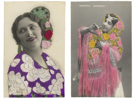
Finally, there are photos which are used as the substrate for other products. The embroidered postcards are beautiful objects and the ID badges are great fun to look at. In neither case am I really looking at the photos though. I’m seeing them as objects and remnants of a specific period of time. I appreciate seeing multiple specimens—Pier 24’s scale does most of the heavy lifting here—as I can get a better sense of the craft and usage of the pieces.
It’s no surprise that my favorite pieces at Pier 24 were these byproduct photos. They were useful objects which we can relate to—even after their previous functions are no longer needed or remembered, we recognize enough about how they were used. Recontextualizing them into a museum allows us to relate to them as useful objects and appreciate the new context along with the original craft. Looking at photography—or really anything else in a museum—needs to be more than just an academic surface-level exercise for me. I need to see what the photos are doing, how they’re being used, or what statement they’re making.